TabBar(
      unselectedLabelColor: Colors.pinkAccent,
      indicatorSize: TabBarIndicatorSize.tab,
      indicator: BoxDecoration(
          gradient: LinearGradient(
              colors: [Colors.purple, Colors.orangeAccent]),
          borderRadius: BorderRadius.circular(40),
          color: Colors.pinkAccent),
      tabs: [
        Tab(
          child: Align(
            alignment: Alignment.center,
            child: Text("CAMERA"),
          ),
        ),
        Tab(
          child: Align(
            alignment: Alignment.center,
            child: Text("BIKE"),
          ),
        ),
        Tab(
          child: Align(
            alignment: Alignment.center,
            child: Text("TRAM"),
          ),
        ),
      ]),
),
body: TabBarView(children: [
  Icon(Icons.camera, size: 50,),
  Icon(Icons.directions_bike, size: 50,),
  Icon(Icons.tram, size: 50,),
]),
import 'package:flutter/material.dart';
import 'package:gradient_bottom_navigation_bar/gradient_bottom_navigation_bar.dart';
void main() => runApp(MyApp());
class MyApp extends StatelessWidget {
// This widget is the root of your application.
@override
Widget build(BuildContext context) {
return MaterialApp(
debugShowCheckedModeBanner: false,
title: 'App Design',
home: MyHomePage(),
);
}
}
class MyHomePage extends StatefulWidget {
MyHomePage({Key key, this.title}) : super(key: key);
final String title;
@override
_MyHomePageState createState() => _MyHomePageState();
}
class _MyHomePageState extends State<MyHomePage> {
int _counter = 0;
void _incrementCounter() {
setState(() {
_counter++;
});
}
@override
Widget build(BuildContext context) {
return DefaultTabController(
length: 3,
child: Scaffold(
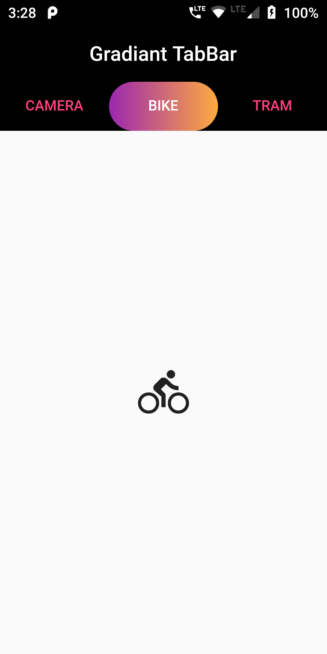
appBar: AppBar(
centerTitle: true,
title: Text('Gradiant TabBar'),
backgroundColor: Colors.black,
elevation: 0,
bottom: TabBar(
unselectedLabelColor: Colors.pinkAccent,
indicatorSize: TabBarIndicatorSize.tab,
indicator: BoxDecoration(
gradient: LinearGradient(
colors: [Colors.purple, Colors.orangeAccent]),
borderRadius: BorderRadius.circular(40),
color: Colors.pinkAccent),
tabs: [
Tab(
child: Align(
alignment: Alignment.center,
child: Text("CAMERA"),
),
),
Tab(
child: Align(
alignment: Alignment.center,
child: Text("BIKE"),
),
),
Tab(
child: Align(
alignment: Alignment.center,
child: Text("TRAM"),
),
),
]),
),
body: TabBarView(children: [
Icon(Icons.camera, size: 50,),
Icon(Icons.directions_bike, size: 50,),
Icon(Icons.tram, size: 50,),
]),
)
);
}
}

 Posted By
Bajarangi soft ,
Posted On 23-09-2020
Posted By
Bajarangi soft ,
Posted On 23-09-2020