
 Posted By
Bajarangi soft ,
Posted On 30-09-2020
Posted By
Bajarangi soft ,
Posted On 30-09-2020
1.CSS Text Shadows Example: 1
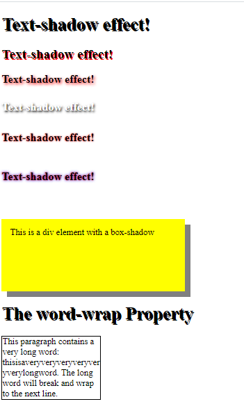
<!DOCTYPE html>
<html>
<head>
    <style>
        h1 {
            text-shadow: 2px 2px;
        }
        h2 {
            text-shadow: 2px 2px red;
        }

        h3 {
            text-shadow: 2px 2px 5px red;font-size:20px;
        }
        h4 {
            color: white;
            text-shadow: 2px 2px 4px #000000;font-size:20px;
        }
        h5 {
            text-shadow: 0 0 3px #FF0000;font-size:20px;
        }
        h6{
        text-shadow: 0 0 3px #FF0000, 0 0 5px #0000FF;
            font-size:20px;

        }
        div {
            width: 300px;
            height: 100px;
            padding: 15px;
            background-color: yellow;
            box-shadow: 10px 10px grey;
        }
    </style>
</head>
<body>

<h1>Text-shadow effect!</h1>
<h2>Text-shadow effect!</h2>
<h3>Text-shadow effect!</h3>
<h4>Text-shadow effect!</h4>
<h5>Text-shadow effect!</h5>
<h6>Text-shadow effect!</h6>
<br>
<div>This is a div element with a box-shadow</div>  <!---box shadow--->
</body>
</html>
<!DOCTYPE html>
<html>
<head>
    <style>
        p.test {
            width: 11em;
            border: 1px solid #000000;
            word-wrap: break-word;
        }
    </style>
</head>
<body>

<h1>The word-wrap Property</h1>

<p class="test"> This paragraph contains a very long word: thisisaveryveryveryveryveryverylongword. The long word will break and wrap to the next line.</p>

</body>
</html>