
 Posted By
Bajarangi soft ,
Posted On 03-11-2020
Posted By
Bajarangi soft ,
Posted On 03-11-2020
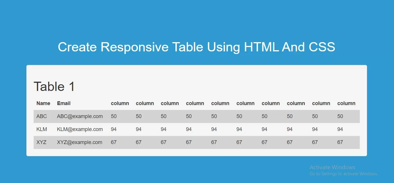
Step 1:Create index.html file and implement as below code in it.
<div style="overflow-x:auto;">
<table>
    <tr>
        <th>Name</th>
        <th>Email</th>
        <th>column</th>
        <th>column</th>
        <th>column</th>
        <th>column</th>
        <th>column</th>
        <th>column</th>
        <th>column</th>
        <th>column</th>
        <th>column</th>
        <th>column</th>
    </tr>
    <tr>
        <td>ABC</td>
        <td>ABC@example.com</td>
        <td>50</td>
        <td>50</td>
        <td>50</td>
        <td>50</td>
        <td>50</td>
        <td>50</td>
        <td>50</td>
        <td>50</td>
        <td>50</td>
        <td>50</td>
    </tr>
    <tr>
        <td>KLM</td>
        <td>KLM@example.com</td>
        <td>94</td>
        <td>94</td>
        <td>94</td>
        <td>94</td>
        <td>94</td>
        <td>94</td>
        <td>94</td>
        <td>94</td>
        <td>94</td>
        <td>94</td>
    </tr>
    <tr>
        <td>XYZ</td>
        <td>XYZ@example.com</td>
        <td>67</td>
        <td>67</td>
        <td>67</td>
        <td>67</td>
        <td>67</td>
        <td>67</td>
        <td>67</td>
        <td>67</td>
        <td>67</td>
        <td>67</td>
    </tr>
</table>
</div>
Step 2:Implement CSS code as below to create responsive table.
<style>
    body {
        background: #2e9ad0;
    }
    table {
        border-collapse: collapse;
        width: 100%;
    }

    th, td {
        text-align: left;
        padding: 8px;
    }

    tr:nth-child(even) {background-color: lightgrey;}
</style>
Complete Code For Creating Responsive Table Using HTML And CSS.
<!DOCTYPE html>
<html>
<head>
    <title>How Do I Create Responsive Table Using HTML And CSS</title>
    <meta name="viewport" content="width=device-width, initial-scale=1.0">
    <script src="https://ajax.googleapis.com/ajax/libs/jquery/3.1.0/jquery.min.js"></script>
    <link rel="stylesheet" href="https://maxcdn.bootstrapcdn.com/bootstrap/3.3.6/css/bootstrap.min.css"/>
    <script src="https://maxcdn.bootstrapcdn.com/bootstrap/3.3.7/js/bootstrap.min.js"></script>

</head>
<style>
    body {
        background: #2e9ad0;
    }
    table {
        border-collapse: collapse;
        width: 100%;
    }

    th, td {
        text-align: left;
        padding: 8px;
    }

    tr:nth-child(even) {background-color: lightgrey;}
</style>
<body>
<br/><br/>
<div class="container">
    <br><br><br>
    <div class="text-center">
        <h1 id="color" style="color: white;">Create Responsive Table Using HTML And CSS</h1>
    </div>
    <br>
    <div class="well">
        <h1>Table 1</h1>
        <div style="overflow-x:auto;">
        <table>
            <tr>
                <th>Name</th>
                <th>Email</th>
                <th>column</th>
                <th>column</th>
                <th>column</th>
                <th>column</th>
                <th>column</th>
                <th>column</th>
                <th>column</th>
                <th>column</th>
                <th>column</th>
                <th>column</th>
            </tr>
            <tr>
                <td>ABC</td>
                <td>ABC@example.com</td>
                <td>50</td>
                <td>50</td>
                <td>50</td>
                <td>50</td>
                <td>50</td>
                <td>50</td>
                <td>50</td>
                <td>50</td>
                <td>50</td>
                <td>50</td>
            </tr>
            <tr>
                <td>KLM</td>
                <td>KLM@example.com</td>
                <td>94</td>
                <td>94</td>
                <td>94</td>
                <td>94</td>
                <td>94</td>
                <td>94</td>
                <td>94</td>
                <td>94</td>
                <td>94</td>
                <td>94</td>
            </tr>
            <tr>
                <td>XYZ</td>
                <td>XYZ@example.com</td>
                <td>67</td>
                <td>67</td>
                <td>67</td>
                <td>67</td>
                <td>67</td>
                <td>67</td>
                <td>67</td>
                <td>67</td>
                <td>67</td>
                <td>67</td>
            </tr>
        </table>
        </div>
    </div>
    <br>
</div>
</body>
</html>