
 Posted By
Bajarangi soft ,
Posted On 27-11-2020
Posted By
Bajarangi soft ,
Posted On 27-11-2020
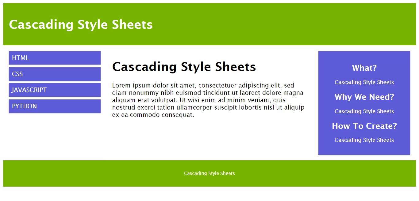
Complete Code For Createing Responsive Web Design.
<!DOCTYPE html>
<html>
<head>
    <meta name="viewport" content="width=device-width, initial-scale=1.0">
    <style>
        * {
            box-sizing: border-box;
        }

        .row::after {
            content: "";
            clear: both;
            display: table;
        }

        [class*="col-"] {
            float: left;
            padding: 15px;
        }

        html {
            font-family: "Lucida Sans", sans-serif;
        }

        .header {
            background-color: #77b300;
            color: #ffffff;
            padding: 15px;
        }

        .menu ul {
            list-style-type: none;
            margin: 0;
            padding: 0;
        }

        .menu li {
            padding: 8px;
            margin-bottom: 7px;
            background-color:#5c5cd6;
            color: #ffffff;
            box-shadow: 0 1px 3px rgba(0, 0, 0, 0.12), 0 1px 2px rgba(0, 0, 0, 0.24);
        }

        .menu li:hover {
            background-color: #5c5cd6;
        }

        .aside {
            background-color:#5c5cd6;
            padding: 15px;
            color: #ffffff;
            text-align: center;
            font-size: 14px;
            box-shadow: 0 1px 3px rgba(0, 0, 0, 0.12), 0 1px 2px rgba(0, 0, 0, 0.24);
        }

        .footer {
            background-color: #77b300;
            color: #ffffff;
            text-align: center;
            font-size: 12px;
            padding: 15px;
        }

        /* For mobile phones: */
        [class*="col-"] {
            width: 100%;
        }

        @media only screen and (min-width: 600px) {
            /* For tablets: */
            .col-s-1 {
                width: 8.33%;
            }

            .col-s-2 {
                width: 16.66%;
            }

            .col-s-3 {
                width: 25%;
            }

            .col-s-4 {
                width: 33.33%;
            }

            .col-s-5 {
                width: 41.66%;
            }

            .col-s-6 {
                width: 50%;
            }

            .col-s-7 {
                width: 58.33%;
            }

            .col-s-8 {
                width: 66.66%;
            }

            .col-s-9 {
                width: 75%;
            }

            .col-s-10 {
                width: 83.33%;
            }

            .col-s-11 {
                width: 91.66%;
            }

            .col-s-12 {
                width: 100%;
            }
        }

        @media only screen and (min-width: 768px) {
            /* For desktop: */
            .col-1 {
                width: 8.33%;
            }

            .col-2 {
                width: 16.66%;
            }

            .col-3 {
                width: 25%;
            }

            .col-4 {
                width: 33.33%;
            }

            .col-5 {
                width: 41.66%;
            }

            .col-6 {
                width: 50%;
            }

            .col-7 {
                width: 58.33%;
            }

            .col-8 {
                width: 66.66%;
            }

            .col-9 {
                width: 75%;
            }

            .col-10 {
                width: 83.33%;
            }

            .col-11 {
                width: 91.66%;
            }

            .col-12 {
                width: 100%;
            }
        }
    </style>
</head>
<body>

<div class="header">
    <h1>Cascading Style Sheets</h1>
</div>

<div class="row">
    <div class="col-3 col-s-3 menu">
        <ul>
            <li>HTML</li>
            <li>CSS</li>
            <li>JAVASCRIPT</li>
            <li>PYTHON</li>
        </ul>
    </div>

    <div class="col-6 col-s-9">
        <h1>Cascading Style Sheets</h1>
        <p>Lorem ipsum dolor sit amet, consectetuer adipiscing elit, sed diam nonummy nibh euismod tincidunt ut laoreet
            dolore magna aliquam erat volutpat. Ut wisi enim ad minim veniam, quis nostrud exerci tation ullamcorper
            suscipit lobortis nisl ut aliquip ex ea commodo consequat.</p>
    </div>

    <div class="col-3 col-s-12">
        <div class="aside">
            <h2>What?</h2>
            <p>Cascading Style Sheets</p>
            <h2>Why We Need?</h2>
            <p>Cascading Style Sheets</p>
            <h2>How To Create?</h2>
            <p>Cascading Style Sheets</p>
        </div>
    </div>
</div>

<div class="footer">
    <p>Cascading Style Sheets</p>
</div>

</body>
</html>