
 Posted By
Bajarangi soft ,
Posted On 08-10-2020
Posted By
Bajarangi soft ,
Posted On 08-10-2020
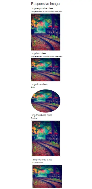
The different classes available in Bootstrap for images are as explained below:
<!DOCTYPE html>
<html>
<head>
    <!-- Link Bootstrap CSS -->
    <link rel="stylesheet" href="https://maxcdn.bootstrapcdn.com/bootstrap/3.3.7/css/bootstrap.min.css">
    <!-- Link Bootstrap JS and JQuery -->
    <script src="https://ajax.googleapis.com/ajax/libs/jquery/3.3.1/jquery.min.js"></script>
    <script src="https://maxcdn.bootstrapcdn.com/bootstrap/3.3.7/js/bootstrap.min.js"></script>
</head>

<body>
<div class="container">
    <h1>Responsive Image </h1>
    <br>
    <h3>.img-responsive class</h3>

    <p>
        Change the size of the browser window
        to see effect
    </p>

    <img src="b1.jpg"
         class="img-responsive" alt="Responsive image"
         width="307" height="240" />
</div>
</body>
</html>
<!DOCTYPE html>
<html>

<head>
    <!-- Link Bootstrap CSS -->
    <link rel="stylesheet" href="https://maxcdn.bootstrapcdn.com/bootstrap/3.3.7/css/bootstrap.min.css">

    <!-- Link Bootstrap JS and JQuery -->
    <script src="https://ajax.googleapis.com/ajax/libs/jquery/3.3.1/jquery.min.js"></script>
    <script src="https://maxcdn.bootstrapcdn.com/bootstrap/3.3.7/js/bootstrap.min.js"></script>
</head>

<body>
<div class="container">
    <h3>.img-fluid class</h3>

    <p>
        Change the size of the browser window
        to see effect.
    </p>

    <img src="b1.jpg"
         class="img-fluid" alt="Responsive Image"
         width="307" height="240" />
</div>

</body>

</html>
!DOCTYPE html>
<html>

<head>
    <!-- Link Bootstrap CSS -->
    <link rel="stylesheet" href="https://maxcdn.bootstrapcdn.com/bootstrap/3.3.7/css/bootstrap.min.css">

    <!-- Link Bootstrap JS and JQuery -->
    <script src="https://ajax.googleapis.com/ajax/libs/jquery/3.3.1/jquery.min.js"></script>
    <script src="https://maxcdn.bootstrapcdn.com/bootstrap/3.3.7/js/bootstrap.min.js"></script>
</head>

<body>
<div class="container">

    <h3>.img-rounded class</h3>

    <p>Rounded Corners</p>

    <img src="b1.jpg"
         class="img-rounded" alt="Responsive Image"
         width="307" height="240" />
</div>

</body>

</html>
<!DOCTYPE html>
<html>

<head>
    <!-- Link Bootstrap CSS -->
    <link rel="stylesheet" href="https://maxcdn.bootstrapcdn.com/bootstrap/3.3.7/css/bootstrap.min.css">

    <!-- Link Bootstrap JS and JQuery -->
    <script src="https://ajax.googleapis.com/ajax/libs/jquery/3.3.1/jquery.min.js"></script>
    <script src="https://maxcdn.bootstrapcdn.com/bootstrap/3.3.7/js/bootstrap.min.js"></script>
</head>

<body>
<div class="container">

    <h3>.img-circle class </h3>

    <p>Circle</p>

    <img src="b1.jpg"
         class="img-circle" alt="Responsive Image"
         width="307" height="240" />
</div>
</body>

</html>
<!DOCTYPE html>
<html>

<head>
    <!-- Link Bootstrap CSS -->
    <link rel="stylesheet" href="https://maxcdn.bootstrapcdn.com/bootstrap/3.3.7/css/bootstrap.min.css">

    <!-- Link Bootstrap JS and JQuery -->
    <script src="https://ajax.googleapis.com/ajax/libs/jquery/3.3.1/jquery.min.js"></script>
    <script src="https://maxcdn.bootstrapcdn.com/bootstrap/3.3.7/js/bootstrap.min.js"></script>
</head>

<body>
<div class="container">
    <h3>.img-thumbnail class</h3>

    <p>Thumbnail</p>

    <img src="b1.jpg"
         class="img-thumbnail" alt="Responsive Image"
         width="307" height="240">
</body>

</html>