
 Posted By
Bajarangi soft ,
Posted On 06-11-2020
Posted By
Bajarangi soft ,
Posted On 06-11-2020
Using CSS user can set 3D-positioned element.
<style>
body {
background: #c7254e;
}
#div1 {
position: relative;
height: 150px;
width: 150px;
margin-left: 60px;
border: 1px solid blue;
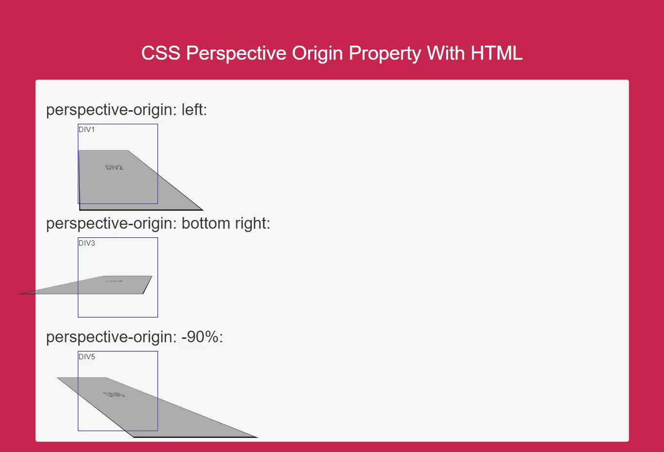
perspective: 100px;
perspective-origin: left;
}
#div2, #div4, #div6 {
padding: 50px;
position: absolute;
border: 1px solid black;
background-color: red;
background: rgba(100,100,100,0.5);
transform-style: preserve-3d;
transform: rotateX(45deg);
}
#div3 {
position: relative;
height: 150px;
width: 150px;
margin-left: 60px;
border: 1px solid blue;
perspective: 100px;
perspective-origin: bottom right;
}
#div5 {
position: relative;
height: 150px;
width: 150px;
margin-left: 60px;
border: 1px solid blue;
perspective: 100px;
perspective-origin: -90%;
}
</style>
Complete Code For Using CSS Perspective Property For Div Elements.
<!DOCTYPE html>
<html>
<head>
    <title>How To Use CSS Perspective Origin Property With HTML</title>
    <meta name="viewport" content="width=device-width, initial-scale=1.0">
    <link rel="stylesheet" href="https://maxcdn.bootstrapcdn.com/bootstrap/3.3.6/css/bootstrap.min.css"/>
</head>
<style>
    body {
        background: #c7254e;
    }

    #div1 {
        position: relative;
        height: 150px;
        width: 150px;
        margin-left: 60px;
        border: 1px solid blue;
        perspective: 100px;
        perspective-origin: left;
    }

    #div2, #div4, #div6 {
        padding: 50px;
        position: absolute;
        border: 1px solid black;
        background-color: red;
        background: rgba(100,100,100,0.5);
        transform-style: preserve-3d;
        transform: rotateX(45deg);
    }

    #div3 {
        position: relative;
        height: 150px;
        width: 150px;
        margin-left: 60px;
        border: 1px solid blue;
        perspective: 100px;
        perspective-origin: bottom right;
    }

    #div5 {
        position: relative;
        height: 150px;
        width: 150px;
        margin-left: 60px;
        border: 1px solid blue;
        perspective: 100px;
        perspective-origin: -90%;
    }
</style>
<body>
<br/><br/>
<div class="container">
    <br>
    <div class="text-center">
        <h1 id="color" style="color: white;">CSS Perspective Origin Property With HTML</h1>
    </div>
    <br>
    <div class="col-md-12">
        <div class="well">
            <h2>perspective-origin: left:</h2>
            <div id="div1">DIV1
                <div id="div2">DIV2</div>
            </div>

            <h2>perspective-origin: bottom right:</h2>
            <div id="div3">DIV3
                <div id="div4">DIV4</div>
            </div>

            <h2>perspective-origin: -90%:</h2>
            <div id="div5">DIV5
                <div id="div6">DIV6</div>
            </div>
        </div>
    </div>
</div>
</body>
</html>