
 Posted By
Bajarangi soft ,
Posted On 05-11-2020
Posted By
Bajarangi soft ,
Posted On 05-11-2020
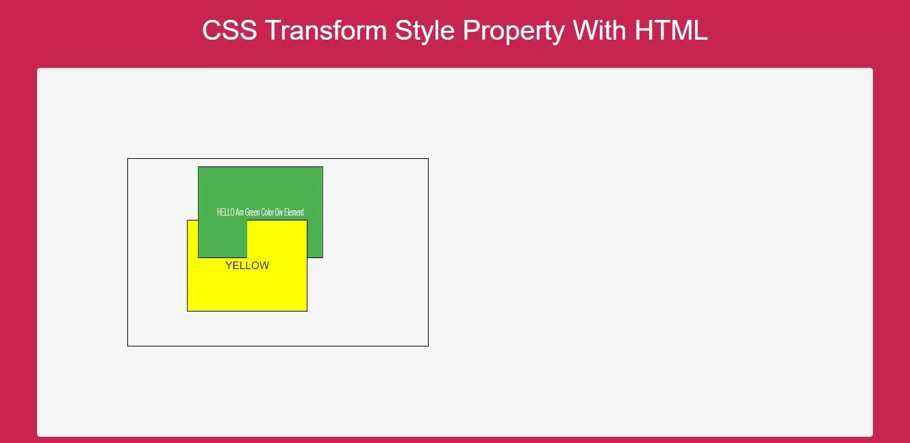
Using CSS set the transformed child elements preserve the 3D transformations.
<style>
    body {
        background: #c7254e;
    }
    #div1 {
        position: relative;
        height: 250px;
        width: 400px;
        margin: 100px;
        padding: 10px;
        border: 1px solid black;
    }

    #div2 {
        padding: 50px;
        position: absolute;
        border: 1px solid black;
        color: white;
        background-color: #4CAF50;
        transform: rotateY(60deg);
        transform-style: preserve-3d;
    }

    #div3 {
        padding: 50px;
        position: absolute;
        border: 1px solid black;
        background-color: yellow;
        transform: rotateY(-60deg);
        color: black;
    }
</style>
Complete Code For Using CSS Transform Style Property With HTML.
<!DOCTYPE html>
<html>
<head>
    <title>How To Use CSS Transform Style Property With HTML</title>
    <meta name="viewport" content="width=device-width, initial-scale=1.0">
    <link rel="stylesheet" href="https://maxcdn.bootstrapcdn.com/bootstrap/3.3.6/css/bootstrap.min.css"/>
</head>
<style>
    body {
        background: #c7254e;
    }
    #div1 {
        position: relative;
        height: 250px;
        width: 400px;
        margin: 100px;
        padding: 10px;
        border: 1px solid black;
    }

    #div2 {
        padding: 50px;
        position: absolute;
        border: 1px solid black;
        color: white;
        background-color: #4CAF50;
        transform: rotateY(60deg);
        transform-style: preserve-3d;
    }

    #div3 {
        padding: 50px;
        position: absolute;
        border: 1px solid black;
        background-color: yellow;
        transform: rotateY(-60deg);
        color: black;
    }
</style>
<body>
<br/><br/>
<div class="container">
    <br>
    <div class="text-center">
        <h1 id="color" style="color: white;">CSS Transform Style Property With HTML</h1>
    </div>
    <br>
    <div class="col-md-12">
    <div class="well">
        <div id="div1">
            <div id="div2">HELLO Am Green Color Div Element
                <div id="div3">YELLOW</div>
            </div>
        </div>
       </div>
    </div>
</div>
</body>
</html>