
 Posted By
Bajarangi soft ,
Posted On 30-09-2020
Posted By
Bajarangi soft ,
Posted On 30-09-2020
1. Create a Nav Bar Using Css
<!DOCTYPE html>
<html>
<head>
    <style>
        ul {
            list-style-type: none;
            margin: 0;
            padding: 0;
        }
    </style>
</head>
<body>

<p>In this example, we remove the bullets from the list, and its default padding and margin.</p>

<ul>
    <li><a href="#home">Home</a></li>
    <li><a href="#news">News</a></li>
    <li><a href="#contact">Contact</a></li>
    <li><a href="#about">About</a></li>
</ul>

</body>
</html>
<!DOCTYPE html>
<html>
<head>
    <style>
        body {
            margin: 0;
        }

        ul {
            list-style-type: none;
            margin: 0;
            padding: 0;
            width: 25%;
            background-color: #f1f1f1;
            position: fixed;
            height: 100%;
            overflow: auto;
        }

        li a {
            display: block;
            color: #000;
            padding: 8px 16px;
            text-decoration: none;
        }

        li a.active {
            background-color: #4CAF50;
            color: white;
        }

        li a:hover:not(.active) {
            background-color: #555;
            color: white;
        }
    </style>
</head>
<body>

<ul>
    <li><a class="active" href="#home">Home</a></li>
    <li><a href="#news">News</a></li>
    <li><a href="#contact">Contact</a></li>
    <li><a href="#about">About</a></li>
</ul>

<div style="margin-left:25%;padding:1px 16px;height:1000px;">
    <h2>Fixed Full-height Side Nav</h2>
    <h3>Try to scroll this area, and see how the sidenav sticks to the page</h3>
    <p>Notice that this div element has a left margin of 25%. This is because the side navigation is set to 25% width. If you remove the margin, the sidenav will overlay/sit on top of this div.</p>
    <p>Also notice that we have set overflow:auto to sidenav. This will add a scrollbar when the sidenav is too long (for example if it has over 50 links inside of it).</p>
    <p>Some text..</p>
    <p>Some text..</p>
    <p>Some text..</p>
    <p>Some text..</p>
    <p>Some text..</p>
    <p>Some text..</p>
    <p>Some text..</p>
</div>

</body>
</html>
<!DOCTYPE html>
<html>
<head>
<style>
body {
font-size: 28px;
}
ul {
list-style-type: none;
margin: 0;
padding: 0;
overflow: hidden;
background-color: #333;
position: -webkit-sticky; /* Safari */
position: sticky;
top: 0;
}
li {
float: left;
}
li a {
display: block;
color: white;
text-align: center;
padding: 14px 16px;
text-decoration: none;
}
li a:hover {
background-color: #111;
}
.active {
background-color: #4CAF50;
}
</style>
</head>
<body>
<div class="header">
<h2>Scroll Down</h2>
<p>Scroll down to see the sticky effect.</p>
</div>
<ul>
<li><a class="active" href="#home">Home</a></li>
<li><a href="#news">News</a></li>
<li><a href="#contact">Contact</a></li>
</ul>
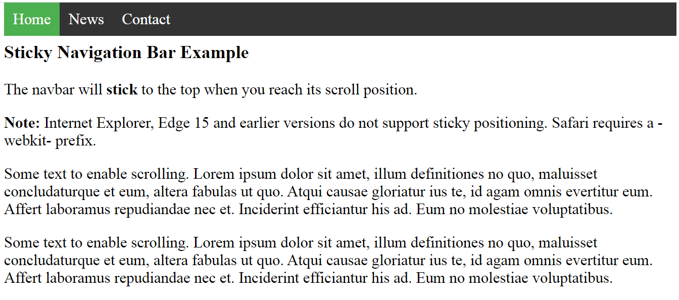
<h3>Sticky Navigation Bar Example</h3>
<p>The navbar will <strong>stick</strong> to the top when you reach its scroll position.</p>
<p><strong>Note:</strong> Internet Explorer, Edge 15 and earlier versions do not support sticky positioning. Safari requires a -webkit- prefix.</p>
<p>Some text to enable scrolling. Lorem ipsum dolor sit amet, illum definitiones no quo, maluisset concludaturque et eum, altera fabulas ut quo. Atqui causae gloriatur ius te, id agam omnis evertitur eum. Affert laboramus repudiandae nec et. Inciderint efficiantur his ad. Eum no molestiae voluptatibus.</p>
<p>Some text to enable scrolling. Lorem ipsum dolor sit amet, illum definitiones no quo, maluisset concludaturque et eum, altera fabulas ut quo. Atqui causae gloriatur ius te, id agam omnis evertitur eum. Affert laboramus repudiandae nec et. Inciderint efficiantur his ad. Eum no molestiae voluptatibus.</p>
<p>Some text to enable scrolling. Lorem ipsum dolor sit amet, illum definitiones no quo, maluisset concludaturque et eum, altera fabulas ut quo. Atqui causae gloriatur ius te, id agam omnis evertitur eum. Affert laboramus repudiandae nec et. Inciderint efficiantur his ad. Eum no molestiae voluptatibus.</p>
<p>Some text to enable scrolling. Lorem ipsum dolor sit amet, illum definitiones no quo, maluisset concludaturque et eum, altera fabulas ut quo. Atqui causae gloriatur ius te, id agam omnis evertitur eum. Affert laboramus repudiandae nec et. Inciderint efficiantur his ad. Eum no molestiae voluptatibus.</p>
<p>Some text to enable scrolling. Lorem ipsum dolor sit amet, illum definitiones no quo, maluisset concludaturque et eum, altera fabulas ut quo. Atqui causae gloriatur ius te, id agam omnis evertitur eum. Affert laboramus repudiandae nec et. Inciderint efficiantur his ad. Eum no molestiae voluptatibus.</p>
<p>Some text to enable scrolling. Lorem ipsum dolor sit amet, illum definitiones no quo, maluisset concludaturque et eum, altera fabulas ut quo. Atqui causae gloriatur ius te, id agam omnis evertitur eum. Affert laboramus repudiandae nec et. Inciderint efficiantur his ad. Eum no molestiae voluptatibus.</p>
<p>Some text to enable scrolling. Lorem ipsum dolor sit amet, illum definitiones no quo, maluisset concludaturque et eum, altera fabulas ut quo. Atqui causae gloriatur ius te, id agam omnis evertitur eum. Affert laboramus repudiandae nec et. Inciderint efficiantur his ad. Eum no molestiae voluptatibus.</p>
</body>
</html>
<!DOCTYPE html>
<html>
<head>
    <meta name="viewport" content="width=device-width, initial-scale=1.0">
    <style>
        body {margin: 0;}

        ul.sidenav {
            list-style-type: none;
            margin: 0;
            padding: 0;
            width: 25%;
            background-color: #f1f1f1;
            position: fixed;
            height: 100%;
            overflow: auto;
        }

        ul.sidenav li a {
            display: block;
            color: #000;
            padding: 8px 16px;
            text-decoration: none;
        }

        ul.sidenav li a.active {
            background-color: #4CAF50;
            color: white;
        }

        ul.sidenav li a:hover:not(.active) {
            background-color: #555;
            color: white;
        }

        div.content {
            margin-left: 25%;
            padding: 1px 16px;
            height: 1000px;
        }

        @media screen and (max-width: 900px) {
            ul.sidenav {
                width: 100%;
                height: auto;
                position: relative;
            }

            ul.sidenav li a {
                float: left;
                padding: 15px;
            }

            div.content {margin-left: 0;}
        }

        @media screen and (max-width: 400px) {
            ul.sidenav li a {
                text-align: center;
                float: none;
            }
        }
    </style>
</head>
<body>

<ul class="sidenav">
    <li><a class="active" href="#home">Home</a></li>
    <li><a href="#news">News</a></li>
    <li><a href="#contact">Contact</a></li>
    <li><a href="#about">About</a></li>
</ul>

<div class="content">
    <h2>Responsive Sidenav Example</h2>
    <p>This example use media queries to transform the sidenav to a top navigation bar when the screen size is 900px or less.</p>
    <p>We have also added a media query for screens that are 400px or less, which will vertically stack and center the navigation links.</p>
    <p>You will learn more about media queries and responsive web design later in our CSS Tutorial.</p>
    <h3>Resize the browser window to see the effect.</h3>
</div>

</body>
</html>