
 Posted By
Bajarangi soft ,
Posted On 06-10-2020
Posted By
Bajarangi soft ,
Posted On 06-10-2020
1.Grid system Example-1
<!DOCTYPE html>
<html lang="en">
<head>
<title>Bootstrap Example</title>
<meta charset="utf-8">
<meta name="viewport" content="width=device-width, initial-scale=1">
<link rel="stylesheet" href="https://maxcdn.bootstrapcdn.com/bootstrap/4.5.2/css/bootstrap.min.css">
<script src="https://ajax.googleapis.com/ajax/libs/jquery/3.5.1/jquery.min.js"></script>
<script src="https://cdnjs.cloudflare.com/ajax/libs/popper.js/1.16.0/umd/popper.min.js"></script>
<script src="https://maxcdn.bootstrapcdn.com/bootstrap/4.5.2/js/bootstrap.min.js"></script>
</head>
<body>
<div class="container-fluid">
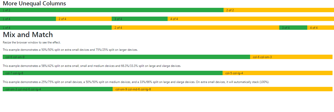
<h2>More Unequal Columns</h2>
<div class="row">
<div class="col-8 bg-success">1 of 2</div>
<div class="col-4 bg-warning">2 of 2</div>
</div>
<br>
<div class="row">
<div class="col-2 bg-success">1 of 4</div>
<div class="col-2 bg-warning">2 of 4</div>
<div class="col-2 bg-success">3 of 4</div>
<div class="col-6 bg-warning">4 of 4</div>
</div>
<br>
<div class="row">
<div class="col-4 bg-success">1 of 4</div>
<div class="col-6 bg-warning">2 of 4</div>
<div class="col bg-success">3 of 4</div>
<div class="col bg-warning">4 of 4</div>
</div>
</div>
</body>
</html>
<!DOCTYPE html>
<html lang="en">
<head>
    <title>Bootstrap Example</title>
    <meta charset="utf-8">
    <meta name="viewport" content="width=device-width, initial-scale=1">
    <link rel="stylesheet" href="https://maxcdn.bootstrapcdn.com/bootstrap/4.5.2/css/bootstrap.min.css">
    <script src="https://ajax.googleapis.com/ajax/libs/jquery/3.5.1/jquery.min.js"></script>
    <script src="https://cdnjs.cloudflare.com/ajax/libs/popper.js/1.16.0/umd/popper.min.js"></script>
    <script src="https://maxcdn.bootstrapcdn.com/bootstrap/4.5.2/js/bootstrap.min.js"></script>
</head>
<body>

<div class="container-fluid">
    <h1>Mix and Match</h1>
    <p>Resize the browser window to see the effect.</p>
    <p>This example demonstrates a 50%/50% split on extra small devices and 75%/25% split on larger devices.</p>
    <div class="container-fluid">
        <div class="row">
            <div class="col-6 col-sm-9 bg-success">col-6 col-sm-9</div>
            <div class="col-6 col-sm-3 bg-warning">col-6 col-sm-3</div>
        </div>
    </div>
    <br>
    <p>This example demonstrates a 58%/42% split on extra small, small and medium devices and 66.3%/33.3% split on large and xlarge devices.</p>
    <div class="container-fluid">
        <div class="row">
            <div class="col-7 col-lg-8 bg-success">col-7 col-lg-8</div>
            <div class="col-5 col-lg-4 bg-warning">col-5 col-lg-4</div>
        </div>
    </div>
    <br>
    <p>This example demonstrates a 25%/75% split on small devices, a 50%/50% split on medium devices, and a 33%/66% split on large and xlarge devices. On extra small devices, it will automatically stack (100%).</p>
    <div class="container-fluid">
        <div class="row">
            <div class="col-sm-3 col-md-6 col-lg-4 bg-success">col-sm-3 col-md-6 col-lg-4</div>
            <div class="col-sm-9 col-md-6 col-lg-8 bg-warning">col-sm-9 col-md-6 col-lg-8</div>
        </div>
    </div>
</div>

</body>
</html>
<!DOCTYPE html>
<html lang="en">
<head>
<title>Bootstrap Example</title>
<meta charset="utf-8">
<meta name="viewport" content="width=device-width, initial-scale=1">
<link rel="stylesheet" href="https://maxcdn.bootstrapcdn.com/bootstrap/4.5.2/css/bootstrap.min.css">
<script src="https://ajax.googleapis.com/ajax/libs/jquery/3.5.1/jquery.min.js"></script>
<script src="https://cdnjs.cloudflare.com/ajax/libs/popper.js/1.16.0/umd/popper.min.js"></script>
<script src="https://maxcdn.bootstrapcdn.com/bootstrap/4.5.2/js/bootstrap.min.js"></script>
</head>
<body>
<div class="container-fluid">
<h1>Responsive Auto Layout Columns</h1>
<p>In Bootstrap 4, there is an easy way to create equal width columns: just use the <code>.col-lg</code> class on a specified number of col elements. Bootstrap will recognize how many columns there are, and each column will get the same width.</p>
<p>If the screen size is <strong>less than 992px</strong>, the columns will stack horizontally.</p>
<div class="container-fluid">
<div class="row">
<div class="col-lg bg-success">1 of 2</div>
<div class="col-lg bg-warning">2 of 2</div>
</div>
</div>
<br>
<div class="container-fluid">
<div class="row">
<div class="col-lg bg-success">1 of 4</div>
<div class="col-lg bg-warning">2 of 4</div>
<div class="col-lg bg-success">3 of 4</div>
<div class="col-lg bg-warning">4 of 4</div>
</div>
</div>
</div>
</body>
</html>