
 Posted By
Bajarangi soft ,
Posted On 06-10-2020
Posted By
Bajarangi soft ,
Posted On 06-10-2020
1.How Create a Columns In Bootstrap
<!DOCTYPE html>
<html lang="en">
<head>
<title>Bootstrap Example</title>
<meta charset="utf-8">
<meta name="viewport" content="width=device-width, initial-scale=1">
<link rel="stylesheet" href="https://maxcdn.bootstrapcdn.com/bootstrap/4.5.2/css/bootstrap.min.css">
<script src="https://ajax.googleapis.com/ajax/libs/jquery/3.5.1/jquery.min.js"></script>
<script src="https://cdnjs.cloudflare.com/ajax/libs/popper.js/1.16.0/umd/popper.min.js"></script>
<script src="https://maxcdn.bootstrapcdn.com/bootstrap/4.5.2/js/bootstrap.min.js"></script>
</head>
<body>
<div class="container-fluid">
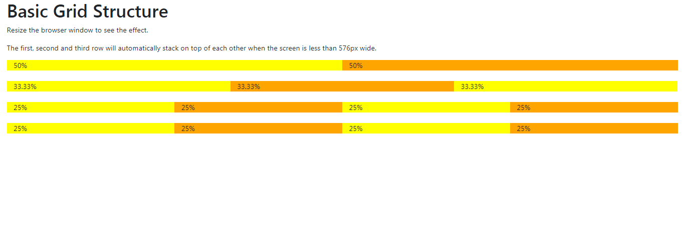
<h1>Basic Grid Structure</h1>
<p>Resize the browser window to see the effect.</p>
<p>The first, second and third row will automatically stack on top of each other when the screen is less than 576px wide.</p>
<div class="container-fluid">
<!-- Control the column width, and how they should appear on different devices -->
<div class="row">
<div class="col-sm-6" style="background-color:yellow;">50%</div>
<div class="col-sm-6" style="background-color:orange;">50%</div>
</div>
<br>
<div class="row">
<div class="col-sm-4" style="background-color:yellow;">33.33%</div>
<div class="col-sm-4" style="background-color:orange;">33.33%</div>
<div class="col-sm-4" style="background-color:yellow;">33.33%</div>
</div>
<br>
<!-- Or let Bootstrap automatically handle the layout -->
<div class="row">
<div class="col-sm" style="background-color:yellow;">25%</div>
<div class="col-sm" style="background-color:orange;">25%</div>
<div class="col-sm" style="background-color:yellow;">25%</div>
<div class="col-sm" style="background-color:orange;">25%</div>
</div>
<br>
<div class="row">
<div class="col" style="background-color:yellow;">25%</div>
<div class="col" style="background-color:orange;">25%</div>
<div class="col" style="background-color:yellow;">25%</div>
<div class="col" style="background-color:orange;">25%</div>
</div>
</div>
</div>
</body>
</html>