
 Posted By
Bajarangi soft ,
Posted On 13-10-2020
Posted By
Bajarangi soft ,
Posted On 13-10-2020
The media queries impact screen widths with the given breakpoint or larger. Example, .d-md-none sets display: none; on md, lg and xl screens.
Grid-breakpoints are
<!DOCTYPE html>
<html lang="en">

<head>
    <!-- Required meta tags -->
    <meta charset="utf-8">
    <meta name="viewport" content=
            "width=device-width,
      initial-scale=1,
      shrink-to-fit=no">

    <!-- Bootstrap CSS -->
    <link rel="stylesheet" href="https://stackpath.bootstrapcdn.com/bootstrap/4.5.0/css/bootstrap.min.css" integrity="sha384-9aIt2nRpC12Uk9gS9baDl411NQApFmC26EwAOH8WgZl5MYYxFfc+NcPb1dKGj7Sk" crossorigin="anonymous">

    <!-- Optional JavaScript -->
    <!-- jQuery first, then Popper.js,
        then Bootstrap JS -->
    <script src="https://code.jquery.com/jquery-3.5.1.slim.min.js" integrity="sha384-DfXdz2htPH0lsSSs5nCTpuj/zy4C+OGpamoFVy38MVBnE+IbbVYUew+OrCXaRkfj" crossorigin="anonymous"></script>
    <script src="https://cdn.jsdelivr.net/npm/popper.js@1.16.0/dist/umd/popper.min.js" integrity="sha384-Q6E9RHvbIyZFJoft+2mJbHaEWldlvI9IOYy5n3zV9zzTtmI3UksdQRVvoxMfooAo" crossorigin="anonymous"></script>

    <script src="https://stackpath.bootstrapcdn.com/bootstrap/4.5.0/js/bootstrap.min.js" integrity="sha384-OgVRvuATP1z7JjHLkuOU7Xw704+h835Lr+6QL9UvYjZE3Ipu6Tp75j7Bh/kR0JKI" crossorigin="anonymous"></script>

    <title>bootstrap4 | grid-breakpoint</title>
</head>

<body>
<center>
    <h1 style="color: #e32d1c">BAJARANGI SOFT</h1>

    <div class="d-inline p-2 bg-info text-white">
        Visible on all screen-size
    </div>

    <div class="d-inline d-sm-none p-2 bg-dark
                  text-white">
        Only Visible on xs (less
        than 576px) screen-size
    </div>

    <div class="d-none d-sm-inline d-md-none
            p-2 bg-success text-white">
        Only Visible on sm (767px to
        576px) screen-size
    </div>

    <div class="d-none d-md-inline d-lg-none
            p-2 bg-danger text-white">
        Only Visible on md (991px
        to 768px) screen-size
    </div>

    <div class="d-none d-lg-inline d-xl-none
         p-2 bg-warning text-white">
        Only Visible on lg (1199px
        to 992px) screen-size
    </div>

    <div class="d-none d-xl-inline p-2
            bg-light text-black">
        Only Visible on xl (>=1200px)
        screen-size
    </div>
</center>
</body>

</html>
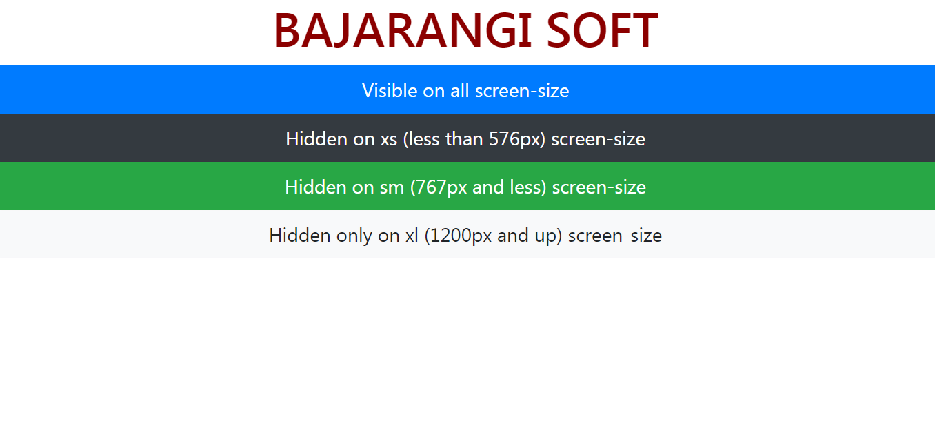
<!DOCTYPE html>
<html lang="en">

<head>
    <!-- Required meta tags -->
    <meta charset="utf-8">
    <meta name="viewport" content=
            "width=device-width,
      initial-scale=1,
      shrink-to-fit=no">

    <!-- Bootstrap CSS -->
    <link rel="stylesheet" href=
            "https://stackpath.bootstrapcdn.com/bootstrap/4.5.0/css/bootstrap.min.css"
          integrity=
                  "sha384-9aIt2nRpC12Uk9gS9baDl411NQApFmC26EwAOH8WgZl5MYYxFfc+NcPb1dKGj7Sk"
          crossorigin="anonymous">

    <!-- Optional JavaScript -->
    <!-- jQuery first, then Popper.js,
        then Bootstrap JS -->
    <script src="https://code.jquery.com/jquery-3.5.1.slim.min.js"
            integrity=
                    "sha384-DfXdz2htPH0lsSSs5nCTpuj/zy4C+OGpamoFVy38MVBnE+IbbVYUew+OrCXaRkfj"
            crossorigin="anonymous">
    </script>

    <script src=
                    "https://cdn.jsdelivr.net/npm/popper.js@1.16.0/dist/umd/popper.min.js"
            integrity=
                    "sha384-Q6E9RHvbIyZFJoft+2mJbHaEWldlvI9IOYy5n3zV9zzTtmI3UksdQRVvoxMfooAo"
            crossorigin="anonymous">
    </script>

    <script src=
                    "https://stackpath.bootstrapcdn.com/bootstrap/4.5.0/js/bootstrap.min.js"
            integrity=
                    "sha384-OgVRvuATP1z7JjHLkuOU7Xw704+h835Lr+6QL9UvYjZE3Ipu6Tp75j7Bh/kR0JKI"
            crossorigin="anonymous">
    </script>

    <title>Bootstrap4 grid-breakpoint</title>
</head>

<body>
<center>
    <h1 style="color: darkred">
       BAJARANI SOFT
    </h1>

    <div class="d-block p-2 bg-primary
            text-white">
        Visible on all screen-size
    </div>

    <div class="d-none d-sm-block p-2
         bg-dark text-white">
        Hidden on xs (less than
        576px) screen-size
    </div>

    <div class="d-none d-md-block p-2
         bg-success text-white">
        Hidden on sm (767px and
        less) screen-size
    </div>

    <div class="d-none d-lg-block p-2
         bg-danger text-white">
        Hidden on md (991px and
        less) screen-size
    </div>

    <div class="d-none d-xl-block p-2
         bg-warning text-white">
        Hidden on lg (1199px and
        less) screen-size
    </div>

    <div class="d-xl-none p-2 bg-light
         text-black">
        Hidden only on xl (1200px
        and up) screen-size
    </div>
</center>
</body>

</html>