
 Posted By
Bajarangi soft ,
Posted On 01-10-2020
Posted By
Bajarangi soft ,
Posted On 01-10-2020
1.Basic Alerts In Bootstrap
<!DOCTYPE html>
<html lang="en">
<head>
<title>Bootstrap Example</title>
<meta charset="utf-8">
<meta name="viewport" content="width=device-width, initial-scale=1">
<link rel="stylesheet" href="https://maxcdn.bootstrapcdn.com/bootstrap/4.5.2/css/bootstrap.min.css">
<script src="https://ajax.googleapis.com/ajax/libs/jquery/3.5.1/jquery.min.js"></script>
<script src="https://cdnjs.cloudflare.com/ajax/libs/popper.js/1.16.0/umd/popper.min.js"></script>
<script src="https://maxcdn.bootstrapcdn.com/bootstrap/4.5.2/js/bootstrap.min.js"></script>
</head>
<body>
<div class="container">
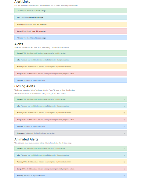
<h2>Alerts</h2>
<p>Alerts are created with the .alert class, followed by a contextual color classes:</p>
<div class="alert alert-success">
<strong>Success!</strong> This alert box could indicate a successful or positive action.
</div>
<div class="alert alert-info">
<strong>Info!</strong> This alert box could indicate a neutral informative change or action.
</div>
<div class="alert alert-warning">
<strong>Warning!</strong> This alert box could indicate a warning that might need attention.
</div>
<div class="alert alert-danger">
<strong>Danger!</strong> This alert box could indicate a dangerous or potentially negative action.
</div>
<div class="alert alert-primary">
<strong>Primary!</strong> Indicates an important action.
</div>
<div class="alert alert-secondary">
<strong>Secondary!</strong> Indicates a slightly less important action.
</div>
<div class="alert alert-dark">
<strong>Dark!</strong> Dark grey alert.
</div>
<div class="alert alert-light">
<strong>Light!</strong> Light grey alert.
</div>
</div>
</body>
</html>
<!DOCTYPE html>
<html lang="en">
<head>
    <title>Bootstrap Example</title>
    <meta charset="utf-8">
    <meta name="viewport" content="width=device-width, initial-scale=1">
    <link rel="stylesheet" href="https://maxcdn.bootstrapcdn.com/bootstrap/4.5.2/css/bootstrap.min.css">
    <script src="https://ajax.googleapis.com/ajax/libs/jquery/3.5.1/jquery.min.js"></script>
    <script src="https://cdnjs.cloudflare.com/ajax/libs/popper.js/1.16.0/umd/popper.min.js"></script>
    <script src="https://maxcdn.bootstrapcdn.com/bootstrap/4.5.2/js/bootstrap.min.js"></script>
</head>
<body>

<div class="container">
    <h2>Alert Links</h2>
    <p>Add the alert-link class to any links inside the alert box to create "matching colored links".</p>
    <div class="alert alert-success">
        <strong>Success!</strong> You should <a href="#" class="alert-link">read this message</a>.
    </div>
    <div class="alert alert-info">
        <strong>Info!</strong> You should <a href="#" class="alert-link">read this message</a>.
    </div>
    <div class="alert alert-warning">
        <strong>Warning!</strong> You should <a href="#" class="alert-link">read this message</a>.
    </div>
    <div class="alert alert-danger">
        <strong>Danger!</strong> You should <a href="#" class="alert-link">read this message</a>.
    </div>
    <div class="alert alert-primary">
        <strong>Primary!</strong> You should <a href="#" class="alert-link">read this message</a>.
    </div>
    <div class="alert alert-secondary">
        <strong>Secondary!</strong> You should <a href="#" class="alert-link">read this message</a>.
    </div>
    <div class="alert alert-dark">
        <strong>Dark!</strong> You should <a href="#" class="alert-link">read this message</a>.
    </div>
    <div class="alert alert-light">
        <strong>Light!</strong> You should <a href="#" class="alert-link">read this message</a>.
    </div>
</div>

</body>
</html>
<!DOCTYPE html>
<html lang="en">
<head>
<title>Bootstrap Example</title>
<meta charset="utf-8">
<meta name="viewport" content="width=device-width, initial-scale=1">
<link rel="stylesheet" href="https://maxcdn.bootstrapcdn.com/bootstrap/4.5.2/css/bootstrap.min.css">
<script src="https://ajax.googleapis.com/ajax/libs/jquery/3.5.1/jquery.min.js"></script>
<script src="https://cdnjs.cloudflare.com/ajax/libs/popper.js/1.16.0/umd/popper.min.js"></script>
<script src="https://maxcdn.bootstrapcdn.com/bootstrap/4.5.2/js/bootstrap.min.js"></script>
</head>
<body>
<div class="container">
<h2> Closing Alerts</h2>
<p>The button with class="close" and data-dismiss="alert" is used to close the alert box.</p>
<p>The alert-dismissible class adds some extra padding to the close button.</p>
<div class="alert alert-success alert-dismissible">
<button type="button" class="close" data-dismiss="alert">×</button>
<strong>Success!</strong> This alert box could indicate a successful or positive action.
</div>
<div class="alert alert-info alert-dismissible">
<button type="button" class="close" data-dismiss="alert">×</button>
<strong>Info!</strong> This alert box could indicate a neutral informative change or action.
</div>
<div class="alert alert-warning alert-dismissible">
<button type="button" class="close" data-dismiss="alert">×</button>
<strong>Warning!</strong> This alert box could indicate a warning that might need attention.
</div>
<div class="alert alert-danger alert-dismissible">
<button type="button" class="close" data-dismiss="alert">×</button>
<strong>Danger!</strong> This alert box could indicate a dangerous or potentially negative action.
</div>
<div class="alert alert-primary alert-dismissible">
<button type="button" class="close" data-dismiss="alert">×</button>
<strong>Primary!</strong> Indicates an important action.
</div>
<div class="alert alert-secondary alert-dismissible">
<button type="button" class="close" data-dismiss="alert">×</button>
<strong>Secondary!</strong> Indicates a slightly less important action.
</div>
<div class="alert alert-dark alert-dismissible">
<button type="button" class="close" data-dismiss="alert">×</button>
<strong>Dark!</strong> Dark grey alert.
</div>
<div class="alert alert-light alert-dismissible">
<button type="button" class="close" data-dismiss="alert">×</button>
<strong>Light!</strong> Light grey alert.
</div>
</div>
</body>
</html>
<!DOCTYPE html>
<html lang="en">
<head>
<title>Bootstrap Example</title>
<meta charset="utf-8">
<meta name="viewport" content="width=device-width, initial-scale=1">
<link rel="stylesheet" href="https://maxcdn.bootstrapcdn.com/bootstrap/4.5.2/css/bootstrap.min.css">
<script src="https://ajax.googleapis.com/ajax/libs/jquery/3.5.1/jquery.min.js"></script>
<script src="https://cdnjs.cloudflare.com/ajax/libs/popper.js/1.16.0/umd/popper.min.js"></script>
<script src="https://maxcdn.bootstrapcdn.com/bootstrap/4.5.2/js/bootstrap.min.js"></script>
</head>
<body>
<div class="container">
<h2>Animated Alerts</h2>
<p>The .fade and .show classes adds a fading effect when closing the alert message.</p>
<div class="alert alert-success alert-dismissible fade show">
<button type="button" class="close" data-dismiss="alert">×</button>
<strong>Success!</strong> This alert box could indicate a successful or positive action.
</div>
<div class="alert alert-info alert-dismissible fade show">
<button type="button" class="close" data-dismiss="alert">×</button>
<strong>Info!</strong> This alert box could indicate a neutral informative change or action.
</div>
<div class="alert alert-warning alert-dismissible fade show">
<button type="button" class="close" data-dismiss="alert">×</button>
<strong>Warning!</strong> This alert box could indicate a warning that might need attention.
</div>
<div class="alert alert-danger alert-dismissible fade show">
<button type="button" class="close" data-dismiss="alert">×</button>
<strong>Danger!</strong> This alert box could indicate a dangerous or potentially negative action.
</div>
<div class="alert alert-primary alert-dismissible fade show">
<button type="button" class="close" data-dismiss="alert">×</button>
<strong>Primary!</strong> Indicates an important action.
</div>
<div class="alert alert-secondary alert-dismissible fade show">
<button type="button" class="close" data-dismiss="alert">×</button>
<strong>Secondary!</strong> Indicates a slightly less important action.
</div>
<div class="alert alert-dark alert-dismissible fade show">
<button type="button" class="close" data-dismiss="alert">×</button>
<strong>Dark!</strong> Dark grey alert.
</div>
<div class="alert alert-light alert-dismissible fade show">
<button type="button" class="close" data-dismiss="alert">×</button>
<strong>Light!</strong> Light grey alert.
</div>
</div>
</body>
</html>