
 Posted By
Bajarangi soft ,
Posted On 01-10-2020
Posted By
Bajarangi soft ,
Posted On 01-10-2020
1.Bootstrap Grid Example-1
<!DOCTYPE html>
<html lang="en">
<head>
<title>Bootstrap Example</title>
<meta charset="utf-8">
<meta name="viewport" content="width=device-width, initial-scale=1">
<link rel="stylesheet" href="https://maxcdn.bootstrapcdn.com/bootstrap/4.5.2/css/bootstrap.min.css">
<script src="https://ajax.googleapis.com/ajax/libs/jquery/3.5.1/jquery.min.js"></script>
<script src="https://cdnjs.cloudflare.com/ajax/libs/popper.js/1.16.0/umd/popper.min.js"></script>
<script src="https://maxcdn.bootstrapcdn.com/bootstrap/4.5.2/js/bootstrap.min.js"></script>
</head>
<body>
<div class="container-fluid">
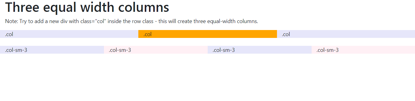
<h1>Three equal width columns</h1>
<p>Note: Try to add a new div with class="col" inside the row class - this will create three equal-width columns.</p>
<div class="row">
<div class="col" style="background-color:lavender;">.col</div>
<div class="col" style="background-color:orange;">.col</div>
<div class="col" style="background-color:lavender;">.col</div>
</div>
</div>
</body>
</html>
<!DOCTYPE html>
<html lang="en">
<head>
    <title>Bootstrap Example</title>
    <meta charset="utf-8">
    <meta name="viewport" content="width=device-width, initial-scale=1">
    <link rel="stylesheet" href="https://maxcdn.bootstrapcdn.com/bootstrap/4.5.2/css/bootstrap.min.css">
    <script src="https://ajax.googleapis.com/ajax/libs/jquery/3.5.1/jquery.min.js"></script>
    <script src="https://cdnjs.cloudflare.com/ajax/libs/popper.js/1.16.0/umd/popper.min.js"></script>
    <script src="https://maxcdn.bootstrapcdn.com/bootstrap/4.5.2/js/bootstrap.min.js"></script>
</head>
<body>

<div class="container-fluid">
    <h1>Responsive Columns</h1>
    <p>Resize the browser window to see the effect.</p>
    <p>The columns will automatically stack on top of each other when the screen is less than 576px wide.</p>
    <div class="row">
        <div class="col-sm-3" style="background-color:lavender;">.col-sm-3</div>
        <div class="col-sm-3" style="background-color:lavenderblush;">.col-sm-3</div>
        <div class="col-sm-3" style="background-color:lavender;">.col-sm-3</div>
        <div class="col-sm-3" style="background-color:lavenderblush;">.col-sm-3</div>
    </div>
</div>

</body>
</html>