
 Posted By
Bajarangi soft ,
Posted On 01-10-2020
Posted By
Bajarangi soft ,
Posted On 01-10-2020
1.Bootstrap .Container Example-1
<!DOCTYPE html>
<html lang="en">
<head>
    <title>Bootstrap Example</title>
    <meta charset="utf-8">
    <meta name="viewport" content="width=device-width, initial-scale=1">
    <link rel="stylesheet" href="https://maxcdn.bootstrapcdn.com/bootstrap/4.5.2/css/bootstrap.min.css">
    <script src="https://ajax.googleapis.com/ajax/libs/jquery/3.5.1/jquery.min.js"></script>
    <script src="https://cdnjs.cloudflare.com/ajax/libs/popper.js/1.16.0/umd/popper.min.js"></script>
    <script src="https://maxcdn.bootstrapcdn.com/bootstrap/4.5.2/js/bootstrap.min.js"></script>
</head>
<body>

<div class="container">
    <h1>My First Bootstrap Page</h1>
    <p>This part is inside a .container class.</p>
    <p>The .container class provides a responsive fixed width container.</p>
    <p>Resize the browser window to see that its width (max-width) will change at different breakpoints.</p>
</div>

</body>
</html>
<!DOCTYPE html>
<html lang="en">
<head>
<title>Bootstrap Example</title>
<meta charset="utf-8">
<meta name="viewport" content="width=device-width, initial-scale=1">
<link rel="stylesheet" href="https://maxcdn.bootstrapcdn.com/bootstrap/4.5.2/css/bootstrap.min.css">
<script src="https://ajax.googleapis.com/ajax/libs/jquery/3.5.1/jquery.min.js"></script>
<script src="https://cdnjs.cloudflare.com/ajax/libs/popper.js/1.16.0/umd/popper.min.js"></script>
<script src="https://maxcdn.bootstrapcdn.com/bootstrap/4.5.2/js/bootstrap.min.js"></script>
</head>
<body>
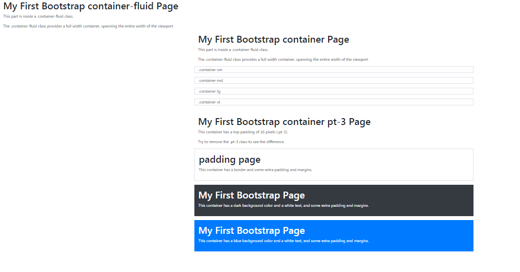
<div class="container-fluid">
<h1>My First Bootstrap Page</h1>
<p>This part is inside a .container-fluid class.</p>
<p>The .container-fluid class provides a full width container, spanning the entire width of the viewport.</p>
</div>
</body>
</html>
<!DOCTYPE html>
<html lang="en">
<head>
    <title>Bootstrap Example</title>
    <meta charset="utf-8">
    <meta name="viewport" content="width=device-width, initial-scale=1">
    <link rel="stylesheet" href="https://maxcdn.bootstrapcdn.com/bootstrap/4.5.2/css/bootstrap.min.css">
    <script src="https://ajax.googleapis.com/ajax/libs/jquery/3.5.1/jquery.min.js"></script>
    <script src="https://cdnjs.cloudflare.com/ajax/libs/popper.js/1.16.0/umd/popper.min.js"></script>
    <script src="https://maxcdn.bootstrapcdn.com/bootstrap/4.5.2/js/bootstrap.min.js"></script>
</head>
<body>

<div class="container pt-3">
    <h1>My First Bootstrap Page</h1>
    <p>This container has a top padding of 16 pixels (.pt-3).</p>
    <p>Try to remove the .pt-3 class to see the difference.</p>
</div>

</body>
</html>
<!DOCTYPE html>
<html lang="en">
<head>
    <title>Bootstrap Example</title>
    <meta charset="utf-8">
    <meta name="viewport" content="width=device-width, initial-scale=1">
    <link rel="stylesheet" href="https://maxcdn.bootstrapcdn.com/bootstrap/4.5.0/css/bootstrap.min.css">
    <script src="https://ajax.googleapis.com/ajax/libs/jquery/3.5.1/jquery.min.js"></script>
    <script src="https://cdnjs.cloudflare.com/ajax/libs/popper.js/1.14.7/umd/popper.min.js"></script>
    <script src="https://maxcdn.bootstrapcdn.com/bootstrap/4.5.0/js/bootstrap.min.js"></script>
</head>
<body>

<div class="container">
    <h1>Responsive Containers</h1>
    <p>Resize the browser window to see the effect.</p>
</div>

<div class="container-sm border">.container-sm</div>
<div class="container-md mt-3 border">.container-md</div>
<div class="container-lg mt-3 border">.container-lg</div>
<div class="container-xl mt-3 border">.container-xl</div>

</body>
</html>
<!DOCTYPE html>
<html lang="en">
<head>
    <title>Bootstrap Example</title>
    <meta charset="utf-8">
    <meta name="viewport" content="width=device-width, initial-scale=1">
    <link rel="stylesheet" href="https://maxcdn.bootstrapcdn.com/bootstrap/4.5.2/css/bootstrap.min.css">
    <script src="https://ajax.googleapis.com/ajax/libs/jquery/3.5.1/jquery.min.js"></script>
    <script src="https://cdnjs.cloudflare.com/ajax/libs/popper.js/1.16.0/umd/popper.min.js"></script>
    <script src="https://maxcdn.bootstrapcdn.com/bootstrap/4.5.2/js/bootstrap.min.js"></script>
</head>
<body>

<div class="container p-3 my-3 border">
    <h1>My First Bootstrap Page</h1>
    <p>This container has a border and some extra padding and margins.</p>
</div>

<div class="container p-3 my-3 bg-dark text-white">
    <h1>My First Bootstrap Page</h1>
    <p>This container has a dark background color and a white text, and some extra padding and margins.</p>
</div>

<div class="container p-3 my-3 bg-primary text-white">
    <h1>My First Bootstrap Page</h1>
    <p>This container has a blue background color and a white text, and some extra padding and margins.</p>
</div>

</body>
</html>