
 Posted By
Bajarangi soft ,
Posted On 01-10-2020
Posted By
Bajarangi soft ,
Posted On 01-10-2020
1.Create Background image Usinig Boostrap Example-1
<!DOCTYPE html>
<html lang="en">
<head>
<title>Bootstrap Example</title>
<meta charset="utf-8">
<meta name="viewport" content="width=device-width, initial-scale=1">
<link rel="stylesheet" href="https://maxcdn.bootstrapcdn.com/bootstrap/4.5.2/css/bootstrap.min.css">
<script src="https://ajax.googleapis.com/ajax/libs/jquery/3.5.1/jquery.min.js"></script>
<script src="https://cdnjs.cloudflare.com/ajax/libs/popper.js/1.16.0/umd/popper.min.js"></script>
<script src="https://maxcdn.bootstrapcdn.com/bootstrap/4.5.2/js/bootstrap.min.js"></script>
</head>
<body>
<div class="container">
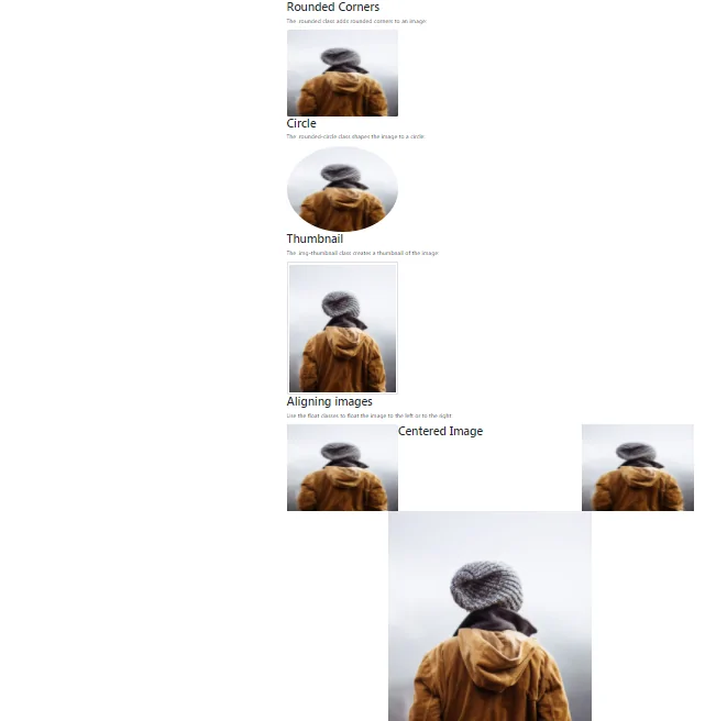
<h2>Rounded Corners</h2>
<p>The .rounded class adds rounded corners to an image:</p>
<img src="my_pic.jpg" class="rounded" alt="Cinque Terre" width="304" height="236">
</div>
<div class="container">
<h2>Circle</h2>
<p>The .rounded-circle class shapes the image to a circle:</p>
<img src="my_pic.jpg" class="rounded-circle" alt="Cinque Terre" width="304" height="236">
</div>
<div class="container">
<h2>Thumbnail</h2>
<p>The .img-thumbnail class creates a thumbnail of the image:</p>
<img src="my_pic.jpg" class="img-thumbnail" alt="Cinque Terre" width="304" height="236">
</div>
<div class="container">
<h2>Aligning images</h2>
<p>Use the float classes to float the image to the left or to the right:</p>
<img src="my_pic.jpg" class="float-left" alt="Paris" width="304" height="236">
<img src="my_pic.jpg" class="float-right" alt="Paris" width="304" height="236">
</div>
<div class="container">
<h2>Centered Image</h2>
<p>Center an image by adding the utility classes .mx-auto (margin:auto) and .d-block (display:block) to the image:</p>
<img src="paris.jpg" class="mx-auto d-block" style="width:50%">
</div>
</body>
</html>
<!DOCTYPE html>
<html lang="en">
<head>
    <title>Bootstrap Example</title>
    <meta charset="utf-8">
    <meta name="viewport" content="width=device-width, initial-scale=1">
    <link rel="stylesheet" href="https://maxcdn.bootstrapcdn.com/bootstrap/4.5.2/css/bootstrap.min.css">
    <script src="https://ajax.googleapis.com/ajax/libs/jquery/3.5.1/jquery.min.js"></script>
    <script src="https://cdnjs.cloudflare.com/ajax/libs/popper.js/1.16.0/umd/popper.min.js"></script>
    <script src="https://maxcdn.bootstrapcdn.com/bootstrap/4.5.2/js/bootstrap.min.js"></script>
</head>
<body>

<div class="container">
    <h2>Image</h2>
    <p>The .img-fluid class makes the image scale nicely to the parent element (resize the browser window to see the effect):</p>
    <img class="img-fluid" src="my_pic.jpg" alt="Chania" width="460" height="345">
</div>

</body>
</html>