
 Posted By
Bajarangi soft ,
Posted On 23-09-2020
Posted By
Bajarangi soft ,
Posted On 23-09-2020
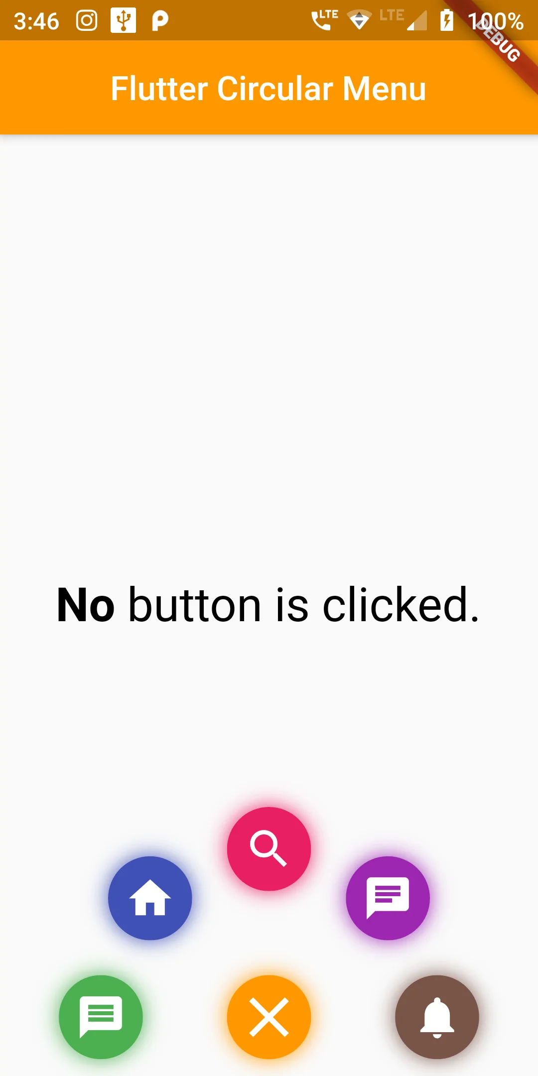
As a starting point, we will create a simple app with a Stack. Stack is a container Widget, that places widgets on top of each other. All of our widgets will be placed in it.Building a flashy Circular Menu Bottom Center in Flutter can be done with ease thanks to the Transform widget and staggered animations.
Step 1
we will add circular_menu: ^1.1.0 dependency name to
our pubspec.yaml file as shown below:
dependencies:
  flutter:
    sdk: flutter
  circular_menu: ^1.1.0
flutter pub get
import 'package:circular_menu/circular_menu.dart';
 CircularMenu(
  alignment: Alignment.bottomCenter,
  backgroundWidget: Center(
    child: RichText(
      text: TextSpan(
        style: TextStyle(color: Colors.black, fontSize: 28),
        children: <TextSpan>[
          TextSpan(
            text: _colorName,
            style:
            TextStyle(color: _color, fontWeight: FontWeight.bold),
          ),
          TextSpan(text: ' button is clicked.'),
        ],
      ),
    ),
  ),
  toggleButtonColor: Colors.orange,
  items: [
    CircularMenuItem(
        icon: Icons.message,
        color: Colors.green,
        onTap: () {
          setState(() {
            _color = Colors.green;
            _colorName = 'Green';
          });
        }),
    CircularMenuItem(
        icon: Icons.home,
        color: Colors.indigo,
        onTap: () {
          setState(() {
            _color = Colors.indigo;
            _colorName = 'Indigo';
          });
        }),
    CircularMenuItem(
        icon: Icons.search,
        color: Colors.pink,
        onTap: () {
          setState(() {
            _color = Colors.pink;
            _colorName = 'Pink';
          });
        }),
    CircularMenuItem(
        icon: Icons.chat,
        color: Colors.purple,
        onTap: () {
          setState(() {
            _color = Colors.purple;
            _colorName = 'Purple';
          });
        }),
    CircularMenuItem(
        icon: Icons.notifications,
        color: Colors.brown,
        onTap: () {
          setState(() {
            _color = Colors.brown;
            _colorName = 'Brown';
          });
        })
  ],
),
import 'package:flutter/material.dart';
import 'package:circular_menu/circular_menu.dart';

void main()=> runApp(MyApp());

class MyApp extends StatelessWidget {
  @override
  Widget build(BuildContext context) {
    return MaterialApp(
      debugShowCheckedModeBanner: false,
      title: "My App",
      home: MyHomePage(),
    );
  }
}


class MyHomePage extends StatefulWidget {
  @override
  _MyHomePageState createState() => _MyHomePageState();
}

class _MyHomePageState extends State<MyHomePage> with SingleTickerProviderStateMixin {

  String _colorName = 'No';
  Color _color = Colors.black;

  @override
  Widget build(BuildContext context) {
    return MaterialApp(
      home: Scaffold(
        appBar: AppBar(
          centerTitle: true,
          backgroundColor: Colors.orange,
          title: Text('Flutter Circular Menu'),
        ),
        body: CircularMenu(
          alignment: Alignment.bottomCenter,
          backgroundWidget: Center(
            child: RichText(
              text: TextSpan(
                style: TextStyle(color: Colors.black, fontSize: 28),
                children: <TextSpan>[
                  TextSpan(
                    text: _colorName,
                    style:
                    TextStyle(color: _color, fontWeight: FontWeight.bold),
                  ),
                  TextSpan(text: ' button is clicked.'),
                ],
              ),
            ),
          ),
          toggleButtonColor: Colors.orange,
          items: [
            CircularMenuItem(
                icon: Icons.message,
                color: Colors.green,
                onTap: () {
                  setState(() {
                    _color = Colors.green;
                    _colorName = 'Green';
                  });
                }),
            CircularMenuItem(
                icon: Icons.home,
                color: Colors.indigo,
                onTap: () {
                  setState(() {
                    _color = Colors.indigo;
                    _colorName = 'Indigo';
                  });
                }),
            CircularMenuItem(
                icon: Icons.search,
                color: Colors.pink,
                onTap: () {
                  setState(() {
                    _color = Colors.pink;
                    _colorName = 'Pink';
                  });
                }),
            CircularMenuItem(
                icon: Icons.chat,
                color: Colors.purple,
                onTap: () {
                  setState(() {
                    _color = Colors.purple;
                    _colorName = 'Purple';
                  });
                }),
            CircularMenuItem(
                icon: Icons.notifications,
                color: Colors.brown,
                onTap: () {
                  setState(() {
                    _color = Colors.brown;
                    _colorName = 'Brown';
                  });
                })
          ],
        ),
      ),
    );
  }
}