
 Posted By
Bajarangi soft ,
Posted On 10-10-2020
Posted By
Bajarangi soft ,
Posted On 10-10-2020
Initializing tooltip:
// Initializing the tooltip
$(document).ready(function() {
    $('[data-toggle="tooltip"]').tooltip();
});
<!DOCTYPE html>
<html lang="en">
<head>
<title>Disabled Button Tooltip</title>
<meta charset="utf-8">
<meta name="viewport" content="width=device-width, initial-scale=1">
<link rel="stylesheet" href="https://maxcdn.bootstrapcdn.com/bootstrap/4.3.1/css/bootstrap.min.css">
<script src="https://ajax.googleapis.com/ajax/libs/jquery/3.3.1/jquery.min.js"></script>
<script src="https://cdnjs.cloudflare.com/ajax/libs/popper.js/1.14.7/umd/popper.min.js"></script>
<script src="https://maxcdn.bootstrapcdn.com/bootstrap/4.3.1/js/bootstrap.min.js"></script>
<style>
.disabled {
pointer-events: all !important;
}
</style>
</head>
<body style="text-align:center;">
<div class="container pt-5">
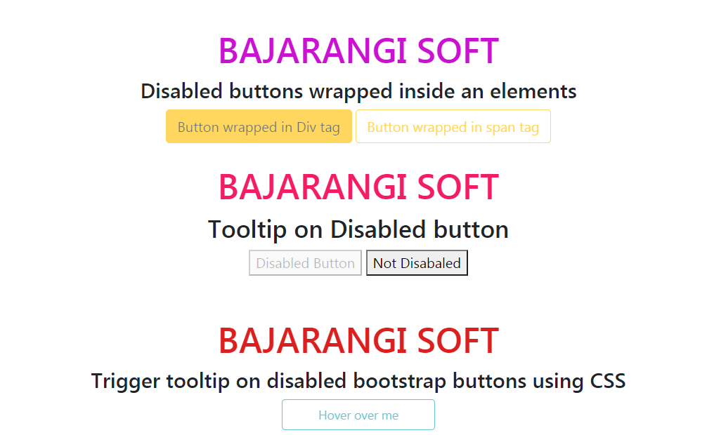
<h1 style="color:#ca12d0;">BAJARANGI SOFT</h1>
<h4>Disabled buttons wrapped inside an elements</h4>
<div class="d-inline-block" tabindex="0" data-toggle="tooltip" data-placement="bottom" title="This button is disabled">
<button type="button" class="btn btn-warning" style="pointer-events: none;" disabled>Button wrapped in Div tag</button>
</div>
<span class="d-inline-block" tabindex="0" data-toggle="tooltip" data-placement="right" title="This button is disabled">
<button class="btn btn-outline-warning" style="pointer-events: none;"type="button" disabled>
Button wrapped in span tag
</button>
</span>
</div>
<script>
$(document).ready(function() {
$('[data-toggle="tooltip"]').tooltip();
});
</script>
</body>
</html>
<!DOCTYPE html>
<html>

<head>
    <title>
        Tooltip on disabled button
    </title>

    <style>
        h1 {
            color: #f31d62;
        }
    </style>
</head>

<body>
<center>
    <h1>BAJARANGI SOFT</h1>
    <h3>Tooltip on Disabled button</h3>
    <div>
        <button disabled="disabled" title="My Tooltip">
            Disabled Button
        </button>
        <button title="Here it's common">Not Disabaled</button>
    </div>
</center>
</body>

</html>
<!DOCTYPE html>
<html>
<title>Disabled Button Tooltip</title>

<style>
    .tooltip1 {
        position: relative !important;
        display: inline-block !important;
        width: 175px !important;
        font-size: 14px;
    }

    .tooltip1 .tooltiptext {
        visibility: hidden;
        width: 120px !important;
        background-color: black !important;
        color: #fff !important;
        text-align: center !important;
        border-radius: 6px !important;
        padding: 5px 0 !important;
        position: absolute !important;
        z-index: 1 !important;
        top: -5px !important;
        left: 110% !important;
    }

    .tooltip1 .tooltiptext::after {
        content: "";
        position: absolute !important;
        top: 50% !important;
        right: 100% !important;
        margin-top: -5px !important;
        border-width: 5px !important;
        border-style: solid !important;
        border-color: transparent black transparent transparent !important;
    }

    .tooltip1:hover .tooltiptext {
        visibility: visible !important;
    }
</style>

<body style="text-align:center;">
<div class="container pt-5">

    <h1 style="color:#db1f1f;">
        BAJARANGI SOFT
    </h1>

    <h4>
        Trigger tooltip on disabled
        bootstrap buttons using CSS
    </h4>

    <button class="btn btn-outline-info tooltip1 " disabled>
        Hover over me
        <span class="tooltip1 tooltiptext">
         disabled button
         </span>
    </button>
</div>

</body>

</html>