
 Posted By
Bajarangi soft ,
Posted On 27-11-2020
Posted By
Bajarangi soft ,
Posted On 27-11-2020
Step 1:Create Index.html file and implement below code in it.
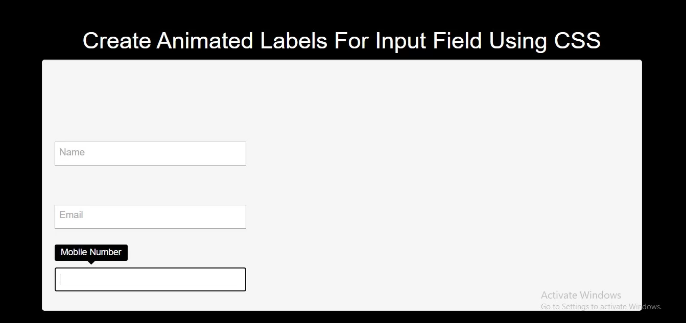
<div class="input1">
    <p>
        <input type="text" id="input1" />
        <label for="input1">Name</label>
    </p>
</div>

<div class="input2">
    <p>
        <input type="text" id="input2" />
        <label for="input2">Email</label>
    </p>
</div>

<div class="input3">
    <p>
        <input type="text" id="input3" />
        <label for="input3">Mobile Number</label>
    </p>
</div>
<style>
    * {
        box-sizing: border-box;
    }

    body {
        background-color: black;
        display: flex;
        justify-content: center;
        align-items: center;
        font: 24px/1.4 "RobotoDraft", sans-serif;
    }
    @import url(https://fonts.googleapis.com/css?family=Open+Sans:400);
    body {
        color: #333;
        font-family: 'Open Sans', sans-serif;
        font-weight: 400;
    }

    .input1 {
        padding-top: 2em;
    }
    p {
        margin-top: 2.5em;
    }

    .input1 p {
        position: relative;
    }
    .input1 input,
    .input1 label {
        -webkit-transition: all .2s;
        transition: all .2s;
        font-size: 15px;
        font-family: 'Open Sans', sans-serif;
        font-weight: 400;
    }
    .input1 input {
        width: 300px;
        padding: .5em .5em .5em 3.5em;
        border: 1px solid #aaa;
        background: #fff;
        border-radius: 0;
        -webkit-appearance: none;
        -moz-appearance: none;
        appearance: none;
        -webkit-box-sizing: border-box;
        box-sizing: border-box;
        color: #333;
    }
    .input1 label {
        position: absolute;
        top: .7em;
        left: .5em;
        color: #aaa;
        line-height: 1;
    }
    .input1 input:focus {
        padding-left: .5em;
    }
    .input1 input:focus + label {
        top: -1.5em;
    }


    .input2 p {
        position: relative;
    }
    .input2 input,
    .input2 label {
        -webkit-transition: all .2s;
        transition: all .2s;
        font-size: 15px;
        font-family: 'Open Sans', sans-serif;
        font-weight: 400;
    }
    .input2 input {
        width: 300px;
        padding: .5em .5em .5em 3.5em;
        border: 1px solid #aaa;
        background: #fff;
        border-radius: 0;
        -webkit-appearance: none;
        -moz-appearance: none;
        appearance: none;
        -webkit-box-sizing: border-box;
        box-sizing: border-box;
        color: #333;
    }
    .input2 label {
        position: absolute;
        top: .7em;
        left: .5em;
        color: #aaa;
        line-height: 1;
    }
    .input2 input:focus {
        padding-left: 1.5em;
    }
    .input2 input:focus + label {
        top: .75em;
        left: -.5em;
        -webkit-transform: rotate(-90deg) scale(.7);
        transform: rotate(-90deg) scale(.7);
    }

    .input3 p {
        position: relative;
    }
    .input3 input,
    .input3 label {
        -webkit-transition: all .2s;
        transition: all .2s;
        font-size: 15px;
        font-family: 'Open Sans', sans-serif;
        font-weight: 400;
    }
    .input3 input {
        width: 300px;
        padding: .5em .5em .5em 3.5em;
        border: 1px solid #aaa;
        background: #fff;
        border-radius: 0;
        -webkit-appearance: none;
        -moz-appearance: none;
        appearance: none;
        -webkit-box-sizing: border-box;
        box-sizing: border-box;
        color: #333;
    }
    .input3 label {
        position: absolute;
        top: .7em;
        left: .5em;
        color: #aaa;
        line-height: 1;
    }
    .input3 input:focus {
        padding-left: .5em;
    }
    .input3 input:focus + label {
        top: -2.5em;
        left: 0;
        padding: .4em .7em .45em;
        border-radius: .2em;
        background-color: black;
        color: #fff;
        font-size: 14px;
    }
    .input3 input:focus + label::after {
        content: '';
        position: absolute;
        top: 100%;
        left: 50%;
        margin-left: -6px;
        border: 6px solid transparent;
        border-top-color: black;
    }
</style>
<!DOCTYPE html>
<html>
<head>
    <title>How To Create Animated Labels For Input Field Using CSS</title>
    <meta name="viewport" content="width=device-width, initial-scale=1.0">
    <link rel="stylesheet" href="https://maxcdn.bootstrapcdn.com/bootstrap/3.3.6/css/bootstrap.min.css"/>

</head>
<body>
<br/><br/>
<div class="container">
    <br>
    <div class="text-center">
        <h1 id="color" style="color: white;">Create Animated Labels For Input Field Using CSS</h1>
    </div>
    <div class="well">
        <div class="input1">
            <p>
                <input type="text" id="input1" />
                <label for="input1">Name</label>
            </p>
        </div>

        <div class="input2">
            <p>
                <input type="text" id="input2" />
                <label for="input2">Email</label>
            </p>
        </div>

        <div class="input3">
            <p>
                <input type="text" id="input3" />
                <label for="input3">Mobile Number</label>
            </p>
        </div>
    </div>
</div>
</body>
</html>