
 Posted By
Bajarangi soft ,
Posted On 27-11-2020
Posted By
Bajarangi soft ,
Posted On 27-11-2020
Step 1:Create Index.html file and implement below Code .
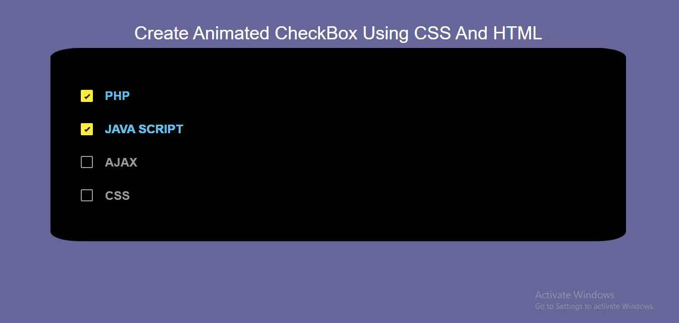
<div class="div1">
    <input id='one' type='checkbox'/>
    <label for='one'>
        <span></span>
        PHP
        <ins><i>PHP</i></ins>
    </label>

    <input id='two' type='checkbox'/>
    <label for='two'>
        <span></span>
        JAVA SCRIPT
        <ins><i>JAVA SCRIPT</i></ins>
    </label>

    <input id='three' type='checkbox'/>
    <label for='three'>
        <span></span>
        AJAX
        <ins><i>AJAX</i></ins>
    </label>

    <input id='four' type='checkbox'/>
    <label for='four'>
        <span></span>
        CSS
        <ins><i>CSS</i></ins>
    </label>

</div>
* {
    box-sizing: border-box;
}

body {
    background-color: #666699;
    display: flex;
    justify-content: center;
    align-items: center;
    font: 24px/1.4 "RobotoDraft", sans-serif;
    color: #fff;
}

*{ box-sizing: border-box; user-select: none; }
.div1{
    display: flex;
    flex-direction: column;
    background: black;
    border-radius: 5%;
    padding: 60px;
}

input[type='checkbox']{ height: 0; width: 0; }

input[type='checkbox'] + label{
    position: relative;
    display: flex;
    margin: .6em 0;
    align-items: center;
    color: #9e9e9e;
    transition: color 250ms cubic-bezier(.4,.0,.23,1);
}
input[type='checkbox'] + label > ins{
    position: absolute;
    display: block;
    bottom: 0;
    left: 2em;
    height: 0;
    width: 100%;
    overflow: hidden;
    text-decoration: none;
    transition: height 300ms cubic-bezier(.4,.0,.23,1);
}
input[type='checkbox'] + label > ins > i{
    position: absolute;
    bottom: 0;
    font-style: normal;
    color: #4FC3F7;
}
input[type='checkbox'] + label > span{
    display: flex;
    justify-content: center;
    align-items: center;
    margin-right: 1em;
    width: 1em;
    height: 1em;
    background: transparent;
    border: 2px solid #9E9E9E;
    border-radius: 2px;
    cursor: pointer;
    transition: all 250ms cubic-bezier(.4,.0,.23,1);
}

input[type='checkbox'] + label:hover, input[type='checkbox']:focus + label{
    color: #fff;
}
input[type='checkbox'] + label:hover > span, input[type='checkbox']:focus + label > span{
    background: rgba(255,255,255,.1);
}
input[type='checkbox']:checked + label > ins{ height: 100%; }

input[type='checkbox']:checked + label > span{
    border: .5em solid #FFEB3B;
    animation: shrink-bounce 200ms cubic-bezier(.4,.0,.23,1);
}
input[type='checkbox']:checked + label > span:before{
    content: "";
    position: absolute;
    top: .8em;
    left: .3em;
    border-right: 3px solid transparent;
    border-bottom: 3px solid transparent;
    transform: rotate(45deg);
    transform-origin: 0% 100%;
    animation: checkbox-check 125ms 250ms cubic-bezier(.4,.0,.23,1) forwards;
}

@keyframes shrink-bounce{
    0%{
        transform: scale(1);
    }
    33%{
        transform: scale(.85);
    }
    100%{
        transform: scale(1);
    }
}
@keyframes checkbox-check{
    0%{
        width: 0;
        height: 0;
        border-color: #212121;
        transform: translate3d(0,0,0) rotate(45deg);
    }
    33%{
        width: .2em;
        height: 0;
        transform: translate3d(0,0,0) rotate(45deg);
    }
    100%{
        width: .2em;
        height: .5em;
        border-color: #212121;
        transform: translate3d(0,-.5em,0) rotate(45deg);
    }
}
<!DOCTYPE html>
<html>
<head>
    <title>How To Create Animated CheckBox Using CSS And HTML</title>
    <meta name="viewport" content="width=device-width, initial-scale=1.0">
    <link rel="stylesheet" href="https://maxcdn.bootstrapcdn.com/bootstrap/3.3.6/css/bootstrap.min.css"/>
</head>
<body>
<br/><br/>
<div class="container">
    <br>
    <div class="text-center">
        <h1 id="color" style="color: white;">Create Animated CheckBox Using CSS And HTML</h1>
    </div>
    <div class="div1">
        <input id='one' type='checkbox'/>
        <label for='one'>
            <span></span>
            PHP
            <ins><i>PHP</i></ins>
        </label>

        <input id='two' type='checkbox'/>
        <label for='two'>
            <span></span>
            JAVA SCRIPT
            <ins><i>JAVA SCRIPT</i></ins>
        </label>

        <input id='three' type='checkbox'/>
        <label for='three'>
            <span></span>
            AJAX
            <ins><i>AJAX</i></ins>
        </label>

        <input id='four' type='checkbox'/>
        <label for='four'>
            <span></span>
            CSS
            <ins><i>CSS</i></ins>
        </label>

    </div>
</div>
</body>
</html>