
 Posted By
Bajarangi soft ,
Posted On 27-11-2020
Posted By
Bajarangi soft ,
Posted On 27-11-2020
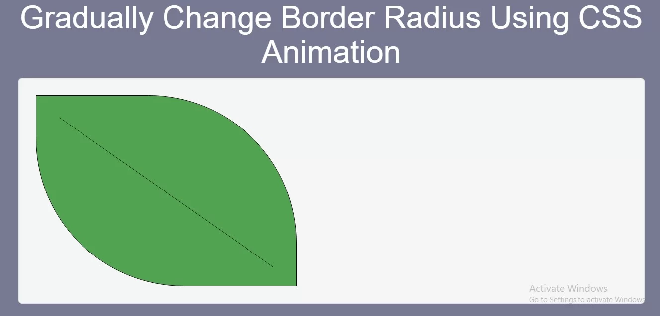
Complete Code For Gradually Change Border Radius Using CSS Animation.
<!DOCTYPE html>
<html>
<head>
    <title>How To Gradually Change Border Radius Using CSS Animation</title>
    <meta name="viewport" content="width=device-width, initial-scale=1.0">
    <link rel="stylesheet" href="https://maxcdn.bootstrapcdn.com/bootstrap/3.3.6/css/bootstrap.min.css"/>
    <link rel="stylesheet" href="https://cdnjs.cloudflare.com/ajax/libs/font-awesome/4.7.0/css/font-awesome.min.css">

</head>

<style>
    * {
        box-sizing: border-box;
    }

    body {

        background-color: #777891;

    }

    #myDIV {
        width: 300px;
        height: 220px;
        border: 1px solid black;
        animation: mymove 20s infinite;
        background: #51A351;
    }

    #myDIV2 {
        width: 300px;
        /* height: 100px; */
        top: 300px;
        position: absolute;
        border-bottom: 1px solid black;
        animation: mymove 5s infinite;
        background: #51A351;
        transform: rotate(35deg);
    }

    @keyframes mymove {
        50% {
            border-bottom-left-radius: 200px;
            border-top-right-radius: 200px;
        }
    }
</style>

<body>
<br/><br/>
<div class="container">
    <br>
    <div class="text-center">
        <h1 id="color" style="color: white;">Gradually Change Border Radius Using CSS Animation</h1>
    </div>
    <div class="well">
        <div id="myDIV"></div>
        <div id="myDIV2"></div>
    </div>
</div>
</body>
</html>