
 Posted By
Bajarangi soft ,
Posted On 01-10-2020
Posted By
Bajarangi soft ,
Posted On 01-10-2020
1.Navbar Example-1
<!DOCTYPE html>
<html lang="en">
<head>
<title>Bootstrap Example</title>
<meta charset="utf-8">
<meta name="viewport" content="width=device-width, initial-scale=1">
<link rel="stylesheet" href="https://maxcdn.bootstrapcdn.com/bootstrap/4.5.2/css/bootstrap.min.css">
<script src="https://ajax.googleapis.com/ajax/libs/jquery/3.5.1/jquery.min.js"></script>
<script src="https://cdnjs.cloudflare.com/ajax/libs/popper.js/1.16.0/umd/popper.min.js"></script>
<script src="https://maxcdn.bootstrapcdn.com/bootstrap/4.5.2/js/bootstrap.min.js"></script>
</head>
<body style="height:1500px">
<div class="container-fluid">
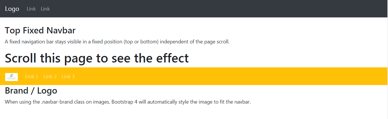
<nav class="navbar navbar-expand-sm bg-dark navbar-dark fixed-top">
<a class="navbar-brand" href="#">Logo</a>
<ul class="navbar-nav">
<li class="nav-item">
<a class="nav-link" href="#">Link</a>
</li>
<li class="nav-item">
<a class="nav-link" href="#">Link</a>
</li>
</ul>
</nav>
</div>
<div class="container-fluid" style="margin-top:80px">
<h3>Top Fixed Navbar</h3>
<p>A fixed navigation bar stays visible in a fixed position (top or bottom) independent of the page scroll.</p>
<h1>Scroll this page to see the effect</h1>
</div>
</body>
</html>
<!DOCTYPE html>
<html lang="en">
<head>
    <title>Bootstrap Example</title>
    <meta charset="utf-8">
    <meta name="viewport" content="width=device-width, initial-scale=1">
    <link rel="stylesheet" href="https://maxcdn.bootstrapcdn.com/bootstrap/4.5.2/css/bootstrap.min.css">
    <script src="https://ajax.googleapis.com/ajax/libs/jquery/3.5.1/jquery.min.js"></script>
    <script src="https://cdnjs.cloudflare.com/ajax/libs/popper.js/1.16.0/umd/popper.min.js"></script>
    <script src="https://maxcdn.bootstrapcdn.com/bootstrap/4.5.2/js/bootstrap.min.js"></script>
</head>
<body>

<nav class="navbar navbar-expand-sm bg-warning navbar-dark">
    <!-- Brand/logo -->
    <a class="navbar-brand" href="#">
        <img src="logo.jpg" alt="logo" style="width:40px;">
    </a>

    <!-- Links -->
    <ul class="navbar-nav">
        <li class="nav-item">
            <a class="nav-link" href="#">Link 1</a>
        </li>
        <li class="nav-item">
            <a class="nav-link" href="#">Link 2</a>
        </li>
        <li class="nav-item">
            <a class="nav-link" href="#">Link 3</a>
        </li>
    </ul>
</nav>

<div class="container-fluid">
    <h3>Brand / Logo</h3>
    <p>When using the .navbar-brand class on images, Bootstrap 4 will automatically style the image to fit the navbar.</p>
</div>

</body>
</html>