
 Posted By
Bajarangi soft ,
Posted On 10-10-2020
Posted By
Bajarangi soft ,
Posted On 10-10-2020
There are basically two ways by which you can align items to the center which are as follows:
<!DOCTYPE html>
<html>

<head>
    <title>Align nav bar item into center</title>
    <link rel="stylesheet" href="https://stackpath.bootstrapcdn.com/bootstrap/4.3.1/css/bootstrap.min.css" integrity="sha384-ggOyR0iXCbMQv3Xipma34MD+dH/1fQ784/j6cY/iJTQUOhcWr7x9JvoRxT2MZw1T" crossorigin="anonymous" />
    <link rel="stylesheet" type="text/css" href="https://stackpath.bootstrapcdn.com/font-awesome/4.7.0/css/font-awesome.min.css" />
    <link rel="stylesheet" href="https://cdnjs.cloudflare.com/ajax/libs/font-awesome/4.7.0/css/font-awesome.min.css" />
    <style>
        .navbar-nav.navbar-center {
            position: absolute;
            left: 50%;
            transform: translatex(-50%);
        }
    </style>
</head>

<body><br>
<!--NAVBAR STARTING-->
<nav class="navbar navbar-expand-sm navbar-light bg-light">
    <div class="container">
        <a class="navbar-brand text-success" href="#">
         BAJARANGI SOFT
        </a>
        <button class="navbar-toggler" type="button"
                data-toggle="collapse"
                data-target="#navbarSupportedContent"
                aria-controls="navbarSupportedContent"
                aria-expanded="false"
                aria-label="Toggle navigation">
            <span class="navbar-toggler-icon"></span>
        </button>

        <div class="collapse navbar-collapse"
             id="navbarSupportedContent">
            <ul class=" nav navbar-nav navbar-center">
                <li class="nav-item active">
                    <a class="nav-link"
                       href="#">
                        Home
                        <span class="sr-only">
                     (current)
                  </span>
                    </a>
                </li>
                <li class="nav-item">
                    <a class="nav-link"
                       href="#">
                        About
                    </a>
                </li>
                <li class="nav-item">
                    <a class="nav-link"
                       href="#">
                        About
                    </a>
                </li>
            </ul>
        </div>
    </div>
</nav>
</body>

</html>
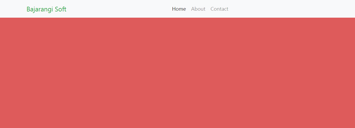
<!DOCTYPE html>
<html>

<head>
    <title>Align nav bar item into center</title>
    <link rel="stylesheet" href="https://stackpath.bootstrapcdn.com/bootstrap/4.3.1/css/bootstrap.min.css" integrity="sha384-ggOyR0iXCbMQv3Xipma34MD+dH/1fQ784/j6cY/iJTQUOhcWr7x9JvoRxT2MZw1T" crossorigin="anonymous" />
    <link rel="stylesheet" type="text/css" href="https://stackpath.bootstrapcdn.com/font-awesome/4.7.0/css/font-awesome.min.css" />
    <link rel="stylesheet" href="https://cdnjs.cloudflare.com/ajax/libs/font-awesome/4.7.0/css/font-awesome.min.css" />

</head>

<body style="background-color: #de5b5b">

<nav class="navbar navbar-expand-sm navbar-light bg-light">
    <div class="container">
        <a class="navbar-brand text-success" href="#">
          Bajarangi Soft
        </a>
        <button class="navbar-toggler" type="button"
                data-toggle="collapse"
                data-target="#navbarSupportedContent"
                aria-controls="navbarSupportedContent"
                aria-expanded="false"
                aria-label="Toggle navigation">
            <span class="navbar-toggler-icon"></span>
        </button>

        <div class="collapse navbar-collapse"></div>

        <div class="collapse navbar-collapse"
             id="navbarSupportedContent">
            <ul class="navbar-nav mr-auto">
                <li class="nav-item active">
                    <a class="nav-link"
                       href="#">
                        Home
                        <span class="sr-only">
                     (current)
                  </span>
                    </a>
                </li>
                <li class="nav-item">
                    <a class="nav-link"
                       href="#">
                        About
                    </a>
                </li>
                <li class="nav-item">
                    <a class="nav-link"
                       href="#">
                        Contact
                    </a>
                </li>
            </ul>
        </div>
    </div>
</nav>
</body>

</html>