
 Posted By
Bajarangi soft ,
Posted On 01-10-2020
Posted By
Bajarangi soft ,
Posted On 01-10-2020
1.Basic Css Media Query
<!DOCTYPE html>
<html>
<head>
<meta name="viewport" content="width=device-width, initial-scale=1.0">
<style>
.wrapper {overflow: auto;}
#main {margin-left: 4px;}
#leftsidebar {
float: none;
width: auto;
}
#menulist {
margin: 0;
padding: 0;
}
.menuitem {
background: #CDF0F6;
border: 1px solid #d4d4d4;
border-radius: 4px;
list-style-type: none;
margin: 4px;
padding: 2px;
}
@media screen and (min-width: 480px) {
#leftsidebar {width: 200px; float: left;}
#main {margin-left: 216px;}
}
</style>
</head>
<body>
<div class="wrapper">
<div id="leftsidebar">
<ul id="menulist">
<li class="menuitem">Menu-item 1</li>
<li class="menuitem">Menu-item 2</li>
<li class="menuitem">Menu-item 3</li>
<li class="menuitem">Menu-item 4</li>
<li class="menuitem">Menu-item 5</li>
</ul>
</div>
<div id="main">
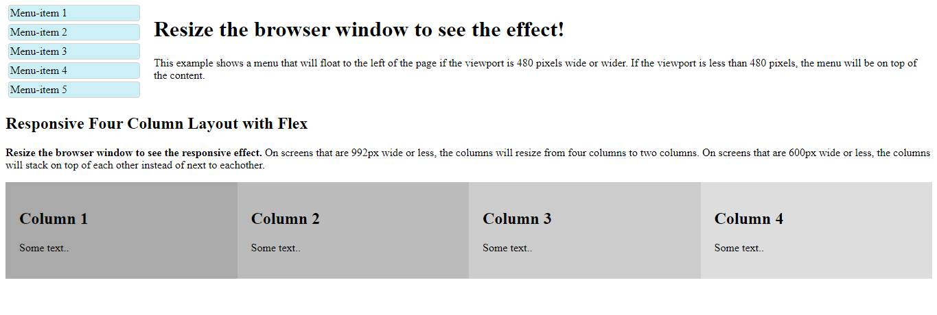
<h1>Resize the browser window to see the effect!</h1>
<p>This example shows a menu that will float to the left of the page if the viewport is 480 pixels wide or wider. If the viewport is less than 480 pixels, the menu will be on top of the content.</p>
</div>
</div>
</body>
</html>
<!DOCTYPE html>
<html>
<head>
    <meta name="viewport" content="width=device-width, initial-scale=1">
    <style>
        * {
            box-sizing: border-box;
        }

        /* Container for flexboxes */
        .row {
            display: flex;
            flex-wrap: wrap;
        }

        /* Create four equal columns */
        .column {
            flex: 25%;
            padding: 20px;
        }

        /* On screens that are 992px wide or less, go from four columns to two columns */
        @media screen and (max-width: 992px) {
            .column {
                flex: 50%;
            }
        }

        /* On screens that are 600px wide or less, make the columns stack on top of each other instead of next to each other */
        @media screen and (max-width: 600px) {
            .row {
                flex-direction: column;
            }
        }
    </style>
</head>
<body>

<h2>Responsive Four Column Layout with Flex</h2>
<p><strong>Resize the browser window to see the responsive effect.</strong> On screens that are 992px wide or less, the columns will resize from four columns to two columns. On screens that are 600px wide or less, the columns will stack on top of each other instead of next to eachother.</p>

<div class="row">
    <div class="column" style="background-color:#aaa;">
        <h2>Column 1</h2>
        <p>Some text..</p>
    </div>

    <div class="column" style="background-color:#bbb;">
        <h2>Column 2</h2>
        <p>Some text..</p>
    </div>

    <div class="column" style="background-color:#ccc;">
        <h2>Column 3</h2>
        <p>Some text..</p>
    </div>

    <div class="column" style="background-color:#ddd;">
        <h2>Column 4</h2>
        <p>Some text..</p>
    </div>
</div>

</body>
</html>
<!DOCTYPE html>
<html>
<head>
    <meta name="viewport" content="width=device-width, initial-scale=1">
    <style>
        @media screen and (max-width: 900px) and (min-width: 600px) {
            div.example {
                font-size: 50px;
                padding: 50px;
                border: 8px solid black;
                background: yellow;
            }
        }
    </style>
</head>
<body>

<h2>Change the appearance of DIV on different screen sizes</h2>

<div class="example">Example DIV.</div>

<p>When the browser's width is between 600 and 900px, change the appearance of DIV.
    <strong>Resize the browser window to see the effect</strong>.</p>

</body>
</html>