
 Posted By
Bajarangi soft ,
Posted On 01-10-2020
Posted By
Bajarangi soft ,
Posted On 01-10-2020
The window.matchMedia() method returns a MediaQueryList object representing the results of the specified CSS media query string. The value of the matchMedia() method can be any of the media features of the CSS @media rule, like min-height, min-width, orientation, etc.
Example(1)
<script>
    function adjust_window(x) {
        if (x.matches) { // If media query matches
            document.body.style.backgroundColor = "green";
        } else {
            document.body.style.backgroundColor = "lightblue";
        }
    }

    var x = window.matchMedia("(max-width: 700px)")
    adjust_window(x) // Call listener function at run time
    x.addListener(adjust_window) // Attach listener function on state changes
</script>
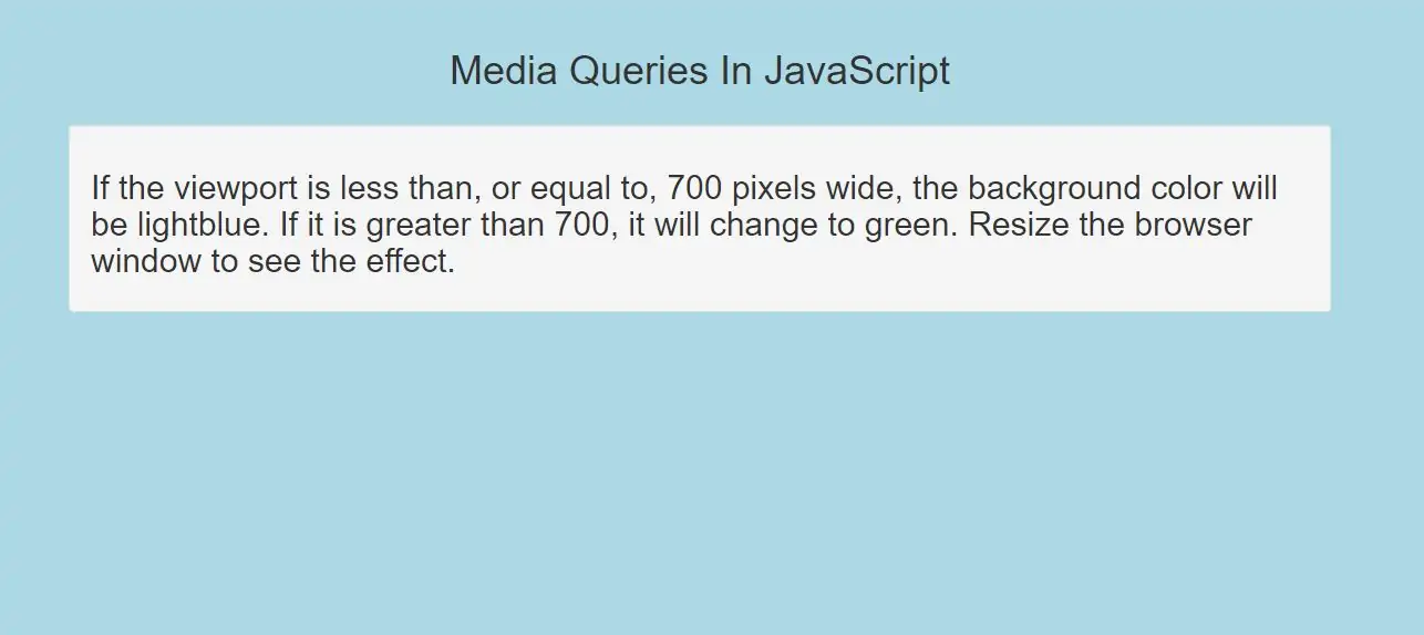
Complete Code For Create Media Queries In JavaScript
<!DOCTYPE html>
<html>
<head>
    <title>Media Queries In JavaScript</title>
    <meta charset="utf-8">
    <meta name="viewport" content="width=device-width, initial-scale=1">
    <link rel="stylesheet" href="https://maxcdn.bootstrapcdn.com/bootstrap/3.4.1/css/bootstrap.min.css">
</head>
<body>
<div class="container">
    <br>
    <br>
    <div class="text-center">
        <h1>Media Queries In JavaScript</h1>
    </div>
    <br>
    <div class="well">
        <h2 id="demo1">If the viewport is less than, or equal to, 700 pixels wide, the background color will be
            lightblue. If it is greater than 700, it will change to green.
            Resize the browser window to see the effect.</h2>
    </div>
</body>
</html>

<script>
    function adjust_window(x) {
        if (x.matches) { // If media query matches
            document.body.style.backgroundColor = "green";
        } else {
            document.body.style.backgroundColor = "lightblue";
        }
    }

    var x = window.matchMedia("(max-width: 700px)")
    adjust_window(x) // Call listener function at run time
    x.addListener(adjust_window) // Attach listener function on state changes
</script>