
 Posted By
Bajarangi soft ,
Posted On 07-11-2020
Posted By
Bajarangi soft ,
Posted On 07-11-2020
Syntax For Media Query
@media not|only mediatype and (expressions) {
CSS-Code;
}
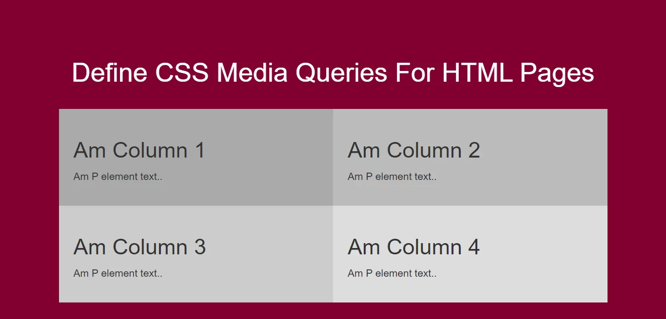
<!DOCTYPE html>
<html>
<head>
    <title>How Can I Define CSS Media Queries For HTML Pages</title>
    <meta name="viewport" content="width=device-width, initial-scale=1.0">
    <link rel="stylesheet" href="https://maxcdn.bootstrapcdn.com/bootstrap/3.3.6/css/bootstrap.min.css"/>
</head>

<style>
    body {
        background-color: #800033;
    }
    * {
        box-sizing: border-box;
    }

    /* Create four equal columns that floats next to each other */
    .column {
        float: left;
        width: 25%;
        padding: 20px;
    }

    /* Clear floats after the columns */
    .row:after {
        content: "";
        display: table;
        clear: both;
    }

    /* On screens that are 992px wide or less, go from four columns to two columns */
    @media screen and (max-width: 992px) {
        .column {
            width: 50%;
        }
    }

    /* On screens that are 600px wide or less, make the columns stack on top of each other instead of next to each other */
    @media screen and (max-width: 600px) {
        .column {
            width: 100%;
        }
    }
</style>

<body>
<br/><br/>
<div class="container">
    <br>
    <div class="text-center">
        <h1 id="color" style="color: white;">Define CSS Media Queries For HTML Pages</h1>
    </div>
    <br>
    <div class="row">
        <div class="column" style="background-color:#aaa;">
            <h2>Am Column 1</h2>
            <p>Am P element text..</p>
        </div>

        <div class="column" style="background-color:#bbb;">
            <h2>Am Column 2</h2>
            <p>Am P element text..</p>
        </div>

        <div class="column" style="background-color:#ccc;">
            <h2>Am Column 3</h2>
            <p>Am P element text..</p>
        </div>

        <div class="column" style="background-color:#ddd;">
            <h2>Am Column 4</h2>
            <p>Am P element text..</p>
        </div>
    </div>
</div>
</body>
</html>