
 Posted By
Bajarangi soft ,
Posted On 07-11-2020
Posted By
Bajarangi soft ,
Posted On 07-11-2020
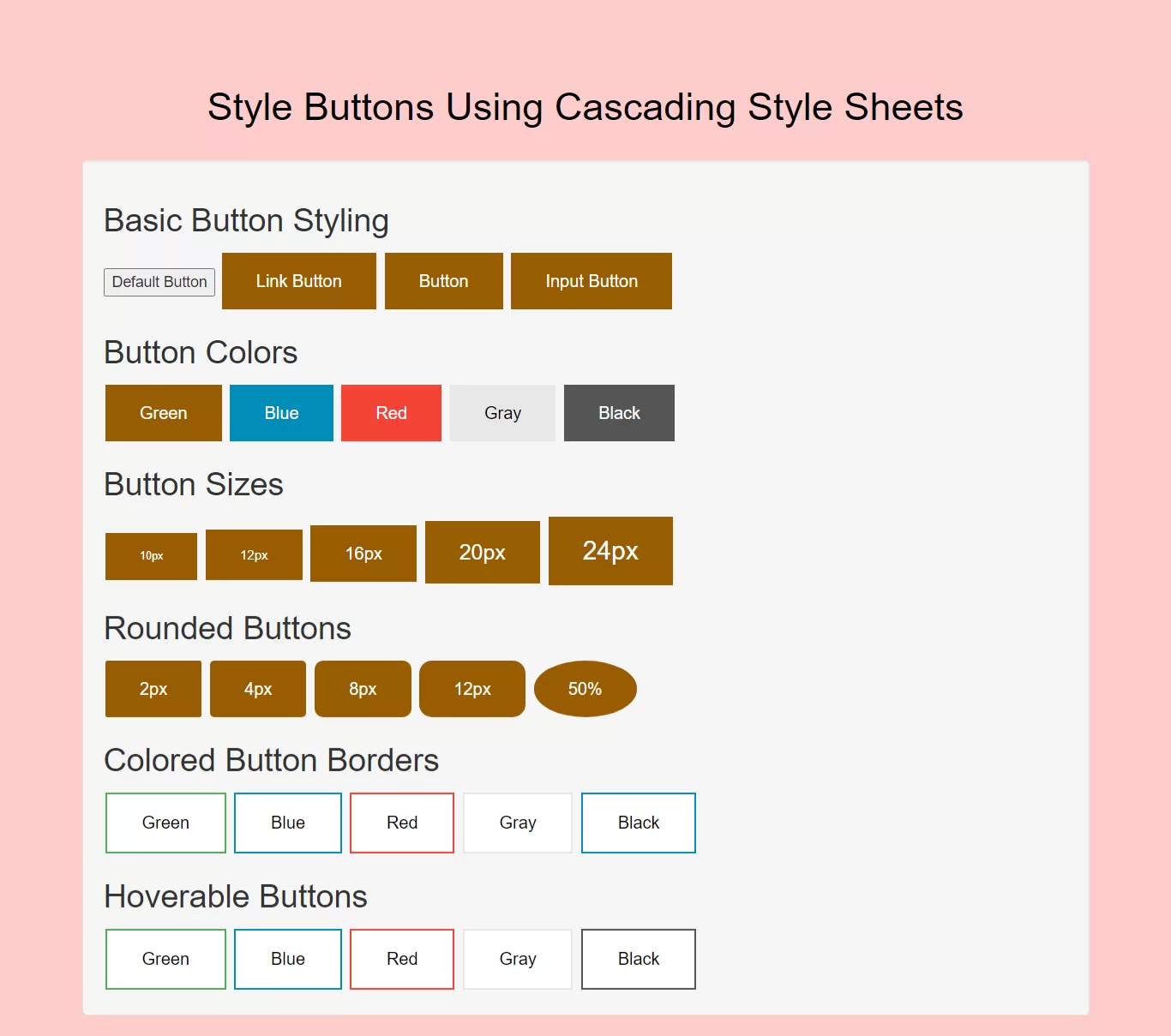
Complete Code For Creating Style Buttons Using Cascading Style Sheets.
<!DOCTYPE html>
<html>
<head>
    <title>How To Create Style Buttons Using Cascading Style Sheets</title>
    <meta name="viewport" content="width=device-width, initial-scale=1.0">
    <link rel="stylesheet" href="https://maxcdn.bootstrapcdn.com/bootstrap/3.3.6/css/bootstrap.min.css"/>
</head>

<style>
    body{
        background: #ffcccc;
    }
    .button {
        background-color: #995c00;
        border: none;
        color: white;
        padding: 15px 32px;
        text-align: center;
        text-decoration: none;
        display: inline-block;
        font-size: 16px;
        margin: 4px 2px;
        cursor: pointer;
    }
    .button2 {background-color: #008CBA;} /* Blue */
    .button3 {background-color: #f44336;} /* Red */
    .button4 {background-color: #e7e7e7; color: black;} /* Gray */
    .button5 {background-color: #555555;} /* Black */

    /*buttonsize*/
    .button11 {font-size: 10px;}
    .button22 {font-size: 12px;}
    .button33 {font-size: 16px;}
    .button44 {font-size: 20px;}
    .button55 {font-size: 24px;}

    /*rounded button*/
    .button111 {border-radius: 2px;}
    .button222 {border-radius: 4px;}
    .button333 {border-radius: 8px;}
    .button444 {border-radius: 12px;}
    .button555 {border-radius: 50%;}
    /*border button*/
    .button12 {
        background-color: white;
        color: black;
        border: 2px solid #4CAF50;
    }

    .button2222 {
        background-color: white;
        color: black;
        border: 2px solid #008CBA;
    }

    .button32 {
        background-color: white;
        color: black;
        border: 2px solid #f44336;
    }

    .button42 {
        background-color: white;
        color: black;
        border: 2px solid #e7e7e7;
    }

    .button52 {
        background-color: white;
        color: black;
        border: 2px solid #555555;
    }
    /*hover*/

    .button51 {
        background-color: white;
        color: black;
        border: 2px solid #4CAF50;
    }

    .button51:hover {
        background-color: #4CAF50;
        color: white;
    }

    .button52 {
        background-color: white;
        color: black;
        border: 2px solid #008CBA;
    }

    .button52:hover {
        background-color: #008CBA;
        color: white;
    }

    .button53 {
        background-color: white;
        color: black;
        border: 2px solid #f44336;
    }

    .button53:hover {
        background-color: #f44336;
        color: white;
    }

    .button54 {
        background-color: white;
        color: black;
        border: 2px solid #e7e7e7;
    }

    .button54:hover {background-color: #e7e7e7;}

    .button5555 {
        background-color: white;
        color: black;
        border: 2px solid #555555;
    }

    .button5555:hover {
        background-color: #555555;
        color: white;
    }
</style>

<body>
<br/><br/>
<div class="container">
    <br>
    <div class="text-center">
        <h1 id="color" style="color: black;">Style Buttons Using Cascading Style Sheets</h1>
    </div>
    <br>
    <div class="well">
       <div>
           <h2>Basic Button Styling</h2>
           <button>Default Button</button>
           <a href="#" class="button">Link Button</a>
           <button class="button">Button</button>
           <input type="button" class="button" value="Input Button">
       </div>

       <div>
           <h2>Button Colors</h2>
           <button class="button">Green</button>
           <button class="button button2">Blue</button>
           <button class="button button3">Red</button>
           <button class="button button4">Gray</button>
           <button class="button button5">Black</button>
       </div>
        <div>

            <h2>Button Sizes</h2>
            <button class="button button11">10px</button>
            <button class="button button22">12px</button>
            <button class="button button33">16px</button>
            <button class="button button44">20px</button>
            <button class="button button55">24px</button>
        </div>
        <div>
            <h2>Rounded Buttons</h2>
            <button class="button button111">2px</button>
            <button class="button button222">4px</button>
            <button class="button button333">8px</button>
            <button class="button button444">12px</button>
            <button class="button button555">50%</button>
        </div>
        <div>
            <h2>Colored Button Borders</h2>

            <button class="button button12">Green</button>
            <button class="button button2222">Blue</button>
            <button class="button button32">Red</button>
            <button class="button button42">Gray</button>
            <button class="button button52">Black</button>
        </div>
        <div>
            <h2>Hoverable Buttons</h2>
            <button class="button button51">Green</button>
            <button class="button button52">Blue</button>
            <button class="button button53">Red</button>
            <button class="button button54">Gray</button>
            <button class="button button5555">Black</button>
        </div>

</div>
</body>
</html>