
 Posted By
Bajarangi soft ,
Posted On 07-11-2020
Posted By
Bajarangi soft ,
Posted On 07-11-2020
Complete Code For Using Flex Direction Property With HTML Div.
<!DOCTYPE html>
<html>
<head>
<title>How Do I Use Flex Direction Property With HTML Div</title>
<meta name="viewport" content="width=device-width, initial-scale=1.0">
<link rel="stylesheet" href="https://maxcdn.bootstrapcdn.com/bootstrap/3.3.6/css/bootstrap.min.css"/>
</head>
<style>
body {
background-color: #dfbf9f;
}
/*column*/
.flex-container1 {
display: flex;
flex-direction: column;
background-color: #bf8040;
}
.flex-container1 > div {
background-color: #f1f1f1;
width: 100px;
margin: 10px;
text-align: center;
line-height: 75px;
font-size: 30px;
}
/*column-reverse*/
.flex-container2 {
display: flex;
flex-direction: column-reverse;
background-color: #bf8040;
}
.flex-container2 > div {
background-color: #f1f1f1;
width: 100px;
margin: 10px;
text-align: center;
line-height: 75px;
font-size: 30px;
}
/*row*/
.flex-container3 {
display: flex;
flex-direction: row;
background-color: #bf8040;
}
.flex-container3 > div {
background-color: #f1f1f1;
width: 100px;
margin: 10px;
text-align: center;
line-height: 75px;
font-size: 30px;
}
/*row-reverse*/
.flex-container4 {
display: flex;
flex-direction: row-reverse;
background-color: #bf8040;
}
.flex-container4 > div {
background-color: #f1f1f1;
width: 100px;
margin: 10px;
text-align: center;
line-height: 75px;
font-size: 30px;
}
</style>
<body>
<br/><br/>
<div class="container">
<br>
<div class="text-center">
<h1 id="color" style="color: black;">Flex Direction Property With HTML Div</h1>
</div>
<br>
<div class="well">
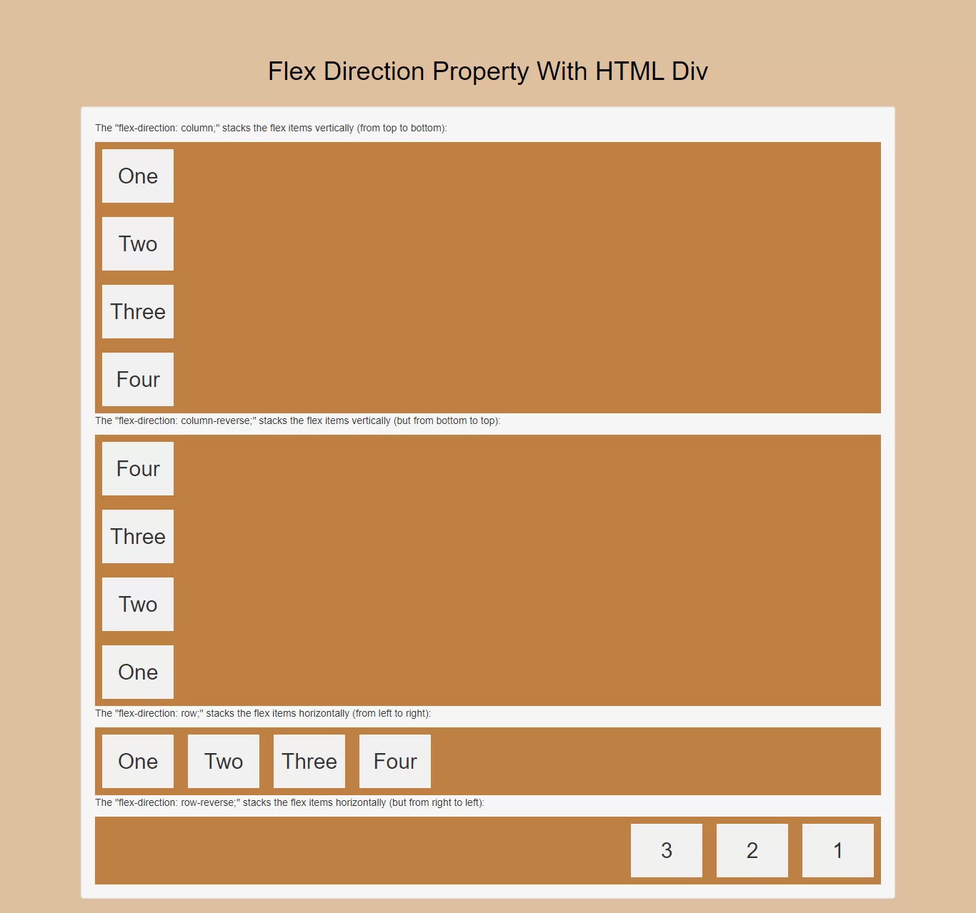
<p>The "flex-direction: column;" stacks the flex items vertically (from top to bottom):</p>
<div class="flex-container1">
<div>One</div>
<div>Two</div>
<div>Three</div>
<div>Four</div>
</div>
<p>The "flex-direction: column-reverse;" stacks the flex items vertically (but from bottom to top):</p>
<div class="flex-container2">
<div>One</div>
<div>Two</div>
<div>Three</div>
<div>Four</div>
</div>
<p>The "flex-direction: row;" stacks the flex items horizontally (from left to right):</p>
<div class="flex-container3">
<div>One</div>
<div>Two</div>
<div>Three</div>
<div>Four</div>
</div>
<p>The "flex-direction: row-reverse;" stacks the flex items horizontally (but from right to left):</p>
<div class="flex-container4">
<div>1</div>
<div>2</div>
<div>3</div>
</div>
</div>
</div>
</body>
</html>