
 Posted By
Bajarangi soft ,
Posted On 10-09-2020
Posted By
Bajarangi soft ,
Posted On 10-09-2020
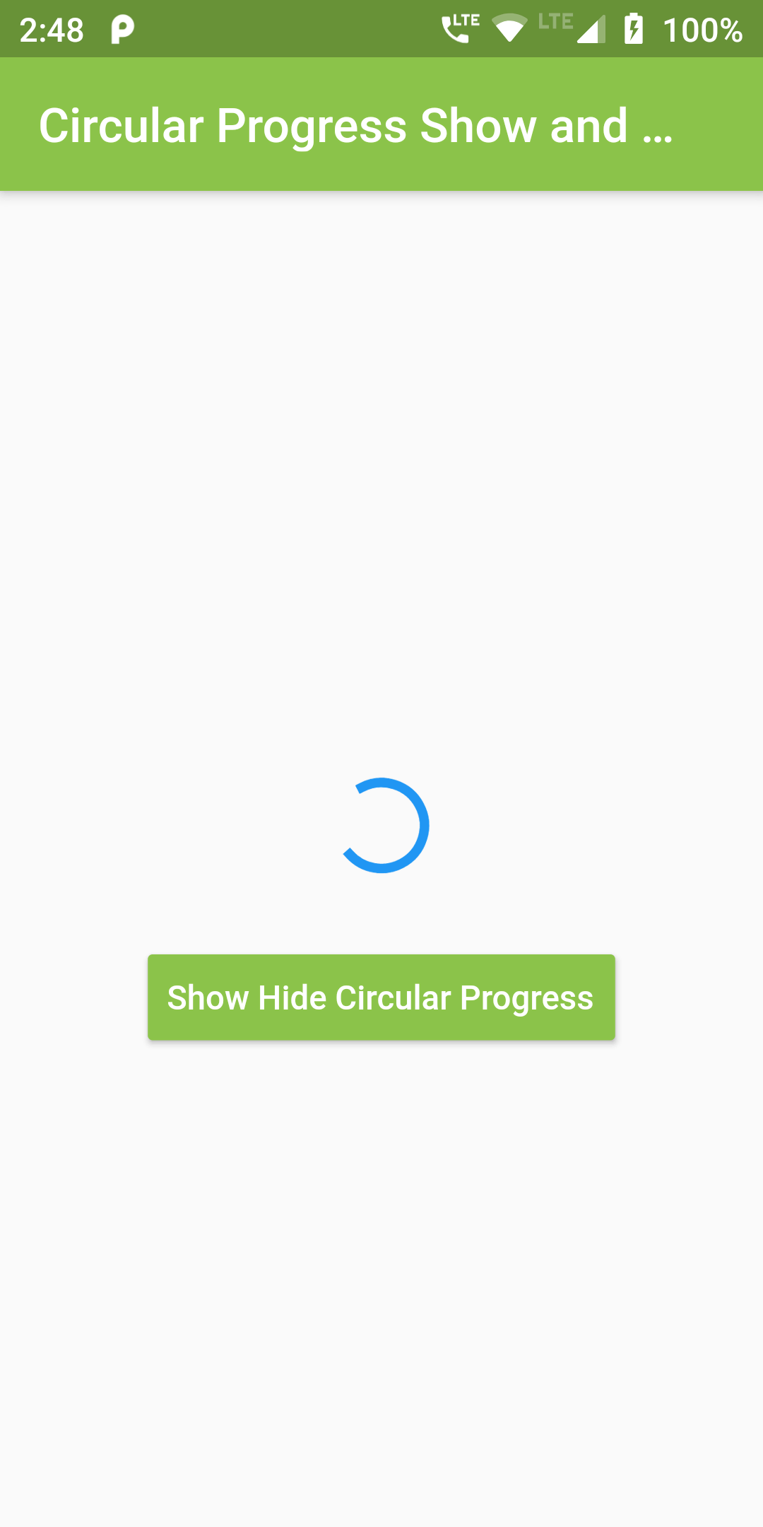
We would use Load Show Hide Circular Progress on Button Click in Flutter iOS Android app.
You Can Add Show Hide Circular Progress Code:
bool visible = true ;

loadProgress(){

  if(visible == true){
    setState(() {
      visible = false;
    });
  }
  else{
    setState(() {
      visible = true;
    });
  }

}
@override
Widget build(BuildContext context) {
  return Scaffold(
      body: Center(
        child: Column(
          mainAxisAlignment: MainAxisAlignment.center,
          children: <Widget>[

            Visibility(
                maintainSize: true,
                maintainAnimation: true,
                maintainState: true,
                visible: visible,
                child: Container(
                    margin: EdgeInsets.only(top: 50, bottom: 30),
                    child: CircularProgressIndicator()
                )
            ),

            RaisedButton(
              onPressed: loadProgress,
              color: Colors.lightGreen,
              textColor: Colors.white,
              padding: EdgeInsets.fromLTRB(8, 8, 8, 8),
              child: Text('Show Hide Circular Progress'),
            ),

          ],
        ),
      ));
}
import 'package:flutter/material.dart';

void main() => runApp(MyApp());

class MyApp extends StatelessWidget {
  @override
  Widget build(BuildContext context) {
    return MaterialApp(
      debugShowCheckedModeBanner: false,
        home: Scaffold(
            appBar: AppBar(
              centerTitle: true,
                backgroundColor: Colors.lightGreen,
                title: Text('Circular Progress Show and Hide')),
            body: Center(
                child: CircularProgress()
            )
        )
    );
  }
}

class CircularProgress extends StatefulWidget {

  CircularProgressWidget createState() => CircularProgressWidget();

}

class CircularProgressWidget extends State {

  bool visible = true ;

  loadProgress(){

    if(visible == true){
      setState(() {
        visible = false;
      });
    }
    else{
      setState(() {
        visible = true;
      });
    }

  }

  @override
  Widget build(BuildContext context) {
    return Scaffold(
        body: Center(
          child: Column(
            mainAxisAlignment: MainAxisAlignment.center,
            children: <Widget>[

              Visibility(
                  maintainSize: true,
                  maintainAnimation: true,
                  maintainState: true,
                  visible: visible,
                  child: Container(
                      margin: EdgeInsets.only(top: 50, bottom: 30),
                      child: CircularProgressIndicator()
                  )
              ),

              RaisedButton(
                onPressed: loadProgress,
                color: Colors.lightGreen,
                textColor: Colors.white,
                padding: EdgeInsets.fromLTRB(8, 8, 8, 8),
                child: Text('Show Hide Circular Progress'),
              ),

            ],
          ),
        ));
  }
}