Using .pull-left and .pull-right classes
These classes help to float the elements:
<!DOCTYPE html>
<html>

<head>
    <title>Bootstrap Floating utility class</title>

    <!-- Include Bootstrap CSS -->
    <link rel="stylesheet" href="https://stackpath.bootstrapcdn.com/bootstrap/3.0.0/css/bootstrap.min.css">
</head>

<body>
<div class="container">
    <h1 style="color:#ea5021">
        Bajarangi Soft
    </h1>
    <b>Bootstrap Floating utility class</b>
    <br>

    <div class="pull-left">
        This div floats to the left.
    </div>
    <br>
    <div class="pull-right">
        This div floats to the right.
    </div>
    <br>
</div>
</body>

</html>
<!DOCTYPE html>
<html>

<head>
    <title>
        Bootstrap 4 Floating utility class
    </title>

    <!-- Include Bootstrap CSS -->
    <link rel="stylesheet"
          href=
                  "https://stackpath.bootstrapcdn.com/bootstrap/4.3.1/css/bootstrap.min.css">
</head>

<body>

<div class="container">
    <h1 style="color:#e3150f">
      Bajarangi Soft
    </h1>
    <b>Bootstrap 4 Floating utility class</b>
    <br>

    <div class="float-left">
        This div floats to the left.
    </div>
    <br>
    <div class="float-right">
        This div floats to the right.
    </div>
    <br>
    <div class="float-none">
        This div does not float.
    </div>
</div>
</body>

</html>
These classes will work on all viewport sizes unless specified using their responsive versions.
Responsive floating based on viewport sizes
The responsive variations of the base classes can be used to apply the floating only on specified viewport sizes. There are four viewport size variations available to be used.
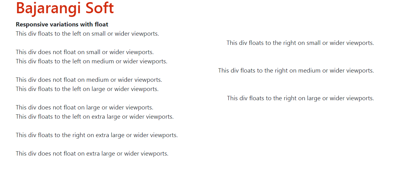
<!DOCTYPE html>
<html>

<head>
    <title>Responsive variations with float</title>
    <!-- Include Bootstrap CSS -->
    <link rel="stylesheet" href="https://stackpath.bootstrapcdn.com/bootstrap/4.3.1/css/bootstrap.min.css">
</head>

<body>

<div class="container">
    <h1 style="color:#d22b0e">Bajarangi Soft</h1>
    <b>Responsive variations with float</b>
    <br>

    <div class="float-sm-left">
        This div floats to the left on small or wider viewports.
    </div>
    <br>
    <div class="float-sm-right">
        This div floats to the right on small or wider viewports.
    </div>
    <br>
    <div class="float-sm-none">
        This div does not float on small or wider viewports.
    </div>

    <div class="float-md-left">
        This div floats to the left on medium or wider viewports.
    </div>
    <br>
    <div class="float-md-right">
        This div floats to the right on medium or wider viewports.
    </div>
    <br>
    <div class="float-md-none">
        This div does not float on medium or wider viewports.
    </div>

    <div class="float-lg-left">
        This div floats to the left on large or wider viewports.
    </div>
    <br>
    <div class="float-lg-right">
        This div floats to the right on large or wider viewports.
    </div>
    <br>
    <div class="float-lg-none">
        This div does not float on large or wider viewports.
    </div>

    <div class="float-xl-left">
        This div floats to the left on extra large or wider viewports.
    </div>
    <br>
    <div class="float-xl-right">
        This div floats to the right on extra large or wider viewports.
    </div>
    <br>
    <div class="float-xl-none">
        This div does not float on extra large or wider viewports.
    </div>
</div>
</body>

</html>