
 Posted By
Bajarangi soft ,
Posted On 12-10-2020
Posted By
Bajarangi soft ,
Posted On 12-10-2020
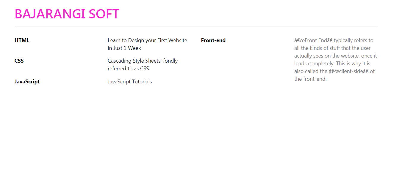
This example uses Bootstrap to create four columns where the first two columns represent the labels and its content and the last two columns represent the labels and its content.
Example:
<!DOCTYPE html>
<html>

<head>
    <title>
        How to use Bootstrap to align labels
        with content into 4 columns ?
    </title>

    <link rel="stylesheet" href=
            "https://stackpath.bootstrapcdn.com/bootstrap/4.3.1/css/bootstrap.min.css">
    <link rel="stylesheet" type="text/css" href=
            "https://stackpath.bootstrapcdn.com/font-awesome/4.7.0/css/font-awesome.min.css">

    <style>
        form {
            margin-top: 30px;
            margin-bottom: 30px;
            padding-bottom: 25px;
        }
        .form-area {
            margin-top: 30px;
        }
        label {
            display: block;
            color: #000000;
            font-weight: bold;
        }
    </style>
</head>

<body><br>
<div class="container">
<h1 style="color:#f328d2">BAJARANGI SOFT</h1>
<hr>

<form>

    <div class="row">
        <div class="col">

            <div class="row">
                <div class="col">
                    <label>HTML</label>
                </div>
                <div class="col">
                    <p>
                        Learn to Design your First
                        Website in Just 1 Week
                    </p>
                </div>
            </div>

            <div class="row">
                <div class="col">
                    <label>CSS</label>
                </div>
                <div class="col">
                    <p>
                        Cascading Style Sheets, fondly
                        referred to as CSS
                    </p>
                </div>
            </div>

            <div class="row">
                <div class="col">
                    <label>JavaScript</label>
                </div>
                <div class="col">
                    <p>JavaScript Tutorials</p>
                </div>
            </div>

        </div>

        <div class="col">
            <div class="row">
                <div class="col">
                    <label>Front-end</label>
                </div>
                <div class="col">
                    <p style="font-weight: italic; color: grey">
                        “Front End” typically refers to all the
                        kinds of stuff that the user actually sees
                        on the website, once it loads completely.
                        This is why it is also called the “client-side”
                        of the front-end.
                    </p>
                </div>
            </div>
        </div>
    </div>
</form>
</div>
</body>

</html>