
 Posted By
Bajarangi soft ,
Posted On 12-10-2020
Posted By
Bajarangi soft ,
Posted On 12-10-2020
Flipping(toggling) of content requires to connect with the href attribute, or a button with the data-target property. In both cases, the data-toggle=”collapse” is required.
Syntax:
Link with the href attribute.
<a data-toggle="collapse" href="#collapseExample" ...>
    <!--Write your link name -->
</a>
<button class="btn btn-primary" type="button"
        data-toggle="collapse"
        data-target="#collapseExample" ...>
    <!--Write your button name-->
</button>
<div class="collapse" id="collapseExample">
    <div class="card card-body">
        <h5 class="card-title"><!--Write title name--></h5>
        <!--Write content here -->
    </div>
</div>
<!doctype html>
<html lang="en">

<head>
    <!-- Required meta tags -->
    <meta charset="utf-8">
    <meta name="viewport" content="width=device-width,
         initial-scale=1, shrink-to-fit=no">

    <!-- Bootstrap CSS -->
    <link rel="stylesheet" href=
            "https://stackpath.bootstrapcdn.com/bootstrap/4.5.0/css/bootstrap.min.css"
          integrity=
                  "sha384-9aIt2nRpC12Uk9gS9baDl411NQApFmC26EwAOH8WgZl5MYYxFfc+NcPb1dKGj7Sk"
          crossorigin="anonymous">

    <!-- Optional JavaScript -->
    <!-- jQuery first, then Popper.js,
        then Bootstrap JS -->
    <script src="https://code.jquery.com/jquery-3.5.1.slim.min.js"
            integrity=
                    "sha384-DfXdz2htPH0lsSSs5nCTpuj/zy4C+OGpamoFVy38MVBnE+IbbVYUew+OrCXaRkfj"
            crossorigin="anonymous">
    </script>

    <script src=
                    "https://cdn.jsdelivr.net/npm/popper.js@1.16.0/dist/umd/popper.min.js"
            integrity=
                    "sha384-Q6E9RHvbIyZFJoft+2mJbHaEWldlvI9IOYy5n3zV9zzTtmI3UksdQRVvoxMfooAo"
            crossorigin="anonymous">
    </script>

    <script src=
                    "https://stackpath.bootstrapcdn.com/bootstrap/4.5.0/js/bootstrap.min.js"
            integrity=
                    "sha384-OgVRvuATP1z7JjHLkuOU7Xw704+h835Lr+6QL9UvYjZE3Ipu6Tp75j7Bh/kR0JKI"
            crossorigin="anonymous">
    </script>

    <title>
        How to automatically close all
        collapsible elements inside of
        the accordion when closing the
        accordion?
    </title>
</head>

<body>
<center>
    <h4><a class="text-danger"
           style="text-decoration: none;" href="#">
       BAJARANGI SOFT
    </a>
    </h4><br>

    <a class="text-danger" data-toggle="collapse"
       href="#collapseExample" aria-expanded="false"
       aria-controls="collapseExample">
        Connect with href
    </a>
    <br /><br />

    <button class="btn btn-danger" type="button"
            data-toggle="collapse"
            data-target="#collapseExample"
            aria-expanded="false"
            aria-controls="collapseExample">
        Button with data-target
    </button>

    <div class="collapse" id="collapseExample">
        <div class="card card-body">
            <h5 class="card-title">
                Basic Example
            </h5>


            <p>
                Collapse plugin provides a quick
                way of revealing and hiding content.
                It toggle the visibility of content
                across your program project with a
                few classes and Bootstrap4
                JavaScript plugins.
            </p>

        </div>
    </div>
</center>
</body>

</html>
<!doctype html>
<html lang="en">

<head>
    <!-- Required meta tags -->
    <meta charset="utf-8">
    <meta name="viewport" content="width=device-width,initial-scale=1, shrink-to-fit=no">
    <!-- Bootstrap CSS -->
    <link rel="stylesheet" href="https://stackpath.bootstrapcdn.com/bootstrap/4.5.0/css/bootstrap.min.css" integrity="sha384-9aIt2nRpC12Uk9gS9baDl411NQApFmC26EwAOH8WgZl5MYYxFfc+NcPb1dKGj7Sk" crossorigin="anonymous">

    <!-- Optional JavaScript -->
    <!-- jQuery first, then Popper.js,
        then Bootstrap JS -->
    <script src="https://code.jquery.com/jquery-3.5.1.slim.min.js" integrity="sha384-DfXdz2htPH0lsSSs5nCTpuj/zy4C+OGpamoFVy38MVBnE+IbbVYUew+OrCXaRkfj" crossorigin="anonymous"></script>

    <script src="https://cdn.jsdelivr.net/npm/popper.js@1.16.0/dist/umd/popper.min.js" integrity="sha384-Q6E9RHvbIyZFJoft+2mJbHaEWldlvI9IOYy5n3zV9zzTtmI3UksdQRVvoxMfooAo" crossorigin="anonymous"></script>

    <script src="https://stackpath.bootstrapcdn.com/bootstrap/4.5.0/js/bootstrap.min.js" integrity="sha384-OgVRvuATP1z7JjHLkuOU7Xw704+h835Lr+6QL9UvYjZE3Ipu6Tp75j7Bh/kR0JKI" crossorigin="anonymous"></script>

    <title>Multiple Collapse</title>
</head>

<body>
<center>
    <h4><a class="text-danger"
           style="text-decoration: none;" href="#">
    BAJARANGI SOFT
    </a>
    </h4><br>

    <a class="text-danger" data-toggle="collapse"
       href="#multiCollapseExample1"
       aria-expanded="false"
       aria-controls="multiCollapseExample1">
        Flip first card
    </a>

    <button class="btn btn-danger" type="button"
            data-toggle="collapse"
            data-target="#multiCollapseExample2"
            aria-expanded="false"
            aria-controls="multiCollapseExample2">
        Flip second card
    </button>

    <button class="btn btn-danger" type="button"
            data-toggle="collapse"
            data-target=".multi-collapse"
            aria-expanded="false"
            aria-controls="multiCollapseExample1
            multiCollapseExample2">
        Flip third card
    </button>

    <div class="row">
        <div class="col">
            <div class="collapse multi-collapse"
                 id="multiCollapseExample1">
                <div class="card card-body text-success">
                    <h5 class="card-title">
                        Multiple collapse
                    </h5>
                    Collapse plugin provides a quick
                    way of revealing and hiding content.
                    It toggle the visibility of content
                    across your program project with a
                    few classes and Bootstrap4 JavaScript
                    plugins.
                </div>
            </div>
        </div>
        <div class="col">
            <div class="collapse multi-collapse"
                 id="multiCollapseExample2">
                <div class="card card-body text-success">
                    <h5 class="card-title">
                        Multiple collapse
                    </h5>
                    Collapse plugin provides a quick way
                    of revealing and hiding content.
                    It toggle the visibility of content
                    across your program project with a
                    few classes and Bootstrap4 JavaScript
                    plugins.
                </div>
            </div>
        </div>
    </div>
</center>
</body>

</html>
<!doctype html>
<html lang="en">

<head>
    <!-- Required meta tags -->
    <meta charset="utf-8">
    <meta name="viewport" content="width=device-width,
         initial-scale=1, shrink-to-fit=no">

    <!-- Bootstrap CSS -->
    <link rel="stylesheet" href=
            "https://stackpath.bootstrapcdn.com/bootstrap/4.5.0/css/bootstrap.min.css"
          integrity=
                  "sha384-9aIt2nRpC12Uk9gS9baDl411NQApFmC26EwAOH8WgZl5MYYxFfc+NcPb1dKGj7Sk"
          crossorigin="anonymous">

    <!-- Optional JavaScript -->
    <!-- jQuery first, then Popper.js,
        then Bootstrap JS -->
    <script src="https://code.jquery.com/jquery-3.5.1.slim.min.js"
            integrity=
                    "sha384-DfXdz2htPH0lsSSs5nCTpuj/zy4C+OGpamoFVy38MVBnE+IbbVYUew+OrCXaRkfj"
            crossorigin="anonymous">
    </script>

    <script src=
                    "https://cdn.jsdelivr.net/npm/popper.js@1.16.0/dist/umd/popper.min.js"
            integrity=
                    "sha384-Q6E9RHvbIyZFJoft+2mJbHaEWldlvI9IOYy5n3zV9zzTtmI3UksdQRVvoxMfooAo"
            crossorigin="anonymous">
    </script>

    <script src=
                    "https://stackpath.bootstrapcdn.com/bootstrap/4.5.0/js/bootstrap.min.js"
            integrity=
                    "sha384-OgVRvuATP1z7JjHLkuOU7Xw704+h835Lr+6QL9UvYjZE3Ipu6Tp75j7Bh/kR0JKI"
            crossorigin="anonymous">
    </script>

    <title>Accordion</title>
</head>

<body>
<center>
    <h4><a class="text-danger"
           style="text-decoration: none;" href="#">
   BAJARANGI SOFT
    </a>
    </h4><br>

    <div id="accordion">
        <div class="card">
            <div class="card-header text-white
               mb-3 bg-danger" id="headingOne">
                <h5 class="mb-0">
                    <button class="btn btn-danger"
                            data-toggle="collapse"
                            data-target="#collapseOne"
                            aria-expanded="true"
                            aria-controls="collapseOne">
                        #1MyCollapsible
                    </button>
                </h5>
            </div>
            <div id="collapseOne" class="collapse show"
                 aria-labelledby="headingOne"
                 data-parent="#accordion">

                <div class="card-body">
                    <b>
                        Collapse plugin provides a
                        quick way of revealing and
                        hiding content. It toggle
                        the visibility of content
                        across your program project
                        with a few classes and
                        Bootstrap4 JavaScript plugins.
                        Using the card component, you
                        can extend the default collapse
                        behavior to create an
                        accordion.
                    </b>
                </div>
            </div>
        </div>
        <div class="card">
            <div class="card-header text-white
               mb-3 bg-danger" id="headingTwo">
                <h5 class="mb-0">
                    <button class="btn btn-danger collapsed"
                            data-toggle="collapse"
                            data-target="#collapseTwo"
                            aria-expanded="false"
                            aria-controls="collapseTwo">
                        #2MyCollapsible
                    </button>
                </h5>
            </div>
            <div id="collapseTwo" class="collapse"
                 aria-labelledby="headingTwo"
                 data-parent="#accordion">

                <div class="card-body">
                    <b>
                        Collapse plugin provides a quick
                        way of revealing and hiding content.
                        It toggle the visibility of content
                        across your program project with a
                        few classes and Bootstrap4 JavaScript
                        plugins. Using the card component,
                        you can extend the default collapse
                        behavior to create an accordion.
                    </b>
                </div>
            </div>
        </div>
        <div class="card">
            <div class="card-header text-white
               mb-3 bg-danger" id="headingThree">
                <h5 class="mb-0">
                    <button class="btn btn-danger collapsed"
                            data-toggle="collapse"
                            data-target="#collapseThree"
                            aria-expanded="false"
                            aria-controls="collapseThree">
                        #3MyCollapsible
                    </button>
                </h5>
            </div>
            <div id="collapseThree" class="collapse"
                 aria-labelledby="headingThree"
                 data-parent="#accordion">

                <div class="card-body">
                    <b>
                        Collapse plugin provides a quick
                        way of revealing and hiding content.
                        It toggle the visibility of content
                        across your program project with a
                        few classes and Bootstrap4 JavaScript
                        plugins. Using the card component,
                        you can extend the default collapse
                        behavior to create an accordion.
                    </b>
                </div>
            </div>
        </div>
    </div>
</center>
</body>

</html>
<!doctype html>
<html lang="en">
<head>
<!-- Required meta tags -->
<meta charset="utf-8">
<meta name="viewport" content="width=device-width, initial-scale=1, shrink-to-fit=no">
<!-- Bootstrap CSS -->
<link rel="stylesheet" href="https://stackpath.bootstrapcdn.com/bootstrap/4.5.0/css/bootstrap.min.css" integrity="sha384-9aIt2nRpC12Uk9gS9baDl411NQApFmC26EwAOH8WgZl5MYYxFfc+NcPb1dKGj7Sk" crossorigin="anonymous">
<!-- Optional JavaScript -->
<!-- jQuery first, then Popper.js,
then Bootstrap JS -->
<script src="https://code.jquery.com/jquery-3.5.1.slim.min.js" integrity="sha384-DfXdz2htPH0lsSSs5nCTpuj/zy4C+OGpamoFVy38MVBnE+IbbVYUew+OrCXaRkfj" crossorigin="anonymous"></script>
<script src="https://cdn.jsdelivr.net/npm/popper.js@1.16.0/dist/umd/popper.min.js" integrity="sha384-Q6E9RHvbIyZFJoft+2mJbHaEWldlvI9IOYy5n3zV9zzTtmI3UksdQRVvoxMfooAo" crossorigin="anonymous"></script>
<script src="https://stackpath.bootstrapcdn.com/bootstrap/4.5.0/js/bootstrap.min.js" integrity="sha384-OgVRvuATP1z7JjHLkuOU7Xw704+h835Lr+6QL9UvYjZE3Ipu6Tp75j7Bh/kR0JKI" crossorigin="anonymous"></script>
<title>Accordion</title>
</head>
<body>
<center>
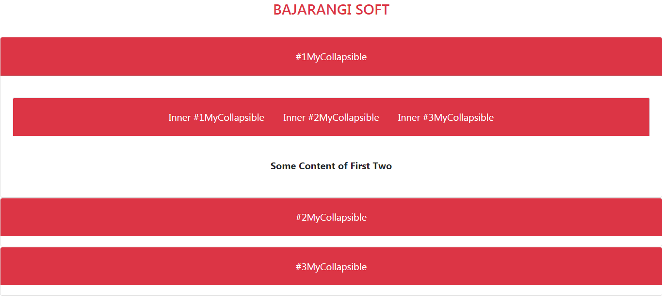
<h4><a class="text-danger"
style="text-decoration: none;" href="#">
BAJARANGI SOFT
</a>
</h4><br>
<div id="accordion">
<div class="card">
<div class="card-header text-white
mb-3 bg-danger" id="headingOne">
<h5 class="mb-0">
<button class="btn btn-danger"
data-toggle="collapse"
data-target="#collapseOne"
aria-expanded="true"
aria-controls="collapseOne">
#1MyCollapsible
</button>
</h5>
</div>
<div id="collapseOne"
class="main collapse show"
aria-labelledby="headingOne"
data-parent="#accordion">
<div class="card-body">
<div id="accordionRecommendation">
<div class="card-header border
text-white mb-3 bg-danger"
id="headingRecommendation">
<h5 class="mb-0">
<button class=
"btn btn-danger collapsed"
data-toggle="collapse"
data-target="#collapseOne1"
aria-expanded="false"
aria-controls="collapseOne1">
Inner #1MyCollapsible
</button>
<button class="btn btn-danger
collapsed" data-toggle="collapse"
data-target="#collapseTwo1"
aria-expanded="false"
aria-controls="collapseTwo1">
Inner #2MyCollapsible
</button>
<button class="btn btn-danger
collapsed" data-toggle="collapse"
data-target="#collapseThree1"
aria-expanded="false"
aria-controls="collapseThree1">
Inner #3MyCollapsible
</button>
</h5>
</div>
<div class="karte">
<div id="collapseOne1" class="collapse"
aria-labelledby="headingRecommendation"
data-parent="#accordionRecommendation">
<div class="card-body">
<b>Some Content of First One</b>
</div>
</div>
</div>
<div class="karte">
<div id="collapseTwo1" class="collapse"
aria-labelledby="headingRecommendation"
data-parent="#accordionRecommendation">
<div class="card-body">
<b>Some Content of First Two</b>
</div>
</div>
</div>
<div class="karte">
<div id="collapseThree1" class="collapse"
aria-labelledby="headingRecommendation"
data-parent="#accordionRecommendation">
<div class="card-body">
<b>Some Content of First Three</b>
</div>
</div>
</div>
</div>
</div>
</div>
</div>
<div class="card">
<div class="card-header text-white mb-3
bg-danger" id="headingTwo">
<h5 class="mb-0">
<button class="btn btn-danger collapsed"
data-toggle="collapse"
data-target="#collapseTwo"
aria-expanded="false"
aria-controls="collapseTwo">
#2MyCollapsible
</button>
</h5>
</div>
<div id="collapseTwo" class="collapse"
aria-labelledby="headingTwo"
data-parent="#accordion">
<div class="card-body">
Collapse plugin provides a quick
way of revealing and hiding content.
It toggle the visibility of content
across your program project with a
few classes and Bootstrap4 JavaScript
plugins. Using the card component,
you can extend the default collapse
behavior to create an accordion.
</div>
</div>
</div>
<div class="card">
<div class="card-header text-white
mb-3 bg-danger" id="headingThree">
<h5 class="mb-0">
<button class="btn btn-danger
collapsed" data-toggle="collapse"
data-target="#collapseThree"
aria-expanded="false"
aria-controls="collapseThree">
#3MyCollapsible
</button>
</h5>
</div>
<div id="collapseThree" class="collapse"
aria-labelledby="headingThree"
data-parent="#accordion">
<div class="card-body">
Collapse plugin provides a quick
way of revealing and hiding content.
It toggle the visibility of content
across your program project with a
few classes and Bootstrap4 JavaScript
plugins. Using the card component,
you can extend the default collapse
behavior to create an accordion.
</div>
</div>
</div>
</div>
</center>
</body>
</html>