
 Posted By
Bajarangi soft ,
Posted On 05-10-2020
Posted By
Bajarangi soft ,
Posted On 05-10-2020
Step 1: Create index.html file and implement below code in it.
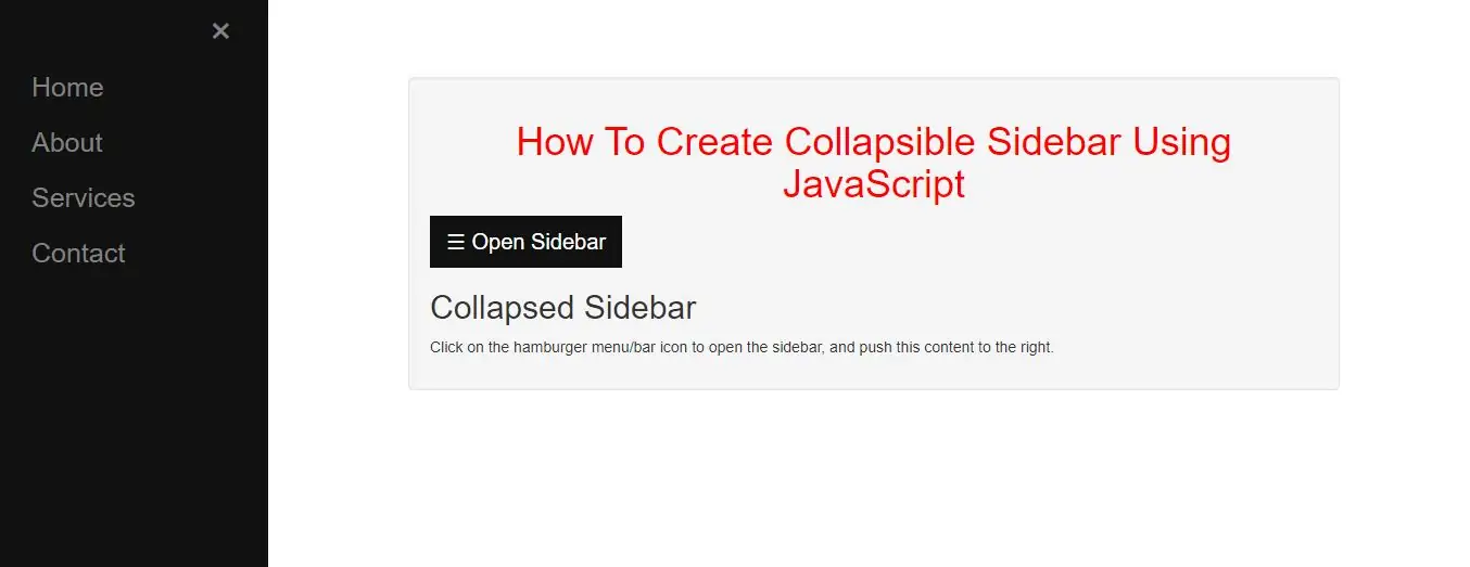
<div id="Sidebar" class="sidebar">
    <a href="javascript:void(0)" class="closebtn" onclick="closeNav()">×</a>
    <a href="#">Home</a>
    <a href="#">About </a>
    <a href="#">Services</a>
    <a href="#">Contact</a>
</div>

<div id="main">
   <div class="well">
       <button class="openbtn" onclick="openNav()">☰ Open Sidebar</button>
       <h2>Collapsed Sidebar</h2>
       <p>Click on the hamburger menu/bar icon to open the sidebar, and push this content to the right.</p>
   </div>
</div>
Step 2:Now we create css code to display side menu bar so implement below code in index.html file.
<style>
    body {
        font-family: "Lato", sans-serif;
    }

    .sidebar {
        height: 100%;
        width: 0;
        position: fixed;
        z-index: 1;
        top: 0;
        left: 0;
        background-color: #111;
        overflow-x: hidden;
        transition: 0.5s;
        padding-top: 60px;
    }

    .sidebar a {
        padding: 8px 8px 8px 32px;
        text-decoration: none;
        font-size: 25px;
        color: #818181;
        display: block;
        transition: 0.3s;
    }

    .sidebar a:hover {
        color: #f1f1f1;
    }

    .sidebar .closebtn {
        position: absolute;
        top: 0;
        right: 25px;
        font-size: 36px;
        margin-left: 50px;
    }

    .openbtn {
        font-size: 20px;
        cursor: pointer;
        background-color: #111;
        color: white;
        padding: 10px 15px;
        border: none;
    }

    .openbtn:hover {
        background-color: #444;
    }

    #main {
        transition: margin-left .5s;
        padding: 16px;
    }

    /* On smaller screens, where height is less than 450px, change the style of the sidenav (less padding and a smaller font size) */
    @media screen and (max-height: 450px) {
        .sidebar {padding-top: 15px;}
        .sidebar a {font-size: 18px;}
    }
</style>
Step 3:Now we implement javascript to open sidebar .
<script>
    function openNav() {
        document.getElementById("Sidebar").style.width = "250px";
        document.getElementById("main").style.marginLeft = "250px";
    }

    function closeNav() {
        document.getElementById("Sidebar").style.width = "0";
        document.getElementById("main").style.marginLeft= "0";
    }
</script>
Complete Code For Creating Collapsible Sidebar Using JavaScript.
<!DOCTYPE html>
<html>
<head>
    <title>How To Create Collapsible Sidebar Using JavaScript</title>
    <meta charset="utf-8">
    <meta name="viewport" content="width=device-width, initial-scale=1">
    <link rel="stylesheet" href="https://maxcdn.bootstrapcdn.com/bootstrap/3.4.1/css/bootstrap.min.css">
</head>
<style>
    h1 {
        color: red;
        text-align: center;
    }
</style>
<style>
    body {
        font-family: "Lato", sans-serif;
    }

    .sidebar {
        height: 100%;
        width: 0;
        position: fixed;
        z-index: 1;
        top: 0;
        left: 0;
        background-color: #111;
        overflow-x: hidden;
        transition: 0.5s;
        padding-top: 60px;
    }

    .sidebar a {
        padding: 8px 8px 8px 32px;
        text-decoration: none;
        font-size: 25px;
        color: #818181;
        display: block;
        transition: 0.3s;
    }

    .sidebar a:hover {
        color: #f1f1f1;
    }

    .sidebar .closebtn {
        position: absolute;
        top: 0;
        right: 25px;
        font-size: 36px;
        margin-left: 50px;
    }

    .openbtn {
        font-size: 20px;
        cursor: pointer;
        background-color: #111;
        color: white;
        padding: 10px 15px;
        border: none;
    }

    .openbtn:hover {
        background-color: #444;
    }

    #main {
        transition: margin-left .5s;
        padding: 16px;
    }

    /* On smaller screens, where height is less than 450px, change the style of the sidenav (less padding and a smaller font size) */
    @media screen and (max-height: 450px) {
        .sidebar {
            padding-top: 15px;
        }

        .sidebar a {
            font-size: 18px;
        }
    }
</style>

<body>
<div class="container">
    <br>
    <br>
    <br>

    <div id="Sidebar" class="sidebar">
        <a href="javascript:void(0)" class="closebtn" onclick="closeNav()">×</a>
        <a href="#">Home</a>
        <a href="#">About </a>
        <a href="#">Services</a>
        <a href="#">Contact</a>
    </div>

    <div id="main">
        <div class="well">
            <h1>How To Create Collapsible Sidebar Using JavaScript</h1>
            <button class="openbtn" onclick="openNav()">☰ Open Sidebar</button>
            <h2>Collapsed Sidebar</h2>
            <p>Click on the hamburger menu/bar icon to open the sidebar, and push this content to the right.</p>
        </div>
    </div>

    <script>
        function openNav() {
            document.getElementById("Sidebar").style.width = "250px";
            document.getElementById("main").style.marginLeft = "250px";
        }

        function closeNav() {
            document.getElementById("Sidebar").style.width = "0";
            document.getElementById("main").style.marginLeft = "0";
        }
    </script>
    <div>
</body>
</html>