
 Posted By
Bajarangi soft ,
Posted On 13-10-2020
Posted By
Bajarangi soft ,
Posted On 13-10-2020
Approach: Please refer linear gradient() method to sreate a gradient background and then use webkit properties to overlay that background with our text.
HTML Code: In the following section, the text used for demonstration is wrapped inside h1 tag.
<!DOCTYPE html>
<html lang="en">
<head>
<meta charset="UTF-8">
<meta name="viewport" content=
"width=device-width, initial-scale=1.0">
<title>Gradient Background Animation</title>
</head>
<body>
<section>
<div>
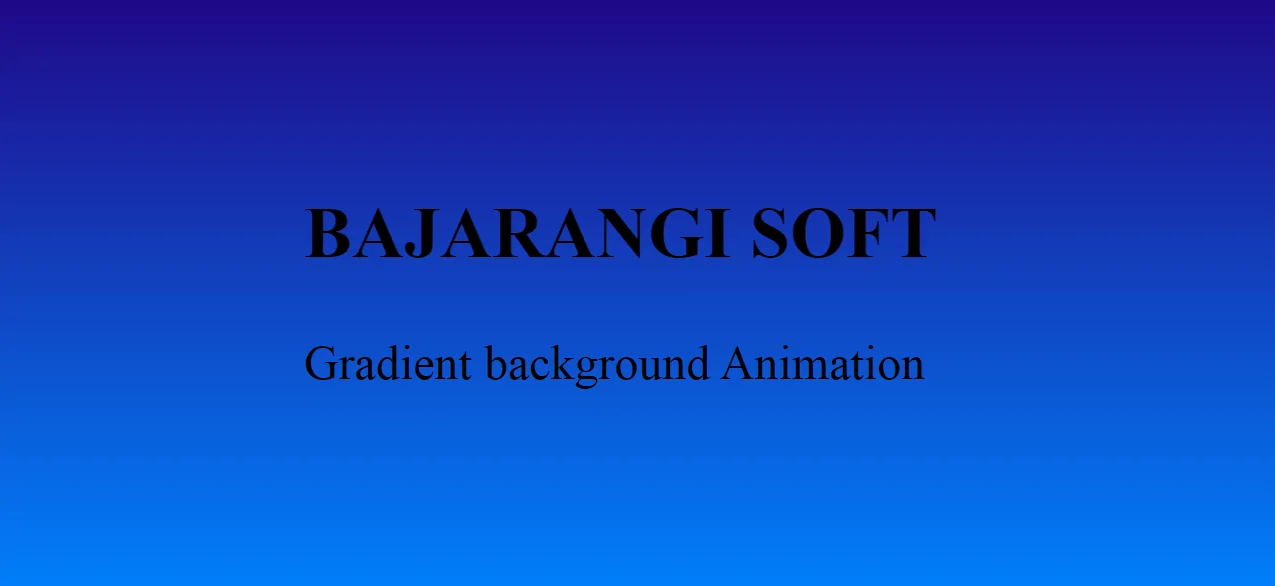
<h2>BAJARANGI SOFT</h2>
<p>Gradient background Animation</p>
</div>
</section>
</body>
</html>
<style>
    body {
        margin: 0;
        padding: 0;
        animation: effect 3s linear infinite;
    }

    section {
        width: 100%;
        height: 100vh;
    }

    div {
        position: absolute;
        top: 50%;
        left: 50%;
        transform: translate(-50%, -50%);
        font-size: 3em;
    }

    h2 {
        text-align: center;
    }

    @keyframes effect {
        0% {
            background: linear-gradient(#008000, #00FF00);
        }

        50% {
            background: linear-gradient(#220080, #0084ff);
        }

        100% {
            background: linear-gradient(#e78f3c, #ff4800);
        }
    }
</style>
<!DOCTYPE html>
<html lang="en">

<head>
    <meta charset="UTF-8">
    <meta name="viewport" content=
            "width=device-width, initial-scale=1.0">
    <title>Gradient Background Animation</title>
</head>
<style>
    body {
        margin: 0;
        padding: 0;
        animation: effect 3s linear infinite;
    }

    section {
        width: 100%;
        height: 100vh;
    }

    div {
        position: absolute;
        top: 50%;
        left: 50%;
        transform: translate(-50%, -50%);
        font-size: 3em;
    }

    h2 {
        text-align: center;
    }

    @keyframes effect {
        0% {
            background: linear-gradient(#008000, #00FF00);
        }

        50% {
            background: linear-gradient(#220080, #0084ff);
        }

        100% {
            background: linear-gradient(#e78f3c, #ff4800);
        }
    }
</style>
<body>
<section>
    <div>
        <h2>BAJARANGI SOFT</h2>
        <p>Gradient background Animation</p>
    </div>
</section>
</body>

</html>