
 Posted By
Bajarangi soft ,
Posted On 30-09-2020
Posted By
Bajarangi soft ,
Posted On 30-09-2020
1.Animation Example-1
<!DOCTYPE html>
<html>
<head>
    <style>
        div {
            width: 100px;
            height: 100px;
            background-color: red;
            position: relative;
            animation-name: example;
            animation-duration: 4s;
            /* here you can add animation-direction:reverse*/
        }

        @keyframes example {
            0%   {background-color:red; left:0px; top:0px;}
            25%  {background-color:yellow; left:200px; top:0px;}
            50%  {background-color:blue; left:200px; top:200px;}
            75%  {background-color:green; left:0px; top:200px;}
            100% {background-color:red; left:0px; top:0px;}
        }
    </style>
</head>
<body>

<p><b>Note:</b> This example does not work in Internet Explorer 9 and earlier versions.</p>

<div></div>

</body>
</html>
<!DOCTYPE html>
<html>
<head>
<style>
div {
width: 100px;
height: 50px;
background-color: red;
font-weight: bold;
position: relative;
animation: mymove 5s infinite;
}
#div1 {animation-timing-function: linear;}
#div2 {animation-timing-function: ease;}
#div3 {animation-timing-function: ease-in;}
#div4 {animation-timing-function: ease-out;}
#div5 {animation-timing-function: ease-in-out;}
@keyframes mymove {
from {left: 0px;}
to {left: 300px;}
}
</style>
</head>
<body>
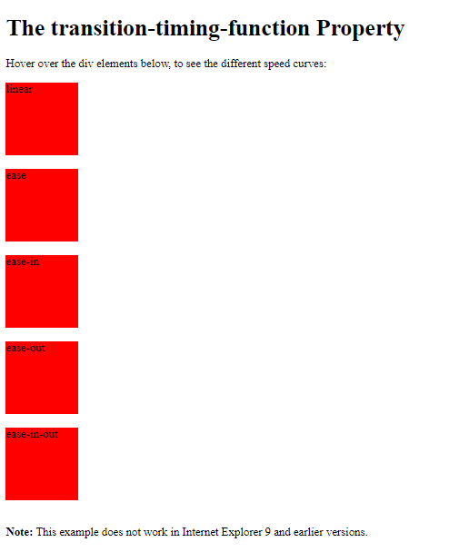
<p><strong>Note:</strong> The animation-timing-funtion property is not supported in Internet Explorer 9 and earlier versions.</p>
<div id="div1">linear</div>
<div id="div2">ease</div>
<div id="div3">ease-in</div>
<div id="div4">ease-out</div>
<div id="div5">ease-in-out</div>
</body>
</html>
<!DOCTYPE html>
<html>
<head>
    <style>
        div {
            width: 100px;
            height: 100px;
            background: red;
            position: relative;
            animation-name: example;
            animation-duration: 3s;
            animation-delay: 2s;
            animation-fill-mode: backwards;
        }

        @keyframes example {
            from {top: 0px; background-color: yellow;}
            to {top: 200px;}
        }
    </style>
</head>
<body>

<p>Let the div element get the style values set by the first keyframe before the animation starts (during the animation-delay period):</p>

<div></div>

<p><strong>Note:</strong> The animation-fill-mode property is not supported in Internet Explorer 9 and earlier versions.</p>

</body>
</html>