
 Posted By
Bajarangi soft ,
Posted On 30-09-2020
Posted By
Bajarangi soft ,
Posted On 30-09-2020
1.2D Transform In Css With Example
<!DOCTYPE html>
<html>
<head>
    <style>
        div {
            width: 300px;
            height: 100px;
            background-color: yellow;
            border: 1px solid black;
        }

        div#myDiv {
            -ms-transform: rotate(20deg); /* IE 9 */
            transform: rotate(20deg); /* Standard syntax */
        }
        div.myDiv{
            -ms-transform: rotate(-20deg);
            transform:rotate(-20deg);
        }
</style>
</head>
<body>
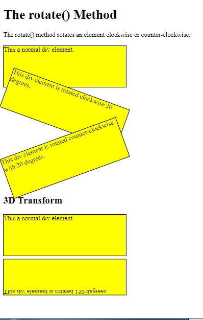
<h1>The rotate() Method</h1>
<p>The rotate() method rotates an element clockwise or counter-clockwise.</p>
<div>
This a normal div element.
</div>
<div id="myDiv">
This div element is rotated clockwise 20 degrees.
</div>
<br>
<div class="myDiv">
This div element is rotated counter-clockwise with 20 degrees.
</div>
</body>
</html>
<!DOCTYPE html>
<html>
<head>
    <style>

.aa{
    width: 300px;
    height: 100px;
    background-color: yellow;
    border: 1px solid black;
}

        #aa{
            transform: rotateX(150deg);
        }


    </style>
</head>
<body>

<h1>The rotate() Method</h1>
<p>The rotate() method rotates an element clockwise or counter-clockwise.</p>
<br>
<h2>3D Transform</h2>

<div class="aa">
    This a normal div element.
</div>

<div id="aa">
    This div element is rotated 150 degrees.
</div>
</body>
</html>