
 Posted By
Bajarangi soft ,
Posted On 03-11-2020
Posted By
Bajarangi soft ,
Posted On 03-11-2020
Step 1:Create index.html file and implement as below code in it.
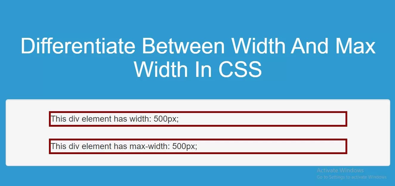
<div class="example1">This div with example1 class element has width: 500px;</div>
<br>
<div class="example2">This div with example2 class element has max-width: 500px;</div>
Step 2:Implement CSS code as below to use width and max width.
<style>
    body {
        background: #2e9ad0;
    }
    .example1 {
        width: 500px;
        margin: auto;
        border: 3px solid darkred;
    }

    .example2 {
        max-width: 500px;
        margin: auto;
        border: 3px solid darkred;
    }
</style>
Complete Code For Differentiate Between Width And Max Width In CSS.
<!DOCTYPE html>
<html>
<head>
    <title>How To Differentiate Between Width And Max Width In CSS</title>
    <meta name="viewport" content="width=device-width, initial-scale=1.0">
    <script src="https://ajax.googleapis.com/ajax/libs/jquery/3.1.0/jquery.min.js"></script>
    <link rel="stylesheet" href="https://maxcdn.bootstrapcdn.com/bootstrap/3.3.6/css/bootstrap.min.css"/>
    <script src="https://maxcdn.bootstrapcdn.com/bootstrap/3.3.7/js/bootstrap.min.js"></script>

</head>
<style>
    body {
        background: #2e9ad0;
    }
    .example1 {
        width: 500px;
        margin: auto;
        border: 3px solid darkred;
    }

    .example2 {
        max-width: 500px;
        margin: auto;
        border: 3px solid darkred;
    }
</style>
<body>
<br/><br/>
<div class="container">
    <br><br><br>
    <div class="text-center">
        <h1 id="color" style="color: white;">Differentiate Between Width And Max Width In CSS</h1>
    </div>
    <br>
    <div class="well">
        <div class="example1">This div with example1 class element has width: 500px;</div>
        <br>
        <div class="example2">This div with example2 class element has max-width: 500px;</div>
    </div>
    <br>
</div>
</body>
</html>