
 Posted By
Bajarangi soft ,
Posted On 06-11-2020
Posted By
Bajarangi soft ,
Posted On 06-11-2020
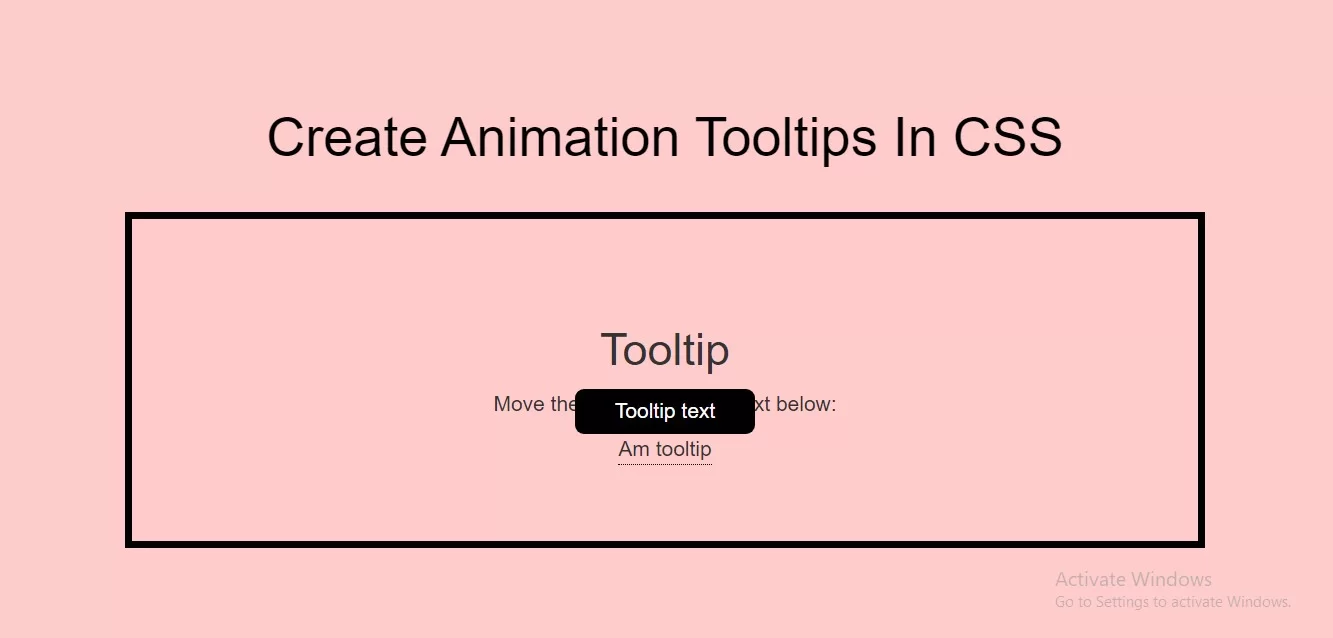
Complete Code For Creating Animation Tooltips In CSS.
<!DOCTYPE html>
<html>
<head>
    <title>How To Create Animation Tooltips In CSS With Example</title>
    <meta name="viewport" content="width=device-width, initial-scale=1.0">
    <link rel="stylesheet" href="https://maxcdn.bootstrapcdn.com/bootstrap/3.3.6/css/bootstrap.min.css"/>
</head>
<style>
    body {
        background: #ffcccc;
    }

    .padding {
        padding: 50px;
        text-align: center;
    }

    .border {
        border: 5px solid black;
    }


    .tooltip_t {
        position: relative;
        display: inline-block;
        border-bottom: 1px dotted black;
    }

    .tooltip_t .tooltiptext {
        visibility: hidden;
        width: 120px;
        background-color: black;
        color: #fff;
        text-align: center;
        border-radius: 6px;
        padding: 5px 0;
        position: absolute;
        z-index: 1;
        bottom: 100%;
        left: 50%;
        margin-left: -60px;

        /* Fade in tooltip - takes 1 second to go from 0% to 100% opac: */
        opacity: 0;
        transition: opacity 1s;
    }


    .tooltip_t:hover .tooltiptext {
        visibility: visible;
        opacity: 1;
    }

</style>
<body>
<br/><br/>
<div class="container">
    <br>
    <div class="text-center">
        <h1 id="color" style="color: black;">Create Animation Tooltips In CSS </h1>
    </div>
    <br>
    <div class="col-md-12 border padding">
            <h2>Tooltip</h2>
            <p>Move the mouse over the text below:</p>

            <div class="tooltip_t">Am tooltip
                <span class="tooltiptext">Tooltip text</span>
            </div>
    </div>
</div>
</body>
</html>