
 Posted By
Bajarangi soft ,
Posted On 06-11-2020
Posted By
Bajarangi soft ,
Posted On 06-11-2020
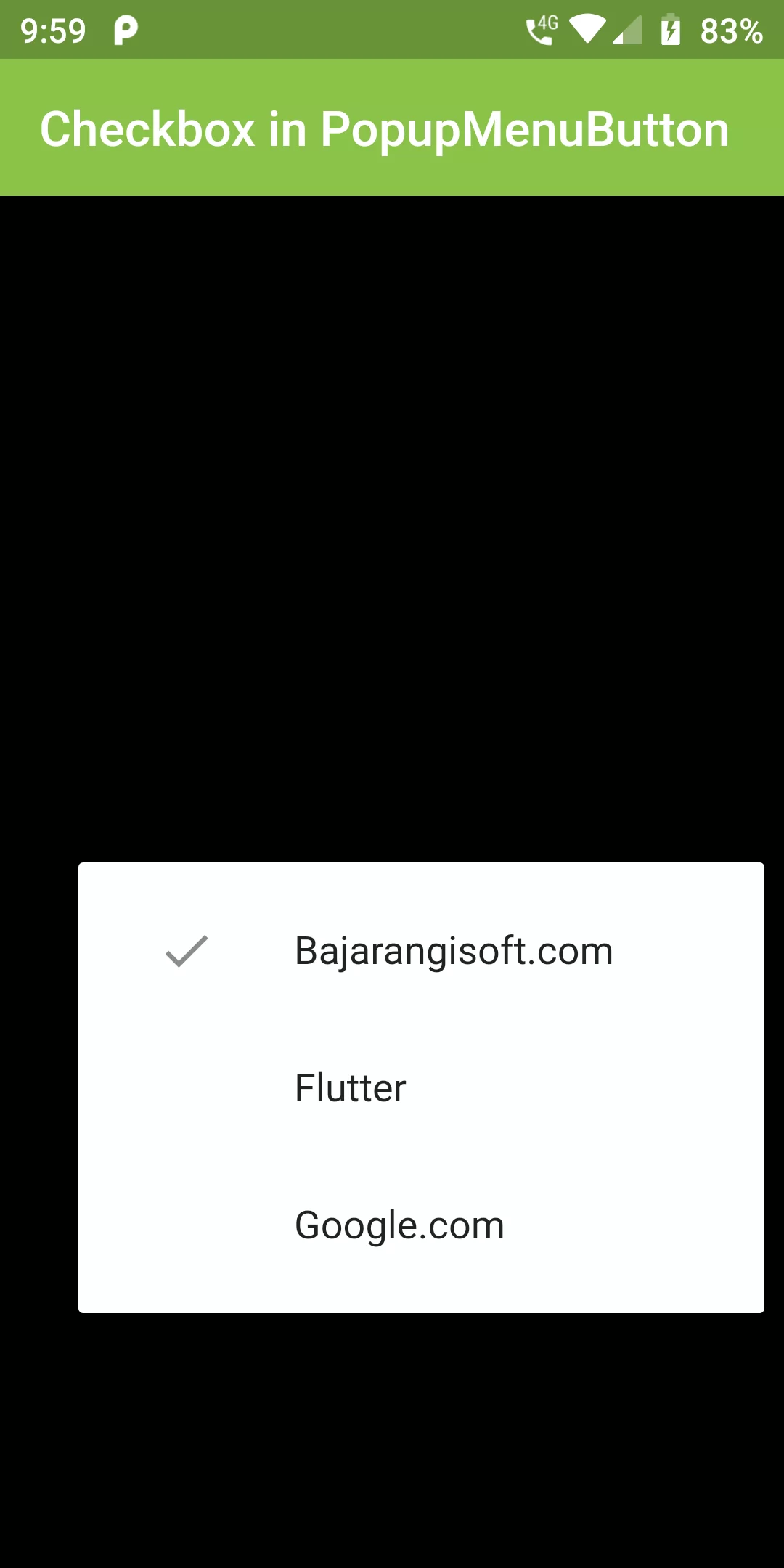
Checkbox PopupMenuBotton
Complete Code For Checkbox PopupMenuBotton In Flutter
main.dart
import 'package:flutter/material.dart';

void main() => runApp(MyApp());

class MyApp extends StatelessWidget {
  @override
  Widget build(BuildContext context) {
    return MaterialApp(
      debugShowCheckedModeBanner: false,
      home: HomeScreen(),
    );
  }
}

class HomeScreen extends StatefulWidget {
  @override
  _HomeScreenState createState() => _HomeScreenState();
}

class _HomeScreenState extends State<HomeScreen> {
  @override
  Widget build(BuildContext context) {
    return Scaffold(
      backgroundColor: Colors.black,
        appBar: AppBar(
          backgroundColor: Colors.lightGreen,
          title: Text("Checkbox in PopupMenuButton"),
        ),
        body: Center(
          child: PopupMenuButton(
            child: Text("Checkbox PopupMenuBotton",style: TextStyle(
              color: Colors.white
            ),),
            itemBuilder: (context) => [
              CheckedPopupMenuItem(
                checked: true,
                child: Text("Bajarangisoft.com"),
              ),
              CheckedPopupMenuItem(
                child: Text("Flutter"),
              ),
              CheckedPopupMenuItem(
                child: Text("Google.com"),
              ),
            ],
          ),
        ));
  }
}