
 Posted By
Bajarangi soft ,
Posted On 08-10-2020
Posted By
Bajarangi soft ,
Posted On 08-10-2020
Method 1: Using pre-defined Bootstrap classes
Bootstrap has pre-defined classes for changing modal dimension attributes to be used with the div element containing .modal-dialog. These are listed below:
<!-- Small Bootstrap Modal Example -->
<!DOCTYPE html>
<html lang="en">
<head>
    <meta charset="utf-8">
    <meta name="viewport" content="width=device-width, initial-scale=1">
    <link rel="stylesheet" href="https://maxcdn.bootstrapcdn.com/bootstrap/3.4.1/css/bootstrap.min.css">
    <script src="https://ajax.googleapis.com/ajax/libs/jquery/3.4.1/jquery.min.js"></script>
    <script src="https://maxcdn.bootstrapcdn.com/bootstrap/3.4.1/js/bootstrap.min.js"></script>
</head>

<body>
<div class="container-fluid">
    <h2>Small Modal</h2>
    <p>Other classes mentioned above are also
        implemented in the same manner.</p>
    <button type="button"
            class="btn btn-success"
            data-toggle="modal"
            data-target="#modal">
        Open Small-modal
    </button>
    <!-- Modal Code -->
    <div class="modal fade"
         id="modal"
         role="dialog">
        <div class="modal-dialog modal-sm">
            <!-- .modal-sm here makes a small modal
Can be replaced with '.modal-md' & '.modal-lg'
-->
            <div class="modal-content">
                <div class="modal-header">
                    <button type="button" class="close" data-dismiss="modal">×</button>
                    <h4 class="modal-title">Bajarangi Soft</h4>
                </div>
                <div class="modal-body">
                    <p>Bajarangi Soft- A computer code  portal</p>
                </div>
                <div class="modal-footer">
                    <button type="button" class="btn btn-default" data-dismiss="modal">Close</button>
                </div>
            </div>
        </div>
    </div>
</div>
</body>
</html>
<!-- Changing CSS properties for the div
containing '.modal-dialog' class -->
<!DOCTYPE html>
<html lang="en">
<head>
<meta charset="utf-8">
<meta name="viewport"
content="width=device-width, initial-scale=1">
<link rel="stylesheet"href="https://maxcdn.bootstrapcdn.com/bootstrap/3.4.1/css/bootstrap.min.css">
<script src= "https://ajax.googleapis.com/ajax/libs/jquery/3.4.1/jquery.min.js"> </script>
<script src= "https://maxcdn.bootstrapcdn.com/bootstrap/3.4.1/js/bootstrap.min.js"> </script>
<style>
.custom {
width: 600px;
min-height: 400px;
}
</style>
</head>
<body>
<div class="container-fluid">
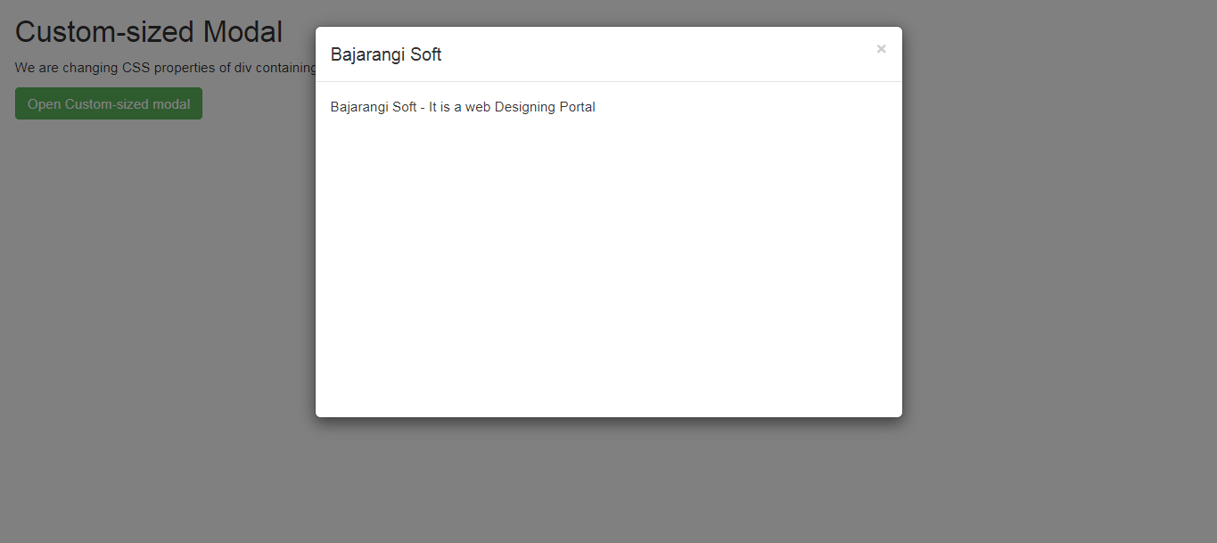
<h2>Custom-sized Modal</h2>
<p>We are changing CSS properties of div
containing the '.modal-dialog' to do the same.</p>
<button type="button"
class="btn btn-success"
data-toggle="modal"
data-target="#modal">
Open Custom-sized modal
</button>
<!-- Modal Code -->
<div class="modal fade"
id="modal"
role="dialog">
<div class="modal-dialog">
<!-- '.custom' class added here to do the same -->
<div class="modal-content custom">
<div class="modal-header">
<button type="button"
class="close"
data-dismiss="modal">
×
</button>
<h4 class="modal-title">
Bajarangi Soft
</h4>
</div>
<div class="modal-body">
<p>Bajarangi Soft -
It is a web Designing Portal</p>
</div>
</div>
</div>
</div>
</div>
</body>
</html>