
 Posted By
Bajarangi soft ,
Posted On 07-11-2020
Posted By
Bajarangi soft ,
Posted On 07-11-2020
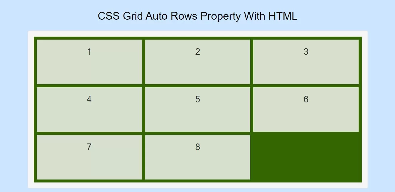
Implement CSS Code For Using CSS Grid Auto Rows Property
<style>
    body {
        background-color: #cce6ff;
    }

    .item1 {
        grid-area: 1 / 1 / 2 / 2;
    }

    .item2 {
        grid-area: 1 / 2 / 2 / 3;
    }

    .item3 {
        grid-area: 1 / 3 / 2 / 4;
    }

    .item4 {
        grid-area: 2 / 1 / 3 / 2;
    }

    .item5 {
        grid-area: 2 / 2 / 3 / 3;
    }

    .item6 {
        grid-area: 2 / 3 / 3 / 4;
    }

    .grid-container {
        display: grid;
        grid-auto-rows: 150px;
        grid-gap: 10px;
        background-color: #336600;
        padding: 10px;
    }

    .grid-container > div {
        background-color: rgba(255, 255, 255, 0.8);
        text-align: center;
        padding: 20px 0;
        font-size: 30px;
    }
</style>
<!DOCTYPE html>
<html>
<head>
    <title>How Do I Use CSS Grid Auto Rows Property With HTML</title>
    <meta name="viewport" content="width=device-width, initial-scale=1.0">
    <link rel="stylesheet" href="https://maxcdn.bootstrapcdn.com/bootstrap/3.3.6/css/bootstrap.min.css"/>
</head>

<style>
    body {
        background-color: #cce6ff;
    }

    .item1 {
        grid-area: 1 / 1 / 2 / 2;
    }

    .item2 {
        grid-area: 1 / 2 / 2 / 3;
    }

    .item3 {
        grid-area: 1 / 3 / 2 / 4;
    }

    .item4 {
        grid-area: 2 / 1 / 3 / 2;
    }

    .item5 {
        grid-area: 2 / 2 / 3 / 3;
    }

    .item6 {
        grid-area: 2 / 3 / 3 / 4;
    }

    .grid-container {
        display: grid;
        grid-auto-rows: 150px;
        grid-gap: 10px;
        background-color: #336600;
        padding: 10px;
    }

    .grid-container > div {
        background-color: rgba(255, 255, 255, 0.8);
        text-align: center;
        padding: 20px 0;
        font-size: 30px;
    }
</style>
<body>
<br/><br/>
<div class="container">
    <br>
    <div class="text-center">
        <h1 id="color" style="color: black;">CSS Grid Auto Rows Property With HTML</h1>
    </div>
    <br>
    <div class="well">
        <div class="grid-container">
            <div class="item1">1</div>
            <div class="item2">2</div>
            <div class="item3">3</div>
            <div class="item4">4</div>
            <div class="item5">5</div>
            <div class="item6">6</div>
            <div class="item7">7</div>
            <div class="item8">8</div>
        </div>
    </div>
</div>
</body>
</html>