
 Posted By
Bajarangi soft ,
Posted On 10-10-2020
Posted By
Bajarangi soft ,
Posted On 10-10-2020
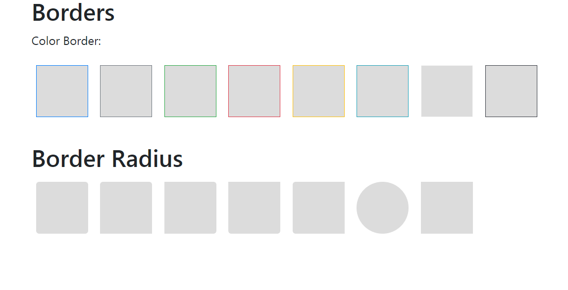
Any colour can be added to the border by using the following border-color classes that are available in bootstrap. If you want any other cutomized color, then you can set it manually using the CSS attribute.
Example-1
<!DOCTYPE html>
<html>
<head>
    <title>Bootstrap Example</title>

    <!-- Link Bootstrap CSS -->
    <link rel="stylesheet" href="https://maxcdn.bootstrapcdn.com/bootstrap/4.1.3/css/bootstrap.min.css">

    <!-- Link Bootstrap JS and JQuery -->
    <script src="https://ajax.googleapis.com/ajax/libs/jquery/3.3.1/jquery.min.js"></script>
    <script src="https://cdnjs.cloudflare.com/ajax/libs/popper.js/1.14.3/umd/popper.min.js"></script>
    <script src="https://maxcdn.bootstrapcdn.com/bootstrap/4.1.3/js/bootstrap.min.js"></script>

    <style>
        /* CSS style for Boxes */
        span {
            display: inline-block;
            width: 70px;
            height: 70px;
            margin: 6px;
            background-color: #DCDCDC;
        }
    </style>
</head>

<body>
<div class="container">
    <h2>Borders</h2>
    <p>Color Border:</p>
    <span class="border border-primary"></span>
    <span class="border border-secondary"></span>
    <span class="border border-success"></span>
    <span class="border border-danger"></span>
    <span class="border border-warning"></span>
    <span class="border border-info"></span>
    <span class="border border-light"></span>
    <span class="border border-dark"></span>
</div>
</body>
</html>
<!DOCTYPE html>
<html>
<head>
    <title>Bootstrap Example</title>

    <!-- Link Bootstrap CSS -->
    <link rel="stylesheet" href="https://maxcdn.bootstrapcdn.com/bootstrap/4.1.3/css/bootstrap.min.css">

    <!-- Link Bootstrap JS and JQuery -->
    <script src="https://ajax.googleapis.com/ajax/libs/jquery/3.3.1/jquery.min.js"></script>
    <script src="https://cdnjs.cloudflare.com/ajax/libs/popper.js/1.14.3/umd/popper.min.js"></script>
    <script src="https://maxcdn.bootstrapcdn.com/bootstrap/4.1.3/js/bootstrap.min.js"></script>

    <style>
        /* CSS Style for Boxes */
        span {
            display: inline-block;
            width: 70px;
            height: 70px;
            margin: 6px;
            background-color: #DCDCDC;
        }
    </style>
</head>
<body>
<div class="container">
    <h2>Border Radius</h2>

    <!-- Below classes are used to add radius
        to the borders -->
    <span class="rounded"></span>
    <span class="rounded-top"></span>
    <span class="rounded-right"></span>
    <span class="rounded-bottom"></span>
    <span class="rounded-left"></span>
    <span class="rounded-circle"></span>
    <span class="rounded-0"></span>
</div>
</body>
</html>