
 Posted By
Bajarangi soft ,
Posted On 27-11-2020
Posted By
Bajarangi soft ,
Posted On 27-11-2020
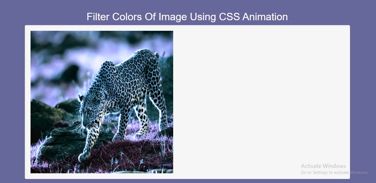
Complete Code For Filtering Colors Of Image Using CSS Animation.
<!DOCTYPE html>
<html>
<head>
    <title>How Do I Filter Colors Of Image Using CSS Animation</title>
    <meta name="viewport" content="width=device-width, initial-scale=1.0">
    <link rel="stylesheet" href="https://maxcdn.bootstrapcdn.com/bootstrap/3.3.6/css/bootstrap.min.css"/>
</head>

<style>
    * {
        box-sizing: border-box;
    }

    body {
        background-color: #666699;
    }

    img {
        animation: mymove 7s infinite;
    }

    @keyframes mymove {
        25% {
            -webkit-filter: grayscale(100%);
            filter: grayscale(100%);
        }
        50% {
            -webkit-filter: invert(100%);
            filter: invert(100%);
        }
        100% {
            -webkit-filter: hue-rotate(180deg);
            filter: hue-rotate(180deg);
        }
    }
</style>
<body>
<br/><br/>
<div class="container">
    <br>
    <div class="text-center">
        <h1 id="color" style="color: white;">Filter Colors Of Image Using CSS Animation</h1>
    </div>
    <div class="well">
        <img class="image2" src="https://cdn.hipwallpaper.com/i/60/49/A0eubB.jpg" alt="Pineapple" width="500" height="500">
    </div>
</div>
</body>
</html>