
 Posted By
Bajarangi soft ,
Posted On 30-09-2020
Posted By
Bajarangi soft ,
Posted On 30-09-2020
1.Position Property in CSS
<!DOCTYPE html>
<html>
<head>
<style>
div.relative {
position: relative;
left: 30px;
border: 3px solid #73AD21;
}
.aa{
position: static;
border: 3px solid #73AD21
}
.bb{
position: fixed;
bottom: 0;
right: 0;
width: 300px;
border: 3px solid #73AD21;
}
.cc{
position: relative;
width: 400px;
height: 200px;
border: 3px solid #73AD21;
}
.dd{
position: -webkit-sticky;
position: sticky;
top: 0;
padding: 5px;
background-color: #cae8ca;
border: 2px solid #4CAF50;
}
</style>
</head>
<body>
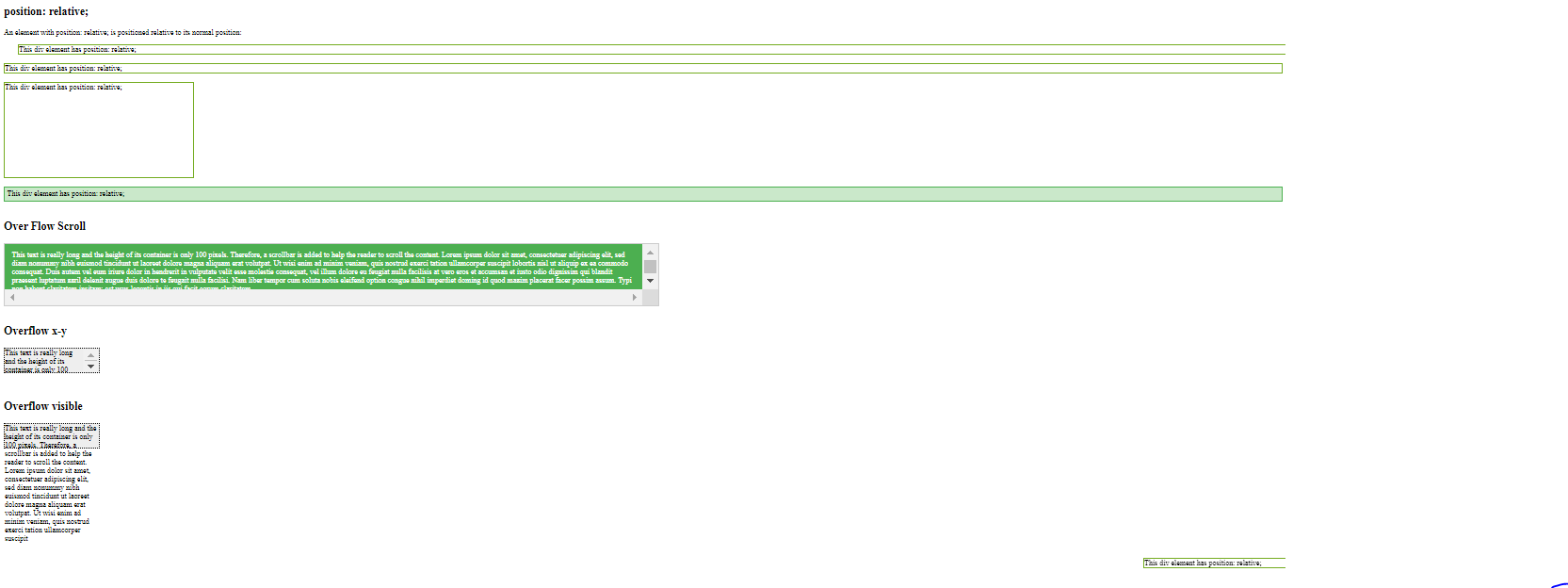
<h2>position: relative;</h2>
<p>An element with position: relative; is positioned relative to its normal position:</p>
<div class="relative">
This div element has position: relative;
</div>
<br>
<div class="aa">
This div element has position: relative;
</div>
<div class="bb">
This div element has position: relative;
</div>
<br>
<div class="cc">
This div element has position: relative;
</div>
<br>
<div class="dd">
This div element has position: relative;
</div>
</body>
</html>
<!DOCTYPE html>
<html>
<head>
    <style>
        #overflowTest {
            background: #4CAF50;
            color: white;
            padding: 15px;
            width: 50%;
            height: 100px;
            overflow: scroll;
            border: 1px solid #ccc;
        }
        #overflowTest1{
            background-color: #eee;
            width: 200px;
            height: 50px;
            border: 1px dotted black;
            overflow: visible;
        }
        #overflowTest2{
            background-color: #eee;
            width: 200px;
            height: 50px;
            border: 1px dotted black;
            overflow-x: hidden;
            overflow-y: scroll;
        }
    </style>
</head>
<body>
<h2>Over Flow Scroll</h2>
<div id="overflowTest">This text is really long and the height of its container is only 100 pixels. Therefore, a scrollbar is added to help the reader to scroll the content. Lorem ipsum dolor sit amet, consectetuer adipiscing elit, sed diam nonummy nibh euismod tincidunt ut laoreet dolore magna aliquam erat volutpat. Ut wisi enim ad minim veniam, quis nostrud exerci tation ullamcorper suscipit lobortis nisl ut aliquip ex ea commodo consequat. Duis autem vel eum iriure dolor in hendrerit in vulputate velit esse molestie consequat, vel illum dolore eu feugiat nulla facilisis at vero eros et accumsan et iusto odio dignissim qui blandit praesent luptatum zzril delenit augue duis dolore te feugait nulla facilisi. Nam liber tempor cum soluta nobis eleifend option congue nihil imperdiet doming id quod mazim placerat facer possim assum. Typi non habent claritatem insitam; est usus legentis in iis qui facit eorum claritatem.</div>
<br>
<h2>Overflow x-y</h2>
<div id="overflowTest2">This text is really long and the height of its container is only 100 pixels. Therefore, a scrollbar is added to help the reader to scroll the content. Lorem ipsum dolor sit amet, consectetuer adipiscing elit, sed diam nonummy nibh euismod tincidunt ut laoreet dolore magna aliquam erat volutpat. Ut wisi enim ad minim veniam, quis nostrud exerci tation ullamcorper suscipit lobortis nisl ut aliquip ex ea commodo consequat. Duis autem vel eum iriure dolor in hendrerit in vulputate velit esse molestie consequat, vel illum dolore eu feugiat nulla facilisis at vero eros et accumsan et iusto odio dignissim qui blandit praesent luptatum zzril delenit augue duis dolore te feugait nulla facilisi. Nam liber tempor cum soluta nobis eleifend option congue nihil imperdiet doming id quod mazim placerat facer possim assum. Typi non habent claritatem insitam; est usus legentis in iis qui facit eorum claritatem.</div>
<br>

<br>
<h2>Overflow visible</h2>
<div id="overflowTest1">This text is really long and the height of its container is only 100 pixels. Therefore, a scrollbar is added to help the reader to scroll the content. Lorem ipsum dolor sit amet, consectetuer adipiscing elit, sed diam nonummy nibh euismod tincidunt ut laoreet dolore magna aliquam erat volutpat. Ut wisi enim ad minim veniam, quis nostrud exerci tation ullamcorper suscipit</div>

</body>
</html>
<!DOCTYPE html>
<html>
<head>
    <style>
        img {
            float: left;
        }
        .img2{
        float:right;
        }
        .clearfix::after {
            content: "";
            clear: both;
            display: table;
        }
        div {
            border: 3px solid #4CAF50;
            padding: 5px;
        }
    </style>
</head>
<body>

<p>In this example, the image will float to the left in the paragraph, and the text in the paragraph will wrap around the image.</p>

<p><img src="my_pic.jpg" alt="Pineapple" style="width:170px;height:170px;margin-right:15px;">
    Lorem ipsum dolor sit amet, consectetur adipiscing elit. Phasellus imperdiet, nulla et dictum interdum, nisi lorem egestas odio, vitae scelerisque enim ligula venenatis dolor. Maecenas nisl est, ultrices nec congue eget, auctor vitae massa. Fusce luctus vestibulum augue ut aliquet. Mauris ante ligula, facilisis sed ornare eu, lobortis in odio. Praesent convallis urna a lacus interdum ut hendrerit risus congue. Nunc sagittis dictum nisi, sed ullamcorper ipsum dignissim ac. In at libero sed nunc venenatis imperdiet sed ornare turpis. Donec vitae dui eget tellus gravida venenatis.</p>


<br><br><br><br>
<div class="clearfix">
    <img class="img2" src="my_pic.jpg" alt="Pineapple" width="170" height="170">
    Lorem ipsum dolor sit amet, consectetur adipiscing elit. Phasellus imperdiet, nulla et dictum interdum...
</div>

</body>
</html>
<!DOCTYPE html>
<html>
<head>
    <style>
        .flex-container {
            display: flex;
            flex-wrap: nowrap;
            background-color: DodgerBlue;
        }

        .flex-container .box {
            background-color: #f1f1f1;
            width: 50%;
            margin: 10px;
            text-align: center;
            line-height: 75px;
            font-size: 30px;
        }
    </style>
</head>
<body>
<h1>Flexible Boxes</h1>

<div class="flex-container">
    <div class="box">Box 1 - This is some text to make sure that the content gets really tall. This is some text to make sure that the content gets really tall.</div>
    <div class="box">Box 2 - My height will follow Box 1.</div>
</div>

<p>Try to resize the browser window to see the flexible layout.</p>
<p><strong>Note:</strong> Flexbox is not supported in Internet Explorer 10 or earlier versions.</p>

</body>
</html>