
 Posted By
Bajarangi soft ,
Posted On 09-10-2020
Posted By
Bajarangi soft ,
Posted On 09-10-2020
Example 1:
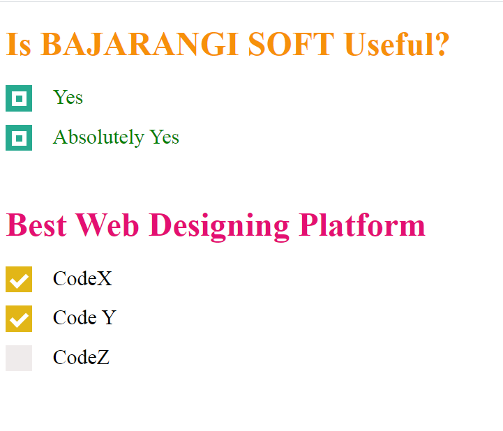
Consider the example where HTML checkbox is styled using CSS. First three check-boxes are created and then the default check-boxes are hide and new checkbox is created using height and width attribute. Set the height and width attribute to 25px and initial background color to black. The check-mark is also styled manually by using webkit. “:checked” is used to style checkbox after it is checked. When the user clicks the checkbox, the background color is set to green.
<!DOCTYPE html>
<html>

<head>
    <style>
        .main {
            display: block;
            position: relative;
            padding-left: 45px;
            margin-bottom: 15px;
            cursor: pointer;
            font-size: 20px;
        }

        /* Hide the default checkbox */
        input[type=checkbox] {
            visibility: hidden;
        }

        /* Creating a custom checkbox
        based on demand */
        .geekmark {
            position: absolute;
            top: 0;
            left: 0;
            height: 25px;
            width: 25px;
            background-color: #efebeb;
        }

        /* Specify the background color to be
        shown when hovering over checkbox */
        .main:hover input ~ .geekmark {
            background-color: yellow;
        }

        /* Specify the background color to be
        shown when checkbox is active */
        .main input:active ~ .geekmark {
            background-color: #d92424;
        }

        /* Specify the background color to be
        shown when checkbox is checked */
        .main input:checked ~ .geekmark {
            background-color: #e2b617;
        }

        /* Checkmark to be shown in checkbox */
        /* It is not be shown when not checked */
        .geekmark:after {
            content: "";
            position: absolute;
            display: none;
        }

        /* Display checkmark when checked */
        .main input:checked ~ .geekmark:after {
            display: block;
        }

        /* Styling the checkmark using webkit */
        /* Rotated the rectangle by 45 degree and
        showing only two border to make it look
        like a tickmark */
        .main .geekmark:after {
            left: 8px;
            bottom: 5px;
            width: 6px;
            height: 12px;
            border: solid white;
            border-width: 0 4px 4px 0;
            -webkit-transform: rotate(45deg);
            -ms-transform: rotate(45deg);
            transform: rotate(45deg);
        }
    </style>
</head>

<body>

<h1 style="color:#e30f72;">
    Best Web Designing  Platform
</h1>

<label class="main">CodeX
    <input type="checkbox">
    <span class="geekmark"></span>
</label>

<label class="main">Code Y
    <input type="checkbox" checked="checked">
    <span class="geekmark"></span>
</label>

<label class="main">CodeZ
    <input type="checkbox">
    <span class="geekmark"></span>
</label>
</body>
</html>
<!DOCTYPE html>
<html>

<head>
    <title>
        Style a checkbox using CSS
    </title>

    <style>
        .script {
            display: block;
            position: relative;
            padding-left: 45px;
            margin-bottom: 15px;
            cursor: pointer;
            font-size: 20px;
        }

        /* Hide the default checkbox */
        input[type=checkbox] {
            visibility: hidden;
        }

        /* creating a custom checkbox based
            on demand */
        .geekmark {
            position: absolute;
            top: 0;
            left: 0;
            height: 25px;
            width: 25px;
            background-color: #ddf508;
        }

        /* specify the background color to be
        shown when hovering over checkbox */
        .script:hover input ~ .geekmark {
            background-color: yellow;
        }

        /* specify the background color to be
        shown when checkbox is active */
        .script input:active ~ .geekmark {
            background-color: red;
        }

        /* specify the background color to be
        shown when checkbox is checked */
        .script input:checked ~ .geekmark {
            background-color: #27aa8f;
        }

        /* checkmark to be shown in checkbox */
        /* It is not be shown when not checked */
        .geekmark:after {
            content: "";
            position: absolute;
            display: none;
        }

        /* display checkmark when checked */
        .script input:checked ~ .geekmark:after {
            display: block;
        }

        /* styling the checkmark using webkit */
        /* creating a square to be the sign of
            checkmark */
        .script .geekmark:after {
            left: 6px;
            bottom: 5px;
            width: 6px;
            height: 6px;
            border: solid white;
            border-width: 4px 4px 4px 4px;
        }
        h1{
            color: #f6910a;
        }
    </style>
</head>

<body>
<h1>Is BAJARANGI SOFT Useful?</h1>

<label class="script" style = "color:green;">
    Yes
    <input type="checkbox">
    <span class="geekmark"></span>
</label>

<label class="script" style = "color:green;">
    Absolutely Yes
    <input type="checkbox" checked="checked">
    <span class="geekmark"></span>
</label>
</body>

</html>