
 Posted By
Bajarangi soft ,
Posted On 27-01-2021
Posted By
Bajarangi soft ,
Posted On 27-01-2021
Step 1:Create css file like style.css.
@import url("https://fonts.googleapis.com/css2?family=Roboto:ital,wght@0,100;0,300;0,400;1,100;1,300&family=Slabo+27px&display=swap");
*::after,
*::before {
box-sizing: border-box;
}
html {
scroll-behavior: smooth;
}
body {
margin: 0px;
padding: 0px;
}
ul,
li {
margin: 0px;
padding: 0px;
list-style: none;
font-family: "Roboto", sans-serif;
font-style: normal;
}
h1,
h2,
h3,
h4,
h5,
h6 {
margin: 0px;
padding: 0px;
font-weight: 500;
font-family: "Roboto", sans-serif;
font-style: normal;
}
p {
margin: 0px;
padding: 0px;
font-family: "Roboto", sans-serif;
font-style: normal;
}
table,
thead,
tbody,
tr,
th,
td {
font-family: "Roboto", sans-serif;
font-style: normal;
}
hr {
margin: 0px;
padding: 0px;
}
input,
button,
select,
optgroup,
textarea {
font-family: "Roboto", sans-serif;
font-style: normal;
}
a,
strong,
label,
span,
img,
b {
font-family: "Roboto", sans-serif;
transition: all 0.3s ease 0s;
font-style: normal;
}
a,
a:hover,
a:focus,
a:active,
a:link {
outline: none;
text-decoration: none;
color: #000;
}
a.bs-btn:focus {
outline: 0;
box-shadow: none;
}
button.bs-btn:focus {
outline: 0;
box-shadow: none;
}
<!DOCTYPE html>
<html lang="en">
<head>
<!-- Required meta tags -->
<title>animaion button three</title>
<meta charset="utf-8" />
<meta name="viewport" content="width=device-width, initial-scale=1, shrink-to-fit=no" />
<!-- Bootstrap CSS -->
<link rel="stylesheet" href="https://maxcdn.bootstrapcdn.com/bootstrap/4.0.0/css/bootstrap.min.css">
<link rel="stylesheet" href="https://cdnjs.cloudflare.com/ajax/libs/font-awesome/4.7.0/css/font-awesome.min.css">
<link rel="stylesheet" type="text/css" href="css/style.css" />
<style type="text/css">
button.bs-btn:focus {
outline: 0 !important;
outline-offset: 0;
}
button.bs-btn {
position: relative;
display: inline-block;
min-width: 170px;
max-width: 170px;
font-size: 16px;
border: none;
border-radius: 0;
background: rgb(216 216 216 / 66%);
cursor: pointer;
color: #000;
z-index: 1;
margin: 3px 0px;
}
button.bs-btn span {
display: block;
padding: 14px 10px;
}
button.bs-btn::before,
button.bs-btn::after {
content: "";
width: 0;
height: 2px;
position: absolute;
transition: all 0.2s linear;
background: rgb(0 0 0);
}
button.bs-btn span::before,
button.bs-btn span::after {
content: "";
width: 2px;
height: 0;
position: absolute;
transition: all 0.2s linear;
background: rgb(0 0 0);
}
button.bs-btn:hover::before,
button.bs-btn:hover::after {
width: 100%;
}
button.bs-btn:hover span::before,
button.bs-btn:hover span::after {
height: 100%;
}
button.bs-btn.btn-hover::before {
left: 50%;
top: 0;
transition-duration: 0.4s;
}
button.bs-btn.btn-hover::after {
left: 50%;
bottom: 0;
transition-duration: 0.4s;
}
button.bs-btn.btn-hover span::before {
left: 0;
top: 50%;
transition-duration: 0.4s;
}
button.bs-btn.btn-hover span::after {
right: 0;
top: 50%;
transition-duration: 0.4s;
}
button.bs-btn.btn-hover:hover::before,
button.bs-btn.btn-hover:hover::after {
left: 0;
}
button.bs-btn.btn-hover:hover span::before,
button.bs-btn.btn-hover:hover span::after {
top: 0;
}
@media (max-width: 768px) {
button.bs-btn {
min-width: 150px;
max-width: 150px;
}
}
</style>
</head>
<body>
<!-- container -->
<div class="container">
<div class="button">
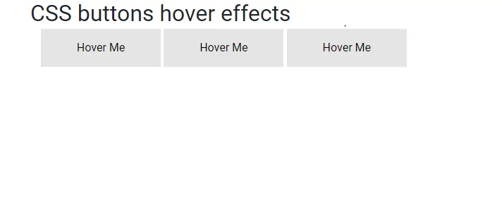
<h2>CSS buttons hover effects</h2>
<div class="container">
<button class="bs-btn btn-hover"><span>Hover Me</span></button>
<button class="bs-btn btn-hover"><span>Hover Me</span></button>
<button class="bs-btn btn-hover"><span>Hover Me</span></button>
</div>
</div>
</div>
<!-- container end-->
<!-- Optional JavaScript -->
<!-- jQuery first, then Popper.js, then Bootstrap JS -->
<script src="js/jquery-3.5.1.min.js"></script>
<script src="js/popper.min.js"></script>
<script src="js/bootstrap.min.js"></script>
<script src="js/jquery.min.js"></script>
<script src="js/jquery.js"></script>
</body>
</html>