
 Posted By
Bajarangi soft ,
Posted On 06-11-2020
Posted By
Bajarangi soft ,
Posted On 06-11-2020
Implement Code For Filtering images.
img {
width: 33%;
height: auto;
float: left;
max-width: 235px;
}
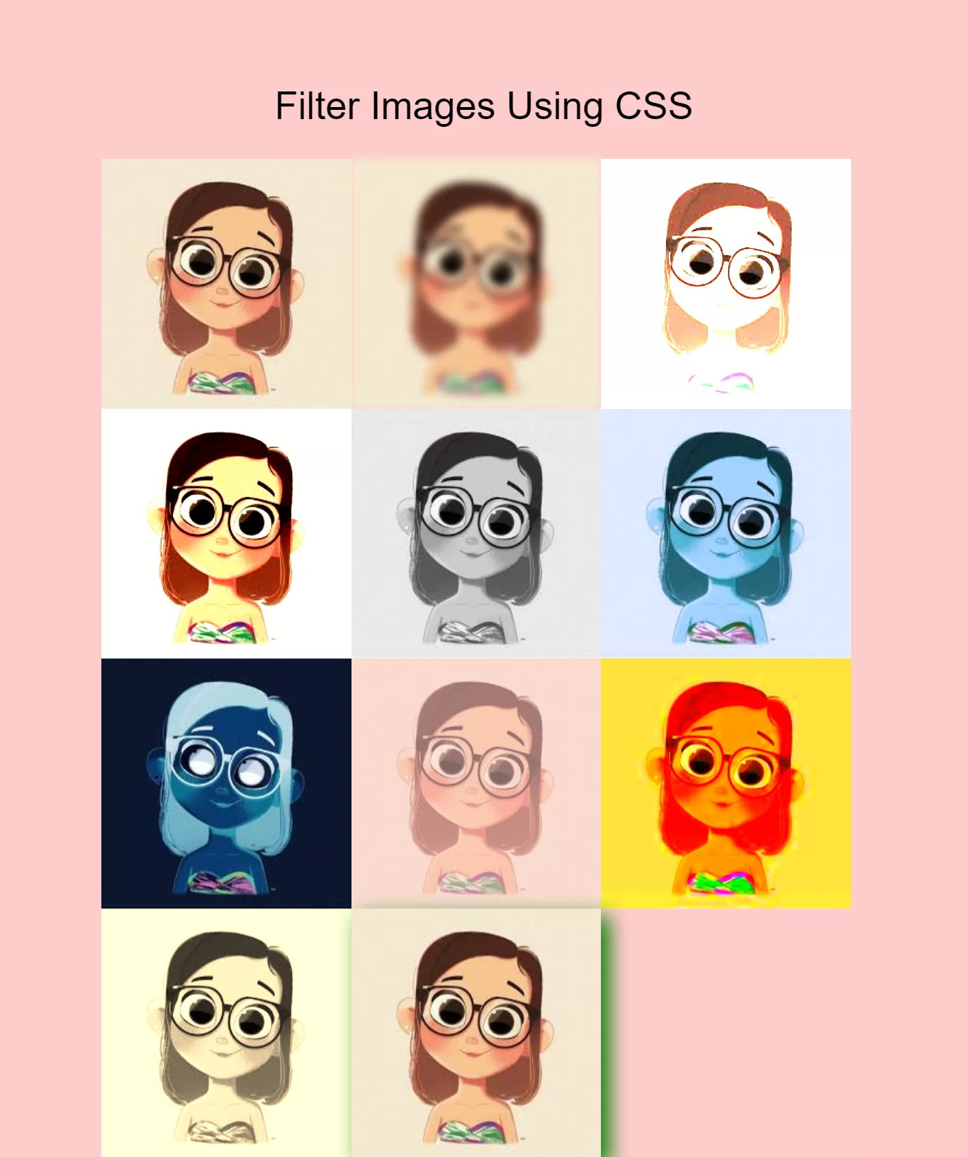
.blur {filter: blur(4px);}
.brightness {filter: brightness(250%);}
.contrast {filter: contrast(180%);}
.grayscale {filter: grayscale(100%);}
.huerotate {filter: hue-rotate(180deg);}
.invert {filter: invert(100%);}
.opacity {filter: opacity(50%);}
.saturate {filter: saturate(7);}
.sepia {filter: sepia(100%);}
.shadow {filter: drop-shadow(8px 8px 10px green);}
<!DOCTYPE html>
<html>
<head>
    <title>How Can I Filter Images Using Cascading Style Sheets</title>
    <meta name="viewport" content="width=device-width, initial-scale=1.0">
    <link rel="stylesheet" href="https://maxcdn.bootstrapcdn.com/bootstrap/3.3.6/css/bootstrap.min.css"/>
</head>
<style>
    body {
        background: #ffcccc;
    }

    img {
        width: 33%;
        height: auto;
        float: left;
        max-width: 235px;
    }

    .blur {filter: blur(4px);}
    .brightness {filter: brightness(250%);}
    .contrast {filter: contrast(180%);}
    .grayscale {filter: grayscale(100%);}
    .huerotate {filter: hue-rotate(180deg);}
    .invert {filter: invert(100%);}
    .opacity {filter: opacity(50%);}
    .saturate {filter: saturate(7);}
    .sepia {filter: sepia(100%);}
    .shadow {filter: drop-shadow(8px 8px 10px green);}
</style>
<body>
<br/><br/>
<div class="container">
    <br>
    <div class="text-center">
        <h1 id="color" style="color: black;">Filter Images Using CSS</h1>
    </div>
    <br>
        <img src="../image/demo1.jpg" alt="doll" width="300" height="300">
        <img class="blur" src="../image/demo1.jpg" alt="doll" width="300" height="300">
        <img class="brightness" src="../image/demo1.jpg" alt="doll" width="300" height="300">
        <img class="contrast" src="../image/demo1.jpg" alt="doll" width="300" height="300">
        <img class="grayscale" src="../image/demo1.jpg" alt="doll" width="300" height="300">
        <img class="huerotate" src="../image/demo1.jpg" alt="doll" width="300" height="300">
        <img class="invert" src="../image/demo1.jpg" alt="doll" width="300" height="300">
        <img class="opacity" src="../image/demo1.jpg" alt="doll" width="300" height="300">
        <img class="saturate" src="../image/demo1.jpg" alt="doll" width="300" height="300">
        <img class="sepia" src="../image/demo1.jpg" alt="doll" width="300" height="300">
        <img class="shadow" src="../image/demo1.jpg" alt="doll" width="300" height="300">
</div>
</body>
</html>