
 Posted By
Bajarangi soft ,
Posted On 10-10-2020
Posted By
Bajarangi soft ,
Posted On 10-10-2020
The example below represents how the default <select> element can be styled using .custom-select in Bootstrap.
Example:1
<!DOCTYPE html>
<html lang="en">

<head>
    <!-- Bootstrap CSS -->
    <link rel="stylesheet" href="https://stackpath.bootstrapcdn.com/bootstrap/4.5.0/css/bootstrap.min.css">
    <script src="https://kit.fontawesome.com/577845f6a5.js" crossorigin="anonymous"></script>
    <!-- Optional JavaScript -->
    <script src="https://code.jquery.com/jquery-3.5.1.slim.min.js"></script>
    <script src="https://cdn.jsdelivr.net/npm/popper.js@1.16.0/dist/umd/popper.min.js"></script>
    <script src="https://stackpath.bootstrapcdn.com/bootstrap/4.5.0/js/bootstrap.min.js"></script>
</head>
<body>
<h1 style="color: green">
   BAJARANGI SOFT
</h1>

<!-- Use the custom-select class -->
<select class="custom-select"
        style="width:150px;">
    <option>Pizzas</option>
    <option>Burger</option>
    <option>Ice Cream</option>
    <option>Fried Potatoes</option>
</select>
</body>

</html>
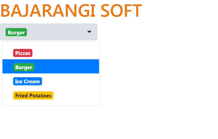
Below are some attributes that can be used to style the <select> tag:
Below are some attributes that can be used to style the <option> tag:
<!DOCTYPE html>
<html>

<head>
    <link rel="stylesheet" href="https://maxcdn.bootstrapcdn.com/bootstrap/4.0.0/css/bootstrap.min.css">
    <script src="https://ajax.googleapis.com/ajax/libs/jquery/3.2.1/jquery.min.js"></script>
    <script src="https://cdnjs.cloudflare.com/ajax/libs/popper.js/1.12.9/umd/popper.min.js"></script>
    <script src="https://maxcdn.bootstrapcdn.com/bootstrap/4.0.0/js/bootstrap.min.js"></script>
    <!-- CDN link used below is compatible with this example -->
    <link rel="stylesheet" href="https://cdnjs.cloudflare.com/ajax/libs/bootstrap-select/1.13.1/css/bootstrap-select.min.css">
    <script src="https://cdnjs.cloudflare.com/ajax/libs/bootstrap-select/1.13.1/js/bootstrap-select.min.js"></script>
</head>

<body>
<h1 style="color: #ee7811">
   BAJARANGI SOFT
</h1>

<!-- Using the attributes to style the
    <select> and <option> tag -->
<select class="selectpicker">
    <option data-content="<span class='badge badge-danger'>Pizzas</span>">Pizzas</option>
    <option data-content="<span class='badge badge-success'>Burger</span>">Burger</option>
    <option data-content="<span class='badge badge-primary'>Ice Cream</span>">Ice Cream</option>
    <option data-content="<span class='badge badge-warning'>Fried Potatoes</span>">Fried Potatoes</option>
</select>
</body>

</html>