
 Posted By
Bajarangi soft ,
Posted On 09-10-2020
Posted By
Bajarangi soft ,
Posted On 09-10-2020
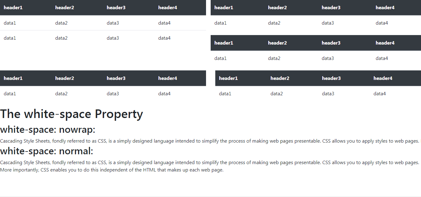
We can prevent inline-block divs from wrapping by adding suitable Bootstrap classes. Let us understand this with the help of an example:
Example 1: We have to display multiple tables that have been laid out using suitable bootstrap row and column classes The problem would be that if there are multiple tables
in the same row then Bootstrap would wrap up the row and push the next table to the next row if it does not fit inline.
Syntax:
<div class="table-responsive">
<!DOCTYPE html>
<html lang="en">

<head>
    <meta charset="UTF-8">
    <meta name="viewport" content="width=device-width, initial-scale=1.0">
    <link rel="stylesheet" href="https://maxcdn.bootstrapcdn.com/bootstrap/4.4.1/css/bootstrap.min.css">
    <title>Prevent inline-block divs from wrapping</title>

    <style>
        div {
            display: inline-block;
        }
    </style>
</head>

<body>
<div class="row">
    <div class="col-6">
        <div class="table-responsive">
            <table class="table table-stripped">

                <!-- This is to make the table
                    have same colors for
                    alternate rows-->
                <thead class="thead-dark">
                <tr>
                    <th>header1</th>
                    <th>header2</th>
                    <th>header3</th>
                    <th>header4</th>
                </tr>
                </thead>
                <tbody>
                <tr>
                    <td>data1</td>
                    <td>data2</td>
                    <td>data3</td>
                    <td>data4</td>
                </tr>
                <tr>
                    <td>data1</td>
                    <td>data2</td>
                    <td>data3</td>
                    <td>data4</td>
                </tr>
                </tbody>
            </table>
        </div>
    </div>

    <div class="col-6">
        <div class="row">
            <div class="table-responsive">
                <table class="table table-stripped">
                    <thead class="thead-dark">
                    <tr>
                        <th>header1</th>
                        <th>header2</th>
                        <th>header3</th>
                        <th>header4</th>
                    </tr>
                    </thead>
                    <tbody>
                    <tr>
                        <td>data1</td>
                        <td>data2</td>
                        <td>data3</td>
                        <td>data4</td>
                    </tr>
                    </tbody>
                </table>
            </div>
        </div>
    </div>

</div>
<div class="row">
    <div class="col-6">
        <div class="table-responsive">
            <table class="table table-stripped">
                <thead class="thead-dark">
                <tr>
                    <th>header1</th>
                    <th>header2</th>
                    <th>header3</th>
                    <th>header4</th>
                </tr>
                </thead>
                <tbody>
                <tr>
                    <td>data1</td>
                    <td>data2</td>
                    <td>data3</td>
                    <td>data4</td>
                </tr>
                </tbody>
            </table>
        </div>
    </div>
</div>
</body>

</html>
white-space: nowrap; property to class “a” which keeps the line of text in the same line even if the screen size is small.white-space: nowrap;
white-space: normal; which is the default for “white-space”. This displays the text on multiple lines depending on the size of the screen.white-space: normal;
<!DOCTYPE html>
<html>

<head>
    <title>
        How to prevent inline-block
        divs from wrapping ?
    </title>

    <style>
        .a {
            white-space: nowrap;
        }

        .b {
            white-space: normal;
        }
    </style>
</head>

<body>

<h1>The white-space Property</h1>
<h2>white-space: nowrap:</h2>

<div class="a">
    Cascading Style Sheets, fondly
    referred to as CSS, is a simply
    designed language intended to
    simplify the process of making
    web pages presentable. CSS
    allows you to apply styles to
    web pages. More importantly,
    CSS enables you to do this
    independent of the HTML that
    makes up each web page.
</div>

<h2>white-space: normal:</h2>

<div class="b">
    Cascading Style Sheets, fondly
    referred to as CSS, is a simply
    designed language intended to
    simplify the process of making
    web pages presentable. CSS
    allows you to apply styles to
    web pages. More importantly,
    CSS enables you to do this
    independent of the HTML that
    makes up each web page.
</div>
</body>

</html>