
 Posted By
Bajarangi soft ,
Posted On 07-11-2020
Posted By
Bajarangi soft ,
Posted On 07-11-2020
Complete Code For Using Align Content Property With HTML Div.
<!DOCTYPE html>
<html>
<head>
<title>How To Use Align Items Property With HTML Div Element</title>
<meta name="viewport" content="width=device-width, initial-scale=1.0">
<link rel="stylesheet" href="https://maxcdn.bootstrapcdn.com/bootstrap/3.3.6/css/bootstrap.min.css"/>
</head>
<style>
body {
background-color: #c68c53;
}
/*center*/
.flex-container1 {
display: flex;
height: 300px;
flex-wrap: wrap;
align-content: space-between;
background-color: #996633;
}
.flex-container1 > div {
background-color: #f1f1f1;
width: 100px;
margin: 10px;
text-align: center;
line-height: 75px;
font-size: 30px;
}
/*space-around*/
.flex-container2 {
display: flex;
height: 300px;
flex-wrap: wrap;
align-content: space-around;
background-color: #996633;
}
.flex-container2 > div {
background-color: #f1f1f1;
width: 100px;
margin: 10px;
text-align: center;
line-height: 75px;
font-size: 30px;
}
/*stretch*/
.flex-container3 {
display: flex;
height: 400px;
flex-wrap: wrap;
align-content: stretch;
background-color: #996633;
}
.flex-container3 > div {
background-color: #f1f1f1;
width: 100px;
margin: 10px;
text-align: center;
line-height: 75px;
font-size: 30px;
}
/*center*/
.flex-container4 {
display: flex;
height: 200px;
flex-wrap: wrap;
align-content: center;
background-color: #996633;
}
.flex-container4 > div {
background-color: #f1f1f1;
width: 100px;
margin: 10px;
text-align: center;
line-height: 75px;
font-size: 30px;
}
/*flex-start*/
.flex-container5 {
display: flex;
height: 200px;
flex-wrap: wrap;
align-content: flex-start;
background-color: #996633;
}
.flex-container5 > div {
background-color: #f1f1f1;
width: 100px;
margin: 10px;
text-align: center;
line-height: 75px;
font-size: 30px;
}
</style>
<body>
<br/><br/>
<div class="container">
<br>
<div class="text-center">
<h1 id="color" style="color: white;">Align Items Property With HTML Div Element</h1>
</div>
<br>
<div class="well">
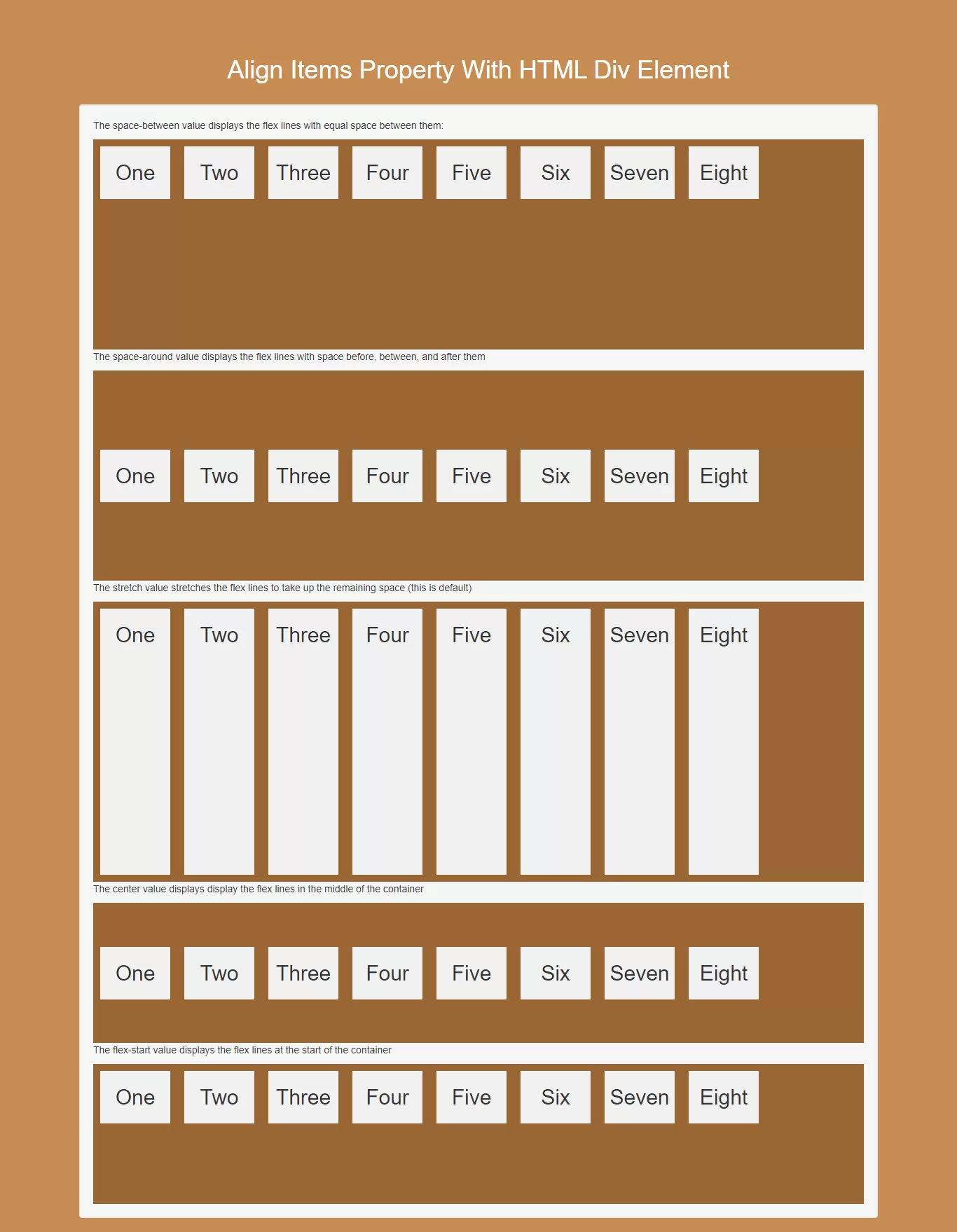
<p>The space-between value displays the flex lines with equal space between them:</p>
<div class="flex-container1">
<div>One</div>
<div>Two</div>
<div>Three</div>
<div>Four</div>
<div>Five</div>
<div>Six</div>
<div>Seven</div>
<div>Eight</div>
</div>
<p>The space-around value displays the flex lines with space before, between, and after them</p>
<div class="flex-container2">
<div>One</div>
<div>Two</div>
<div>Three</div>
<div>Four</div>
<div>Five</div>
<div>Six</div>
<div>Seven</div>
<div>Eight</div>
</div>
<p>The stretch value stretches the flex lines to take up the remaining space (this is default)</p>
<div class="flex-container3">
<div>One</div>
<div>Two</div>
<div>Three</div>
<div>Four</div>
<div>Five</div>
<div>Six</div>
<div>Seven</div>
<div>Eight</div>
</div>
<p>The center value displays display the flex lines in the middle of the container</p>
<div class="flex-container4">
<div>One</div>
<div>Two</div>
<div>Three</div>
<div>Four</div>
<div>Five</div>
<div>Six</div>
<div>Seven</div>
<div>Eight</div>
</div>
<p>The flex-start value displays the flex lines at the start of the container</p>
<div class="flex-container5">
<div>One</div>
<div>Two</div>
<div>Three</div>
<div>Four</div>
<div>Five</div>
<div>Six</div>
<div>Seven</div>
<div>Eight</div>
</div>
</div>
</div>
</body>
</html>