How To create a Simple Animation Buttons Using CSS Part-1

admin_img Posted By Bajarangi soft , Posted On 28-01-2021

A simple button is elevated using CSS and HTML adding an attractive glow effect,Using css animation here we have created swipe right buttons with hover effects animation buttons. Here we make simple css buttons animations with zooming effects.

How To create a Simple Animation Buttons Using CSS Part-1

Step 1:Create css file like style.css.

@import url("https://fonts.googleapis.com/css2?family=Roboto:ital,wght@0,100;0,300;0,400;1,100;1,300&family=Slabo+27px&display=swap");

*::after,
*::before {
    box-sizing: border-box;
}

html {
    scroll-behavior: smooth;
}

body {
    margin: 0px;
    padding: 0px;
}

ul,
li {
    margin: 0px;
    padding: 0px;
    list-style: none;
    font-family: "Roboto", sans-serif;
    font-style: normal;
}

h1,
h2,
h3,
h4,
h5,
h6 {
    margin: 0px;
    padding: 0px;
    font-weight: 500;
    font-family: "Roboto", sans-serif;
    font-style: normal;
}

p {
    margin: 0px;
    padding: 0px;
    font-family: "Roboto", sans-serif;
    font-style: normal;
}

table,
thead,
tbody,
tr,
th,
td {
    font-family: "Roboto", sans-serif;
    font-style: normal;
}

hr {
    margin: 0px;
    padding: 0px;
}

input,
button,
select,
optgroup,
textarea {
    font-family: "Roboto", sans-serif;
    font-style: normal;
}

a,
strong,
label,
span,
img,
b {
    font-family: "Roboto", sans-serif;
    transition: all 0.3s ease 0s;
    font-style: normal;
}

a,
a:hover,
a:focus,
a:active,
a:link {
    outline: none;
    text-decoration: none;
    color: #000;
}

a.bs-btn:focus {
    outline: 0;
    box-shadow: none;
}

button.bs-btn:focus {
    outline: 0;
    box-shadow: none;
}
.text-center{
    color:darkred;
}
Step 2:Create html file and import style.css in it.
<!DOCTYPE html>
<html lang="en">
    <head>
        <!-- Required meta tags -->
        <title>animaion button hover one</title>
        <meta charset="utf-8" />
        <meta name="viewport" content="width=device-width, initial-scale=1, shrink-to-fit=no" />
       <!-- Bootstrap CSS -->
        <link rel="stylesheet" href="https://maxcdn.bootstrapcdn.com/bootstrap/4.0.0/css/bootstrap.min.css">    
        <link rel="stylesheet" href="https://cdnjs.cloudflare.com/ajax/libs/font-awesome/4.7.0/css/font-awesome.min.css">
        <link rel="stylesheet" type="text/css" href="css/style.css" />

        <style type="text/css">
            button.bs-btn {
                position: relative;
                display: inline-block;
                min-width: 170px;
                max-width: 170px;
                padding: 14px 0px;
                background: #1878a9;
                vertical-align: middle;
                -webkit-backface-visibility: hidden;
                -moz-osx-font-smoothing: grayscale;
                text-transform: uppercase;
                letter-spacing: 1px;
                border-radius: 5px;
                border: none;
                font-weight: 500;
                font-size: 14px;
                cursor: pointer;
                color: #fff;
                z-index: 1;
                margin: 3px 0px;
            }
            button.bs-btn:focus {
                outline: none;
            }
            button.bs-btn > span {
                vertical-align: middle;
            }

            button.bs-btn.btn-hover {
                -webkit-transition: background-color 0.3s, color 0.3s;
                transition: background-color 0.3s, color 0.3s;
            }
   
            button.bs-btn.btn-hover::before {
                content: "";
                position: absolute;
                top: 0;
                left: 0;
                width: 100%;
                height: 100%;
                border: 2px solid #1878a9;
                z-index: -1;
                border-radius: inherit;
                opacity: 0;
                -webkit-transform: scale3d(0.6, 0.6, 1);
                transform: scale3d(0.6, 0.6, 1);
                -webkit-transition: -webkit-transform 0.3s, opacity 0.3s;
                transition: transform 0.3s, opacity 0.3s;
                -webkit-transition-timing-function: cubic-bezier(0.75, 0, 0.125, 1);
                transition-timing-function: cubic-bezier(0.75, 0, 0.125, 1);
            }
    
            button.bs-btn.btn-hover:hover {
                background-color: #fff;
                color: #1878a9;
            }

            button.bs-btn.btn-hover:hover::before {
                -webkit-transform: scale3d(1, 1, 1);
                transform: scale3d(1, 1, 1);
                opacity: 1;
            }

            @media (max-width: 768px) {
                button.bs-btn {
                    min-width: 150px;
                    max-width: 150px;
                }
            }
        </style>
    </head>
    <body>
       <!-- container -->
        <div class="container">
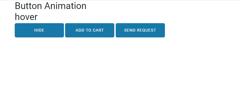
            <h2>Button Animation</h2>
            <h2>hover</h2>
            <div class="button">
                <button class="bs-btn btn-hover">Hide</button>
                <button class="bs-btn btn-hover">Add to Cart</button>
                <button class="bs-btn btn-hover">Send Request</button>
            </div>
        </div>
        <!-- container end -->

         <!-- Optional JavaScript -->
        <!-- jQuery first, then Popper.js, then Bootstrap JS -->
       <script src="https://code.jquery.com/jquery-3.2.1.slim.min.js"></script>
       <script src="https://cdnjs.cloudflare.com/ajax/libs/popper.js/1.12.9/umd/popper.min.js"></script>
       <script src="https://maxcdn.bootstrapcdn.com/bootstrap/4.0.0/js/bootstrap.min.js"></script>
    </body>
</html>

Related Post